For a long time, Outlook has been known as one of the most popular email clients. Today, it’s share is 11% of the respective market sector worldwide. 9% belong to mobile Outlook apps. The other 2% are the desktop versions.
Yes, Outlook is quite a convenient email client, particularly for business needs. There are two sides to every coin though. With Outlook, the dark side is related to, um, “specific rules” of rendering, as it were.
We all are designing and testing our emails to please subscribers with perfect-looking campaigns. And we often see display problems with Outlook. Templates testing constantly shows them. This is especially true for the 2007, 2010, and 2013 editions.
The root of evil is that the mentioned versions of Outlook use Microsoft Word algorithms for email rendering, which results in limited support of HTML and CSS codes.
Some people try to fix these bugs by making changes to the entire email code. This is a dangerous solution, to be honest. You may fix one problem, but another happens. Well, buttons stop being rounded… But banners show you a troll face instead. The worst scenario is when the email is mutilated by other email clients.
That’s why the trouble should be fixed locally. Only edit the problem elements, not the entire code. Other issues may even be solved without invasion in codes, just by the methods available in the HTML email template builders interface.
Well, let’s talk about the most typical problems with Outlook, and the ways of troubleshooting them.
Backgrounds are not rendered
Let’s start with this problem.
The main mission of the background per se is the perfection of the email design. Those who deal with crafting email templates are aware of this truth. Yet, the most typical issue with Outlook is: “What’s going on with the background images?”
We mean backgrounds added to separate elements. Oddly enough, but true: when backgrounds are added to the whole email, there are no problems. All the editions of Outlook display them correctly.

Looks like a simple solution, by the way. Why mess with complex things – just add one background and take it easy. 🙂 In many cases, it really works, so use this method when it fits your goals and concept.
However, there are situations when we need to add background to certain email elements.
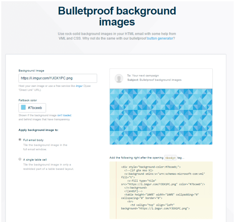
One more simple troubleshooting method – when it fits your design concept, of course. It’s strongly recommended to provide a web-safe fallback in many cases. With email elements, add a fallback color. That way, an email module won’t be empty white. Choose a color that matches the entire color scheme. So, in the worst case scenario of Outlook failing to display the image, it shows the background color instead. Not bad.
Another practice is to build the required structure like a banner. It will be a banner technically, but who cares? 🙂 If something looks like a structure, and it works as a structure – then, it’s a structure…at least, for recipients 🙂
Modern email editors are equipped with a set of tools to build sophisticated banners. Details may differ depending on the particular service you use… In a nutshell, we choose the banner block in drag-n-drop mode. Then, add the image, write the copy over it, and add the respective hyperlink. That’s it! Banner images work correctly with all email clients.

The most “scary” yet advanced practice is to create a VML-based background. When you configure the required element, open the HTML editor (available in most email builders).
Then, insert a code fragment (developed by backgrounds.cm) right above the line that starts with “table width.”
Below that line, insert this sample:
<!--[if gte mso 9]>
 <v:rect xmlns:v="urn:schemas-microsoft-com:vml" fill="true" stroke="false" style="width:327px;height:100%;">
   <v:fill type="frame" src="https://iiqf.stripocdn.email/content/guids/CABINET_b696bac619e2a6fd60a2c756b8b7c9c5/images/26661559905688877.png" color="#7bceeb" ></v:fill>
   <v:textbox inset="0,0,0,0">
 <![endif]-->
Below that line, insert this sample:
<!--[if gte mso 9]>
   </v:textbox>
 </v:rect>
 <![endif]-->
And replace the links with their respective background image URLs.
Important to note: a trick doesn’t work if you also add other VML-based elements, i.e. buttons, to the structures. This is because Outlook can display only one VML object at a time.
Rounded CTAs turn square-shaped
The button shape is not considered to impact marketing metrics. Yes, the essential condition of CTA elements’ performance is that they are visually noticeable with clear compelling text.
On the other hand, the shape really matters when it comes to brand consistency. We must pay attention to the slightest detail in order to stick to the brand style. In many cases, standardized buttons may damage the whole design concept.
So, what does Outlook offer for buttons? Some archaic versions turn them into right angles. They also remove all the white spaces. Of course, this makes the button less attractive.

Are there ways to address this bug? There are different methods to change the button layout. The most typical method is a table-based one. Unfortunately, it’s helpless when it comes to Outlook.
So it’s better to apply the aforementioned VML method. How should one set it? This time, no code samples are needed. All we need is a template editor with an Outlook support feature, for example, Stripo.email. Go to General settings, open the Button tab there. And toggle the “Support for Outlook.”
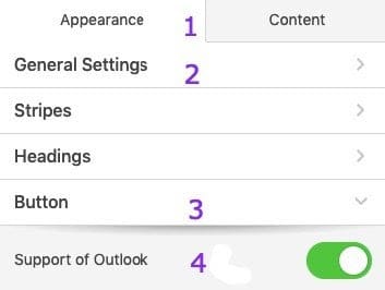
Ready! Now, buttons become rounded with the styles unchanged.
Outlook denies displaying the margins
None of the editions of Outlook support margins in an email (except for Outlook.com). The same is true for Gmail. Without margins, email content may look too unstructured. How can one solve this problem?
We recommend using spacers instead, these blocks are available in most of the available tools. And they are easily applied and configured.
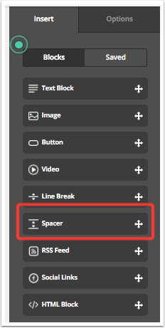
Another solution is to use padding to add required space around the content blocks. Padding is 100% supported by all versions of Outlook. Just select the respective content element in the drag-n-drop email editor mode. Then select the Options menu and set the parameters there.
Important to note: keep in mind the mobile rendering. And test it before sending it. The issue is that padding can make the content look too narrow on a mobile screen.
No support for GIF animations
Embedded videos are still a trend. But besides all the advantages, there are also problems. Therefore, email marketers often choose alternate ways to make their campaigns more dynamic. A light-weight GIF is a good way to replace video in emails.
But Outlook doesn’t support GIFs. Only the first frame is displayed. Sad but true.
The solution here is not technical but creative. Take care of those subscribers who use Outlook. If you add animated GIFs, make the first frame essential for them. Let your GIF be simple. And, not a central item of the message. Rather, let it be an added feature accompanied by other elements.
Buttons with broken text and fonts
Last but not least is one more butt(on) hurt. This time, the victims are text and fonts. The most typical trouble is when the button text is broken into two lines. This is because of rendering algorithms. To avoid this, try to increase the padding in the button. Let the button be significantly larger than the font size.
Still not solved? Well, let’s go the radical way 🙂 Just create an image of the CTA button. And use it instead.

Moreover, Outlook is often harmful to the fonts and replaces the font type you’ve chosen with the default Times New Roman. This issue is caused by a space at the beginning/end of the CTA text in the button.
To fix this issue, remove the spacing. If it doesn’t work, the extreme recipe is the same. Create a new button or an image of a button. How to do this? There’s a service known as Da Button Factory. Craft the button there in no time. And then upload it to your email like a regular image.
Final words
We all know that Outlook is an email client widely used in many businesses due to its benefits. So we cannot ignore it. Even despite annoying issues with rendering, don’t be afraid of it.
Just the opposite, in fact, we need to discover how to troubleshoot the issues. Besides, Outlook has now been updated to support GIFs, and now even AMP for Emails is supported. It seems they’re keeping up with times.
Still, there are some problems… But you’ll find a way to solve them. We wish you only perfect campaigns for all clients!


Comments
1 replies