One of the main observations from our 2021 email marketing forecast was about the interactivity of emails. Experts agreed that dynamic elements – animations, embedded videos, web-like navigations, etc. – are the essential toolset of modern email marketers, and will only get more popular. A GIF in an email is arguably the simplest way of introducing interactivity. But how do you do it right? Is it the way to go? And what are the alternatives? That’s what we’re here to discuss.
When should you put a GIF in an email?
GIFs have come a long way from the annoying antics of the early internet to something that’s nowadays perfectly normal and even desired. They’re in common use on the web, in all kinds of communications, but also in emails.
Initially deemed inappropriate for this form of communication, they soon became socially acceptable, and in many cases essential for keeping users engaged or explaining complex flows. They’re very useful if you want to:
Build brand recognition
In many cases, crafting and embedding a GIF in an email marketing strategy makes the messages a lot more memorable. It also tells a story that no static image could tell. A recipient may still disregard your call-to-action, but rest assured they will remember your message and may convert at some point in the future.
Grab the reader’s attention
Sometimes, getting a reader to smile is all you need. A funny GIF put in an otherwise serious email can get a user involved, eventually leading them to click on a CTA, respond, or simply form a memory that will stick in their mind (and may yield future results).
Demonstrate features
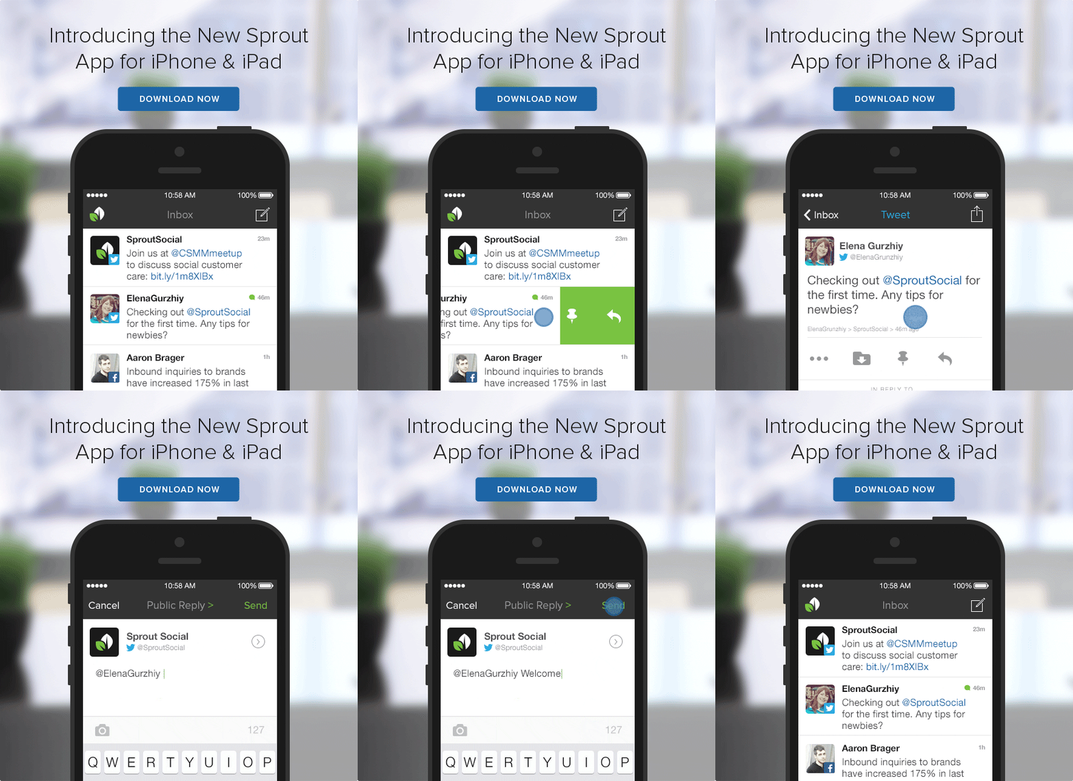
If you’re launching a new feature or just went through a redesign, an animated GIF is a wonderful way of showing what’s changed.
Preview a video
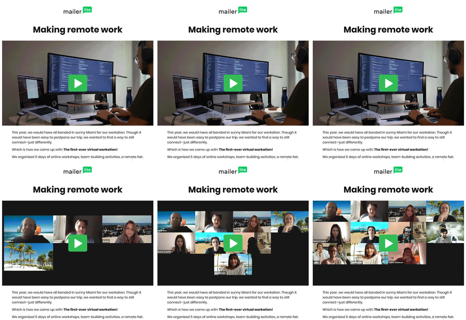
Readers may be hesitant about opening a video you’re linking in your email, without knowing much about its contents. A short video converted into a GIF can serve as a brief preview of this video, and it displays right in the content of an email. If someone opens the email, they’re guaranteed to see it.
Once the company is done with finding qualified candidates, many will opt out to use their newsletter to promote themselves to these new candidates. Instead of a long list of benefits, a far better option is displaying pictures of the people behind the brand. A lot of them. That’s what GIFs are also excellent at.
Explain something step by step
More and more commonly, various onboarding and other transactional emails feature GIFs. They can be very effective at explaining simple flows that a reader should follow.
Things get a bit tricky, however, when you wish to quickly produce a GIF and the complex dashboard you’re going to demonstrate is, well, complex. It’s definitely possible, but there may be better approaches to the problem than GIFs
We’ll come back to the topic with our own example in the ‘Does GIF make your email better’ chapter.
How do you produce a proper GIF?
The choice of tools heavily depends on who you wish to involve in the process and how much time you have at your disposal.
In a perfect world, you would already have a designer standing behind you, eagerly looking at this complex GIF you’re going to ask them for. For them, Adobe Photoshop is arguably the top tool for building high-quality GIFs. It includes an excellent toolset for animating sets of frames, processing videos, and smoothing out the transitions.
Alternatively, Adobe After Effects can also do the job, but it’s not as rich in features as Photoshop.
We don’t live in a perfect world though, and sometimes we need simpler solutions that can produce GIFs quickly, without the designer’s help. There are plenty of available options.
GIF Brewery 3 is a popular and inexpensive app for MacOS users. Instagiffer works well on both Mac and Windows. The same can be said about Wondershare and many others. If you need a single tool that lets you capture your screen, edit the recording, and publish a GIF, ScreenToGif is an excellent and free option (Windows only).
There are also a handful of web-based apps for producing GIFs. Ezgif is a popular choice if you have a set of images you wish to put together. Tools like Makeagif or Imgflip can convert both videos and images into GIFs. GIPHY itself has a built-in GIF creation tool.
What about the GIF size?
Complex GIFs can get heavy, and this can lead to problems for the entire message. Users on weak connections may give up on the message because of the long loading time. Those with limited mobile data may become skeptical about opening your emails. And, maybe worst of all, emails with heavy attachments tend to go to spam on a regular basis.
In general, we would recommend that an animated GIF in an email is no larger than 1MB. If you can make it below 0.5MB, even better, especially if are you including more than one GIF.
Try the following tips to reduce the size of your animations:
- Consider using images instead of a video. They’re lighter, and most GIFs don’t require smooth animations.
- Remove unnecessary frames. A standard video plays at 24 frames a second, but that’s absolutely unnecessary in a GIF – it’s not supposed to be smooth. In reality, you could cut the majority of frames from a video without losing any value for the viewer. And the fewer frames there are, the lighter the GIF.
- Don’t animate an entire picture. Very often, only a small part of an image needs to be in motion, while the background can stay still for a prolonged period. Use layers in tools like Adobe Photoshop to isolate and animate only certain areas.
- Limit the number of colors. You can use up to 256 colors in a GIF, but do you always need that in this particular design? It won’t always work, but try to limit the number to 64 or fewer.
- Don’t stretch your GIF too much. Most email templates are 600-800px wide, which works great for both web and mobile. Keep your animation within this range or lower.
There are a number of other tactics you could incorporate. Check out, for example, this tutorial.
Do email clients support GIFs?
In general, yes – GIFs are supported by Gmail (both web and mobile), Apple/iOS Mail, Outlook.com, AOL, and many others. There are, however, some exceptions.
GIFs won’t work on the older versions of Outlook (2007, 2010, and 2013). If a recipient opens your email in any of these clients, only the first frame will be displayed, so it will look like a static image.
For this reason, it’s worth designing your GIFs in a way that the very first frame conveys the message. This could be the call-to-action displayed straight away or an intro screen with a header explaining what’s in the GIF (e.g. “Getting started with Mailtrap”). Don’t overthink it though – these versions of Outlook account for only a few percent of the global email client share.
Accessibility of GIFs
As with any visuals, and especially with animated ones, accessibility is an important factor.
Rapidly flashing GIFs can be a serious threat for users with photosensitive epilepsy. To avoid unnecessary risks, make sure that:
- the images don’t flash more than 3 times a second (especially important for red color-heavy images).
- you avoid high-contrast transitions.
- only a small portion of an image (roughly <25% of the surface) flashes.
- the GIF doesn’t loop more than once
If you’re uncertain whether your GIF is good enough, it’s better to run a quick assessment. Photosensitive Epilepsy Analysis Tool, for example, is an excellent tool for that.
Some users will choose not to see images and GIFs in the first place, for accessibility reasons or any other. That’s why alt text for each GIF is a must. Make sure it’s brief, yet descriptive, and conveys your message well.
Other considerations
There are a few other aspects that you should consider before sending the first GIF.
First of all, think about the frequency of putting GIFs in emails. A GIF is a nice addition to an email (we have already agreed on that). But it’s precisely that – an addition.
As such, it shouldn’t be added to each and every message you send. If you do that, readers will quickly stop paying attention, or will even find it annoying. Insert a GIF into an email every now and then – every month, every fifth newsletter, in one of the four onboarding emails, etc.
Think about the placement of a GIF in your template. Should you start with it? Probably not. In most cases, it works best when placed in between the paragraphs. It can be particularly helpful for long emails that don’t look that scary anymore in the company of a good-looking animation.
Finally, there’s the question of copyright. GIFs are subject to copyright just like any other visuals or other materials. Remember to give credit when it’s due and get the permission of the author. Better yet, design your own GIFs so you don’t need to ask anyone.
Does a GIF make your email better?
In general, yes. As we discussed earlier, there are many situations when attaching a GIF to an email adds a lot of added value to an otherwise boring email. Most readers don’t mind a bit of entertainment in a newsletter or a long-awaited product update. GIFs can also simplify a lot of things, and if you can get them to work for you with little to no effort, don’t ever look back.
However, GIFs aren’t always the right solution. And we’re not talking here about all kinds of formal emails, where an embedded GIF is a big no-go.
GIF in tutorial emails
Earlier in the article, we talked about how you can use GIFs in onboarding or other emails to teach users something – usually how to complete a flow described in the email. It’s really handy for users, especially those unfamiliar with the UI. No wonder that more and more ‘getting started’ emails come with GIFs embedded in the email body.
And while we definitely agree that it’s a good strategy, it’s not an easy one. And we found out about it first-hand.
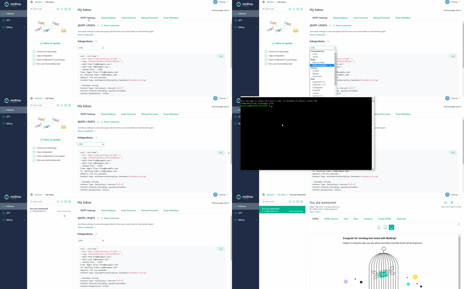
Back in 2020, we worked on onboarding emails. For one of the templates, we chose to include a GIF explaining how to send an email to a Mailtrap inbox via cURL.
The thing is, none of our designers was available to help us out at that time. So our marketing team recorded a screencast and then went on to process it into a GIF using some of the online tools we mentioned above. We needed the image to be sharp so the viewer could understand what was going on on the screen and be capable of reproducing it themselves.
GIF format doesn’t come with any encoding or compression available out of the box. Because of that, a brief, high-quality screen recording straight away weighed close to 5 megabytes – way too much for an email.
We tried to compress it a bit – lowered the resolution, shrank the screen size a bit, cut a few precious milliseconds. The file size dropped, but so did the quality.
The result below is the final 700KB effect of our efforts. It’s not terrible, some would say, but we didn’t feel comfortable putting it in emails landing in thousands of inboxes every day.

Eventually, we paused the GIF experiment and ended up creating high-quality SVG screenshots for this iteration. We still intend to go back to the topic later on when we can allocate a designer to the job.
This is what it basically comes down to. GIFs aren’t a bad approach for tutorial emails. But if you care about the quality, you need a designer, Photoshop, and plenty of patience to experiment with a GIF. The quality doesn’t matter much when you’re inserting a funny cat into an email, but it makes all the difference when you’re trying to explain something.
Here are some tips for designing your tutorial GIFs:
- Keep the video size down to 5-10 seconds. The shorter, the better.
- Speed up the video to cut the loading time or long cursor moves across the screen. Cut those frames when possible.
- Zoom your recording on a particular piece of an interface that you’re explaining, rather than displaying the entire dashboard. You want to make sure the copy is readable, also on mobile.
- Include headlines explaining what’s happening on screen. A brief click on a button may be too quick for the viewer to grasp what’s going on.
When producing and optimizing, also keep in mind the tips we mentioned in the ‘GIF Size’ and ‘Accessibility’ chapters.
If you don’t have that at your disposal, think about the alternatives we’re going to talk about next.
Alternatives for GIFs in emails
The first alternative are HTML5 videos. The animations are sharp and detailed. Because of the excellent compression capacity, the files are light and ready to use in emails right away.
Unfortunately though, HTML5 is not (yet) as widely supported in emails as GIF. In general, it works in Apple-developed browsers (both on desktop and mobile) and a few minor players on the market. In total, slightly over 50% of the market supports HTML5.
HTML5 doesn’t work in Gmail, Outlook, Hotmail, and others. The technology allows you to set a fallback image that will render instead in unsupported clients.
Another alternative to GIFs in emails are APNGs – or animated PNGs. They work in a similar fashion to GIFs – a set of PNGs is put together and animated.
APNGs offer a much wider range of colors (24-bits to be specific), giving the animations a more pleasant look. They also provide support for transparency and a superior compression to GIFs.
APNG also has better support than HTML5. It’s accepted in Apple Mail, on iOS, in most Outlook clients (aside from Windows clients), Yahoo!, Samsung Mail, and others. At the time of writing, aside from that one version of Outlook, APNG didn’t work in Gmail either – those two will display the first frame of the video instead.
Finally, animations inside emails made with CSS are also an option. You can apply various CSS properties on HTML elements as well as images to animate them. It’s an excellent solution for simple videos with a limited number of frames and effects. For more complex setups, try one of the methods above.
The support for CSS elements varies across email clients.
Wrapping up
As you can see, none of the formats we mentioned is perfect. Ultimately, it all depends on your requirements and the time you’re willing to spend on testing various options.
The market is dynamic and the use of videos will keep growing. While we don’t anticipate any changes to GIF format, the support for alternatives is likely to grow. Perhaps new options will also appear on the market. Who knows?
Thanks for reading.


