Skip to Navigation

Measuring the true performance of email campaigns is harder than it looks. Data often lives in separate platforms, reports take hours to compile, and by the time insights are ready, the moment to act has already passed. On top of that, different teams look at different metrics, making it difficult to align around a single version of the truth.
Email marketing dashboards solve these problems by consolidating data into one place, providing real-time visibility, and turning scattered numbers into actionable insights.
In this article, we are going to share 9 of the best dashboards to help you track email campaign performance. Most of these are custom Coupler.io dashboards that consolidate various data and give you an enhanced view of the metrics.
Let’s get right into it!
9 best email marketing dashboard examples
1. Mailchimp analytics dashboard
If you use Mailchimp for your email campaigns, the Coupler.io dashboard will give you a consolidated view of your email marketing performance. Instead of switching between different Mailchimp reports, you get all your key metrics in one place. This makes it easier to understand your audience, track engagement trends, and optimize email campaign strategy. It’s your go-to tool for turning raw email data into clear, actionable insights.
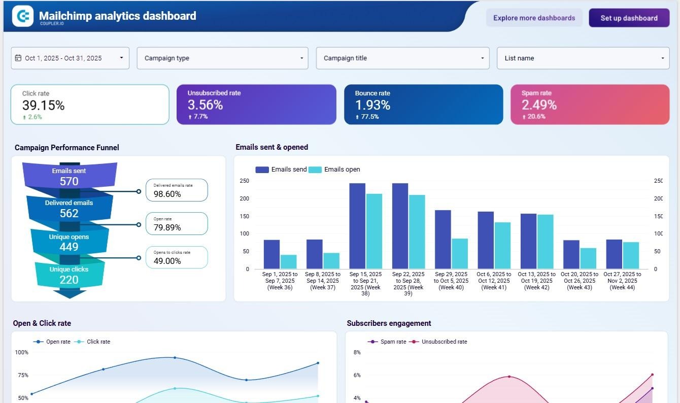
Insights provided
- Email funnel performance
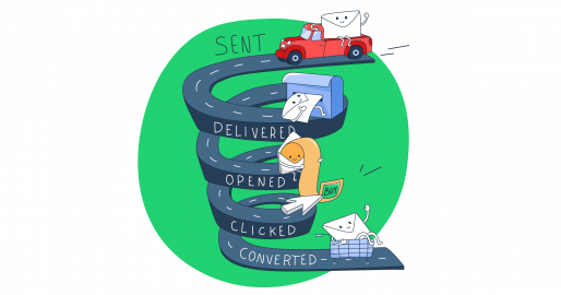
Track the full journey from emails sent → delivered → opened → clicked → converted. Spot where campaigns lose momentum and fix issues like weak subject lines, poor CTAs, or low-quality targeting. - Engagement and reputation health
Monitor unsubscribes, bounces, and spam reports in real time. Detect spikes that could signal problems with content, frequency, or list hygiene. - High-performing campaigns
Identify which campaigns delivered the best open and click rates, or generated the most revenue. - Send time optimization
See engagement patterns by day and week to understand when your audience is most responsive. Use this data to schedule sends during high-engagement windows and avoid low-performing slots. - Subscriber source quality
Evaluate which subscriber acquisition channels deliver the most engaged users and revenue. Focus your budget and time on the sources that bring in the best results. - Audience demographics & devices
Break down performance by location, device, and email client.
How to use
This email campaign dashboard is available in Looker Studio, powered by the Coupler.io Mailchimp connector. Setup takes just a few minutes, and you can customize it to match your brand’s reporting needs. With automated data refreshes, you’ll always have the latest engagement and revenue insights.
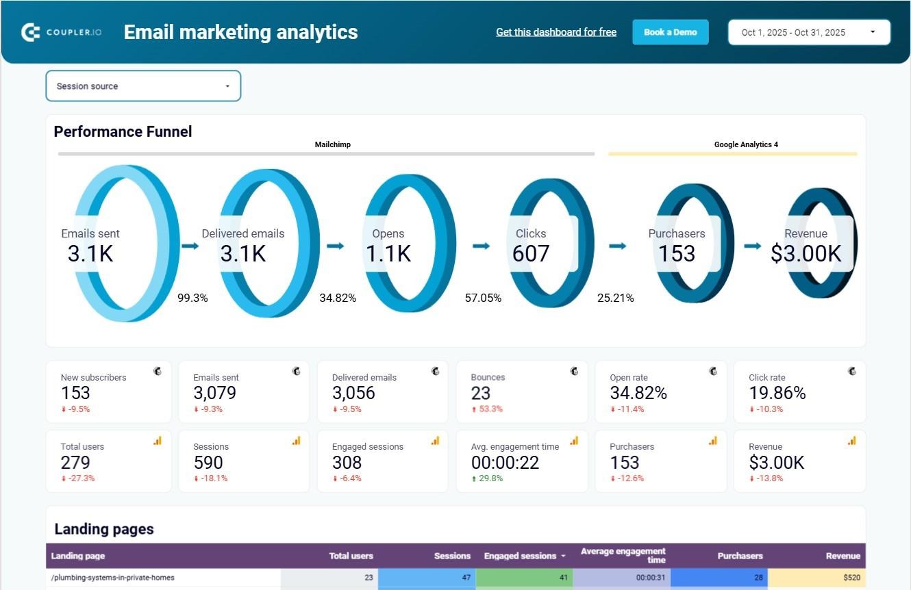
2. Email marketing dashboard for Mailchimp + Google Analytics 4
This Coupler.io-powered Mailchimp dashboard is designed to give you a full-funnel view of performance. It doesn’t just show opens and clicks; it also combines email data with Google Analytics 4, so you can connect engagement metrics directly to traffic and revenue outcomes. Instead of using multiple reports, you get one dashboard that ties campaign activity to business impact.
Insights provided
- Email performance funnel + overview
Visualize the entire funnel: sent → delivered → opened → clicked → purchases made → revenue generated. This makes it easy to spot where users are dropping off. - Performance overview
Scorecards display key campaign metrics from both Mailchimp and GA4, clearly labeled so you know which platform each number comes from. - Landing page performance
Identify your best- and worst-performing landing pages by traffic, engagement, purchases, and revenue. - Campaign traffic performance
See how much traffic and revenue each campaign drives, with breakdowns of acquired users and engagement levels. - Campaign engagement performance
Dig into engagement metrics (opens, clicks, unsubscribes) to evaluate which campaigns resonate most with your audience.
How to use
This email performance dashboard is available as a Looker Studio template and powered by the Coupler.io connector for Mailchimp & GA4 data. For teams that also track web conversions, connecting GA4 ensures your dashboard links email engagement directly to revenue.
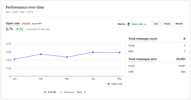
3. Mailchimp’s native email report dashboard
Mailchimp provides a built-in analytics dashboard that gives marketers a clear view of how their email campaigns are performing. It’s available inside Mailchimp’s platform, making it ideal for teams that want a straightforward way to monitor engagement and campaign health.
Insights provided
- Performance overview
Track essential campaign metrics such as total emails sent, open rate, click rate, and unsubscribe rate. This provides a quick health check for each campaign. - Performance over time
Visualize engagement trends across days, weeks, or months. - Conversion funnel
Follow the journey from deliveries → opens → clicks → orders. This helps you connect campaign engagement to actual sales and identify where users drop off in the funnel. - Conversions tracking
See attributed revenue per recipient and monitor how different emails contribute to conversions. Use this to evaluate campaign ROI and optimize for higher returns. - Delivery details
Monitor deliverability with metrics like bounces, unsubscribes, and abuse report rates.
How to use
This dashboard is available natively inside Mailchimp’s Analytics section and requires no extra setup. You can filter results by campaign, date range, or message type for more granular reporting.
4. Klaviyo analytics dashboard
Running campaigns in Klaviyo gives you powerful targeting and automation, but understanding the results often requires digging through multiple reports. The Klaviyo analytics dashboard, enhanced by Coupler.io, brings everything together in one place, open rates, clicks, unsubscribes, bounce rates, and more, so you can see at a glance what’s working and what isn’t.
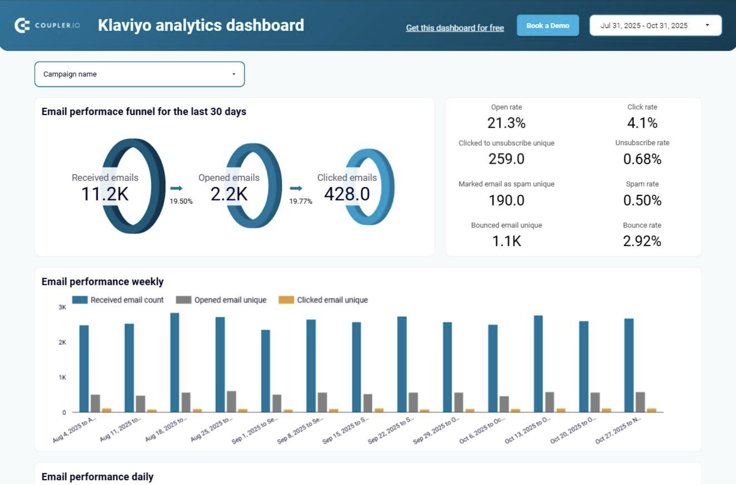
Insights provided
- Email funnel performance
See the full funnel from delivered emails to opens and clicks. - Weekly & daily performance trends
Analyze when your audience is most engaged. - Email client & domain engagement
Understand how subscribers interact across email clients (e.g., Gmail vs Apple Mail) and domains. - Best send times by day
Use daily open and click data to identify your audience’s most active days. - Unsubscribe trends
Track unsubscribes to identify which email types or frequencies are driving people away. - Geographic targeting
See where your subscribers are located and build campaigns tailored to those regions. - Top-performing links
Find out which links in your emails generate the most clicks.
How to use
This email marketing dashboard template is designed for Looker Studio and equipped with the Coupler.io connector. Setup is quick and requires no coding.
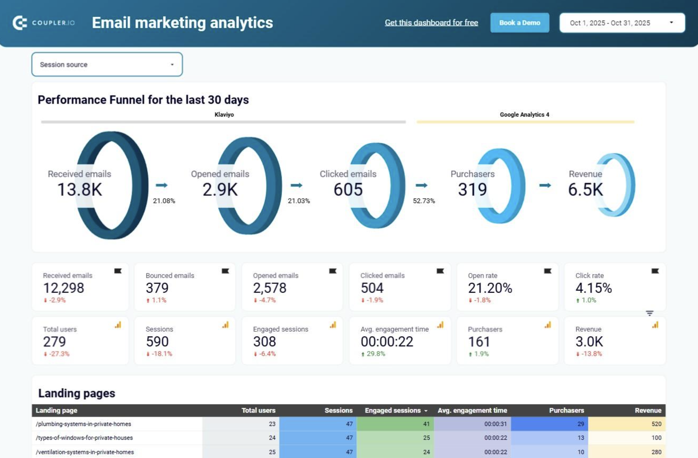
5. Email marketing dashboard for Klaviyo + Google Analytics 4
Again, this Coupler.io-powered Klaviyo analytics dashboard takes reporting one step further by combining Klaviyo data with GA4 marketing insights. The result is a comprehensive view of how your email campaigns perform, not only in terms of opens and clicks but also traffic, purchases, and revenue.
Insights provided
- Email performance funnel + overview
Get a visual funnel of the last 30 days. - Performance overview
Scorecards show key campaign metrics. - Landing page performance
See which landing pages drive the most traffic, engagement, purchases, and revenue. - Email campaign traffic performance
Analyze how many users each campaign acquired, how engaged they were, and how many converted into paying customers. - Email campaign engagement performance
Assess campaign-level engagement using Klaviyo’s data on opens, clicks, unsubscribes, and other user actions.
- Top 5 subject lines
A dedicated chart highlights your highest-performing subject lines. By analyzing the keywords and tone that drive opens and clicks, you can refine your subject line strategy for better future results.
How to use
This email marketing metrics dashboard in Looker Studio collects data from Klaviyo and GA4 using the built-in Coupler.io connector. Once connected, the data refreshes automatically, keeping your reports up to date without manual work.
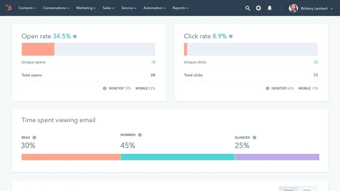
6. HubSpot email marketing dashboard
HubSpot’s native email marketing dashboard provides a built-in view of campaign performance, making it easy for marketers to monitor engagement, delivery, and revenue-related metrics without needing external tools. Since it’s part of the HubSpot ecosystem, the dashboard integrates seamlessly with your CRM, giving you deeper insights into how email campaigns influence leads and customers.
Insights provided
- Recipient engagement overview
Track opens, clicks, click-through rate (CTR), and reply rate across all campaigns. This view makes it simple to see whether your emails are grabbing attention and driving meaningful interactions. - Delivery health
Monitor delivery rate, bounce rate, unsubscribes, and spam reports. - Performance by device type
Understand how subscribers engage with your emails across desktop, mobile, and other devices. - Performance over time
Analyze engagement trends with weekly charts of open rates and click-through rates. Spotting peaks and drops over time helps you measure the impact of different campaigns and optimize scheduling.
How to use
This email campaign analytics dashboard is available natively inside HubSpot’s Marketing Hub, with no setup required. You can filter reports by campaign, date range, or list segment, making it easy to drill down into specific performance metrics.
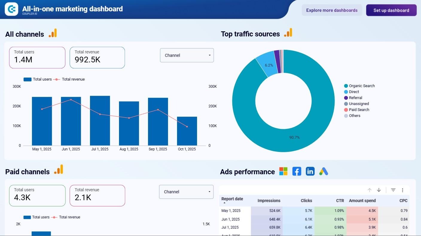
7. All-in-one email marketing dashboard
If you’re managing campaigns across multiple platforms (ads, search, social, email, and video), keeping track of performance can quickly become overwhelming. The All-in-one marketing dashboard consolidates data from Google Analytics, Google Search Console, advertising platforms, social media apps, YouTube, and email tools like Mailchimp and Klaviyo into a single interface. With this email marketing campaign dashboard, you get a unified view of marketing performance across all channels so you won’t have to move from one report to another.
Insights provided
- All channels’ performance overview
See how each channel contributes to your overall traffic and revenue. A pie chart shows the distribution, so you can instantly compare performance between ads, search, social, email, and video. - Email performance overview
Monitor Klaviyo and Mailchimp campaigns in the same dashboard. See emails delivered, open rates, clicks, bounces, and unsubscribes side by side with your other channels. - Paid channels performance
Track PPC results with impressions, clicks, CTR, cost per click, and spend. The monthly breakdown helps you compare performance across platforms like Google Ads, Meta Ads, or LinkedIn Ads. - Organic search performance
Analyze impressions, clicks, CTR, and average position with data pulled directly from Google Search Console. - Social media performance
Measure impressions and page views across social channels, with the option to filter results by platform to see what’s driving the most engagement. - YouTube performance
Track video success with views, watch time, and engagement metrics, showing how video contributes to your wider marketing strategy.
How to use:
This dashboard for email marketing reporting is available in Looker Studio, powered by Coupler.io’s pre-built connectors. With automated refreshes, your cross-channel data stays up to date in real time.
8. Mailchimp email campaign performance dashboard for Shopify store
If you run a Shopify store and use Mailchimp for email campaigns, this dashboard bridges the gap between email engagement and revenue generation. Combining Mailchimp and Shopify data helps you see how emails influence customer acquisition, retention, and product sales. Instead of managing email, e-commerce, and AI-based dropshipping independently, you get a single, data-driven view of how campaigns impact your bottom line.
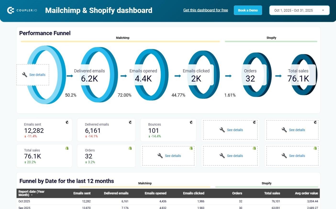
Insights provided
- Email funnel performance
Track the journey from emails sent → delivered → opened → clicked → orders → revenue. - Quick overview of campaign metrics
View key stats at a glance — emails sent, delivered, bounces, open rate, click rate, revenue, orders, AOV, new vs. total customers. - Daily performance trends
Monitor how email engagement and revenue fluctuate day by day. - Top-selling products
Identify which products generate the most revenue from your campaigns. Focus promotions on top sellers, restock popular items faster, or bundle related products to boost revenue. - Detailed product performance
Drill down into all products sold, including revenue and quantity. - Comparative metric patterns
- Clicks vs. Revenue → Are email clicks converting into sales?
- Orders vs. Average Order Value → Are customers buying more items or just spending less?
- Open Rate vs. Click Rate → Are your emails compelling enough beyond the subject line?
- New Customers vs. Total Customers → Are you acquiring new buyers or mostly retaining old ones?
- Email deliverability health
Compare emails sent vs. delivered to uncover deliverability issues. A high bounce or undelivered rate signals the need for list cleaning or sender reputation management. - Long-term campaign trends
Review 12 months of Mailchimp campaign performance.
How to use
This dashboard is available in Looker Studio and powered by Coupler.io’s Mailchimp + Shopify connectors.
9. Klaviyo email campaign performance dashboard for Shopify store
The Klaviyo & Shopify performance dashboard combines email marketing metrics from Klaviyo with revenue and product data from Shopify. With this single view, you can see how emails drive purchases, understand customer behavior, and identify which products and campaigns contribute most to growth.
Insights provided
- Email-to-revenue funnel (30 days)
Follow the journey from emails sent → opened → clicked → purchased. - Campaign & sales metrics overview
Track core KPIs such as revenue, orders, average order amount, total customers, and new customers. - Monthly performance analysis
Compare engagement and revenue trends across weeks and months. - Top-selling products from emails
See which products generate the most revenue through email-driven sales. - Detailed product performance
Review all products sold, with metrics on revenue and quantity. Identify underperformers and adjust pricing, messaging, or discounts to improve sales outcomes. - Long-term campaign evaluation
Assess campaign health with open rates, CTR, bounces, and spam reports. Identify seasonal dips or recurring weaknesses and refine your long-term strategy to ensure consistent performance.
How to use
This dashboard is built in Looker Studio and powered by Coupler.io’s Klaviyo + Shopify connectors.
Now that we’ve covered some of the best email marketing dashboards, let’s take a look at the challenges faced by marketers and how these dashboards can solve them.
Benefits of using email marketing dashboards
Tracking email campaign performance sounds simple until you actually try to piece the numbers together. However, with email marketing dashboards, you can solve these challenges and take advantage of the following benefits:
Consolidated data in one place
Open rates in Mailchimp, revenue in Shopify, engagement in HubSpot… you end up jumping between tabs and exporting CSVs just to understand how a campaign performed. Instead of juggling tabs and CSVs, a dashboard brings everything together. You get a single, unified view of performance across platforms, saving time and reducing errors.
Save hours with automated reporting
Pulling reports from multiple tools, cleaning them up in spreadsheets, and updating charts eats hours every week. A 2023 Funnel survey found that 63% of data-related time is spent on tasks that could be automated, including populating reports and dashboards.
Also, Campaign Magazine highlighted that over 88% of marketers say they dedicate most of their work time to reporting tasks.
With a dashboard, that work happens automatically. This means you have more time to focus on strategy and creative tasks.
Faster insights for real-time optimization
Waiting until a report is ready often means the campaign is already over. A dashboard gives you real-time visibility, so you can spot underperforming campaigns while they’re still running and make adjustments on the fly. That means less wasted budget and better results.
Alignment across teams and leadership
Marketers track clicks, leadership wants ROI, and sales may care about conversions. Without a single source of truth, conversations can get messy. Dashboards provide clarity for all stakeholders by presenting KPIs that matter at every level, from open rates and CTR to revenue per subscriber. This makes collaboration smoother and reporting more impactful.
A dashboard consolidates all your campaign data into one place, giving you:
- A real-time view of performance across every channel and platform.
- Faster decision-making, since you don’t have to wait for manual reports.
- Clarity on key KPIs: from open rates and CTR to revenue per subscriber.
- A single source of truth for marketers, sales, and executives alike.
Instead of chasing scattered reports, you get a single, automated view of your email performance that helps you react quickly and optimize smarter.
Key email marketing dashboard KPIs to track
Regardless of the platform or template you choose, the value of an email dashboard comes down to the KPIs you track. Here are the essential metrics every email marketing dashboard should include:
| KPI | What it measures | How to calculate | Why it matters |
| Open rate | Percentage of recipients who opened your email. | (Emails opened ÷ Emails delivered) × 100 | Strong indicator of subject line effectiveness and audience interest. |
| Click-through rate (CTR) | Share of recipients who clicked on links within the email. | (Unique clicks ÷ Emails delivered) × 100 | Shows how compelling your content and CTAs are. |
| Conversion rate | Percentage of recipients who completed a desired action (purchase, sign-up, download). | (Conversions ÷ Emails delivered) × 100 | Directly measures campaign impact on business goals. |
| Bounce rate | Percentage of emails that couldn’t be delivered. | (Bounced emails ÷ Emails sent) × 100 | High bounce rates signal list quality issues or deliverability problems. |
| Unsubscribe rate | Percentage of recipients who opted out after receiving a campaign. | (Unsubscribes ÷ Emails delivered) × 100 | Spikes indicate problems with content relevance, frequency, or targeting. |
| Revenue per email / per subscriber | How much revenue each email or subscriber generates. | Revenue ÷ Emails sent (or ÷ Active subscribers) | Connects engagement metrics to bottom-line results. |
| Campaign ROI | Return on investment for an email campaign. | (Revenue – Campaign cost) ÷ Campaign cost × 100 | The ultimate measure of campaign profitability. |
By monitoring these KPIs consistently, marketers can move beyond vanity metrics and measure what truly matters: how email drives revenue and long-term customer growth.
Wrapping up
Email dashboards take the guesswork out of tracking your campaigns. Instead of juggling reports from different tools, you get all your insights in one clear view. They help you understand what’s working, improve what’s not, and make smarter decisions faster. In the end, a good dashboard turns data into direction and helps your email strategy grow.