In the rapidly evolving world of digital marketing, following the latest and current trends can give your campaigns a much-needed edge. This is especially true for email marketing.
The average person is bombarded with hundreds of emails daily, so to stand out from the email clutter and capture your target audience’s attention, you need to visually present your message.
On top of that, you should also adapt your email marketing strategy to the changing times.
In this article, you can learn from top marketing teams at notable companies as we explore 2024 email design trends through email design examples.
Trend 1: Gamification in emails
Gamification, a strategy of integrating game elements into traditionally non-game contexts, is revolutionizing email marketing. Emails are no longer just about information; they’re about creating immersive experiences. A progress bar nudging a customer towards their next reward or a mini-game built into the email itself can drastically improve engagement.
Gamified emails encourage recipients to interact more with your emails, which can lead to increased time spent reading and a better understanding of your content.
Here are some things to keep in mind when using gamification in emails:
- A catchy subject line or email header promising a fun game or a chance to earn points can significantly increase your open rates
- Keep the game mechanics simple and provide clear instructions to encourage participation
- Personalize the experience by tailoring challenges and rewards based on user preferences
- Couple your gamification with a call-to-action (CTA) so it’s clear what action you’re expecting your subscribers to take
Incorporating gamification into emails can be easy. Start by outlining your goals – be it boosting open rates or promoting purchases. Then, choose game elements that make sense in an email context – simple and interactive components like progress bars, quizzes, or puzzles work well. With a quiz builder, you can create interactive quizzes with ease. Remember, user experience is paramount, so ensure your gamified elements are intuitive and do not overshadow your email’s primary message.
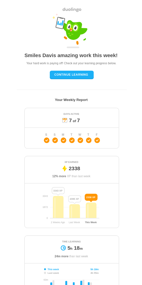
Language learning app Duolingo sends out gamified emails, which include mini-quizzes and progress reports to keep users engaged and encourage regular app use.
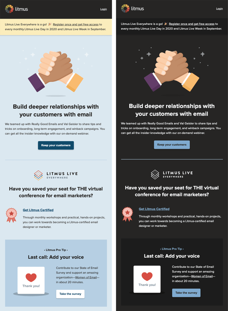
Trend 2: Dynamic content and interactive elements
Interactive elements, dynamic content, and the above-mentioned gamification are strategies that can be used to engage users in digital environments. Still, they serve different purposes and can be used in different contexts.
Interactive elements like quizzes, polls, or sliders can significantly boost user engagement as they offer a fun, engaging way for subscribers to “play” your content.
Dynamic content in email templates, on the other hand, allows you to customize emails based on subscriber data, delivering a highly personalized experience. By using information such as a subscriber’s location, past purchases, or browsing history, you can tailor your email content to better resonate with them. Incorporating AI marketing tools can further enhance this personalization, making your campaigns even more effective.
Related to the strategies above are real-time content updates, which are a powerful tool for creating a sense of urgency and excitement. These can be countdown timers for sales or events, inventory updates, or live tracking information that can keep your subscribers engaged and prompt them to take action.
Trend 3: Dark mode compatibility
Dark mode, known for its eye-friendly, battery-saving attributes, has become increasingly popular in everything from social media to email marketing. As more email clients (Gmail, Outlook, Apple Mail, Yahoo, etc.) and devices offer dark mode, it’s essential to ensure your emails look great irrespective of the user’s choice.
But, email design for dark mode goes beyond merely inverting colors. Instead, it requires a careful selection of colors, images, and text that are legible and aesthetically pleasing in both light and dark modes.
The exact implementation may vary based on your email service provider and the specific design of your emails, but here are some general strategies you can use to ensure dark mode compatibility:
- Use transparent backgrounds: Wherever possible, use transparent backgrounds for your images or remove background elements that may not blend well.. This ensures that the image will blend seamlessly with the background color, regardless of whether the user is using light or dark mode.
- Use high-contrast colors: Ensure that your text and design elements have enough contrast against the background to increase readability and remain legible in both light and dark modes.
- Avoid pure black or white: In dark mode, pure white can be glaring, while pure black in light mode might blend with the text color. Aim for softer, off-black, and off-white shades for better visual comfort.
- Invert colors for dark mode: If your email design permits, consider inverting your colors for dark mode. This means using light text on a dark background.
Remember, not all email clients support dark mode or media queries, so it’s important to design your emails in a way that makes them look great in all viewing scenarios. The goal is to provide a comfortable reading experience, regardless if your subscriber is in a brightly lit room or checking their email in the middle of the night.
Trend 4: Accessibility and inclusivity
In the pursuit of innovative designs, minimalistic or somewhat flashy, accessibility can often take a backseat. However, designing emails that are accessible to diverse audiences isn’t just an ethical move; it’s a strategic one, helping you reach a broader audience and fostering inclusivity.
A well-structured email, with legible fonts, clear color contrasts, clever use of white space, and a logical hierarchy, can significantly improve user experience. So, use larger font sizes, opt for fonts that are easily readable, and ensure sufficient color contrast for visibility.
Also, do remember that alt text for images and semantic HTML email aspects are crucial for screen readers used by visually impaired email users. Including these not only makes your emails accessible but also improves their performance in instances where images are blocked or slow to load.
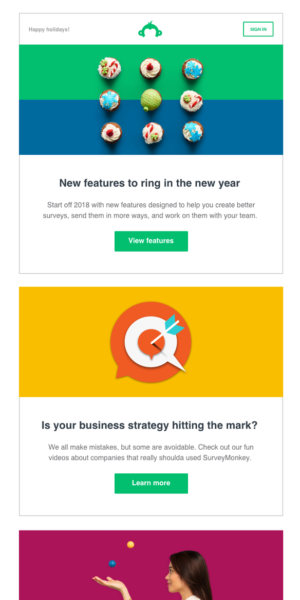
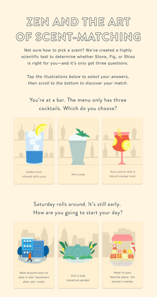
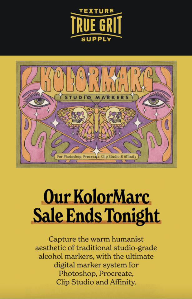
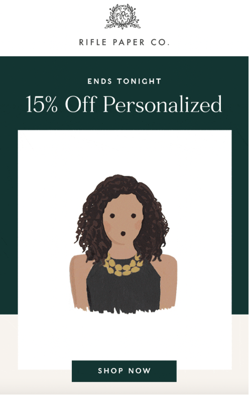
Trend 5: Monochromatic and duotone color schemes
Monochromatic, duotone, or bold color palettes can deliver eye-catching visuals. The simplicity of a single color or the contrast of two colors can make your email stand out in an inbox, grabbing your subscribers’ attention.
Different shades and tints of a single color can create a cohesive, harmonious design. This monochromatic approach can also be soothing to the eye and help draw attention to the email’s content.
With their stark contrast, duotone color schemes can create visually engaging emails. And carefully chosen duotone schemes can guide the reader’s eye and highlight key aspects of your message.
My advice? Use pastels like in the example below!
Trend 6: Cinemagraphs in email
Cinemagraphs, or subtle, looping animations, can bring your emails to life. They add visual interest and a touch of sophistication without distracting from your primary message.
A cinemagraph can enhance your email design, making it more engaging and dynamic. However, balancing motion with static elements is important to avoid overwhelming your subscribers.
Here are some ways you can effectively use cinemagraphs in your emails:
- Highlight a product: Use a cinemagraph to draw attention to a specific product or feature. For example, a gently swirling cup of coffee to promote a new cafe.
- Set a mood: Use a cinemagraph to create a certain atmosphere or mood. A flickering candle, for instance, can evoke a sense of coziness.
- Demonstrate a process: Show your product in action. If you sell cooking utensils through your e-commerce store, a cinemagraph of a whisk stirring batter could be engaging.
- Enhance a CTA button: A subtle animation around your call-to-action button can make it stand out and increase click-through rates.
- Send seasonal greetings: For holiday-themed emails, cinemagraphs like twinkling lights or falling snow can add a festive touch.
Remember, while cinemagraphs can be visually captivating, they should not distract from your main message. So, keep them subtle, and always provide alt text for those who can’t view the animations.
Also, when using cinemagraphs, it’s crucial to optimize them for email. Ensure they are compatible with various email clients and devices, and compress them to ensure fast loading times.
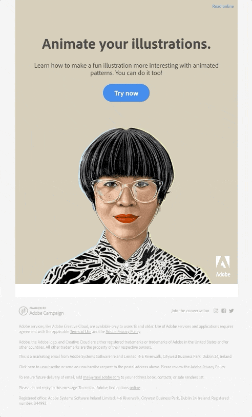
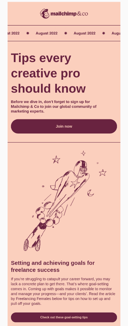
Trend 7: Visual storytelling with illustrations and animations
Custom illustrations can help create a unique brand identity. They can convey your brand’s personality, making your emails more engaging and memorable.
Subtle animations, like GIFs or CSS animations, can add a layer of interactivity to your emails and make your emails more enjoyable to read, increasing user engagement.
A cool approach is to use a series of illustrations, animations, or even AI generated photos to tell a story across multiple emails or within a single email. Each image can represent a different part of the story, leading your subscribers through the narrative.
You can also experiment with an AI animation generator to quickly create unique, eye-catching animations for your emails, enhancing visual storytelling without heavy design work.
For instance, you can show the journey of your product from creation to delivery through illustrations and animations. Using tools like Venngage’s timeline templates can help you design clear and engaging visual timelines that enhance your storytelling.
Leveraging the AI video generators can also simplify this process, producing high-quality visuals that captivate your audience. This can create a more personal connection between your subscribers and your product.
But do keep in mind that while visual storytelling is powerful, balancing it with text content is crucial, as too many visual elements can overwhelm your subscribers and distract from your primary message.
Trend 8: Augmented reality (AR) experiences
Augmented Reality (AR) offers exciting possibilities for email marketing. By integrating AR design elements into your emails, you can create a highly immersive and interactive experience.
AR can be used for virtual product try-ons or interactive demonstrations, encouraging user email engagement and potentially driving conversions.
Here are some key ways it can be leveraged:
- Personalization: AI can analyze data from each subscriber’s behavior, such as browsing patterns and purchase history, to deliver highly personalized content and recommendations.
- Optimized send times: AI can determine the best time to send emails to each subscriber based on when they’re most likely to open and engage with them, thus increasing open rates.
- Predictive analysis: By analyzing historical data, AI can predict future behavior, such as when a subscriber is likely to make a purchase and tailor emails accordingly.
- A/B testing: AI can automate the A/B testing process, quickly determining the best-performing options and implementing them in real-time. Using a UX design tool in tandem with AI can further enhance the process by offering data-driven design suggestions to improve user experience.
AR can help create a unique and memorable brand interaction, setting you apart from the competition by offering an innovative way to showcase products and engage with your subscribers.
Trend 9: Nostalgic design elements
Nostalgic design elements can trigger positive memories, strengthening the emotional connection your brand establishes with a subscriber. On top of that, retro-inspired typography, bright color palettes, or imagery can lend a timeless charm to your emails.
But, it should be noted that although nostalgia can be powerful, blending it with modern email marketing best practices and email marketing trends is important. So, ensure your nostalgic designs are still clean, legible, and mobile-friendly to provide a seamless user experience.
Trend 10: Mixed media collages
Combining photos, illustrations, and textures into mixed media collages can create a visually engaging and eclectic graphic design; for it you may use such tools as Kittl, Canva, and others. This approach can also break the monotony of conventional designs, keeping your subscribers intrigued and serve as a powerful tool for brand identity.
Mixed media collages allow for an immense creative expression, helping you create designs that are unmistakably “you”.
Here are some best practices for this approach to keep in mind:
- Balanced: While the charm of mixed media collages lies in their eclectic mix of elements, it’s important to maintain balance. Overloading your email with too many different elements can be overwhelming and distract from your main message.
- Consistent theme: Ensure the different elements in your collage align with a consistent theme or narrative. This can be a color, a specific subject matter, or a particular style.
- Clear hierarchy: Despite the mix of elements, your email should still have a clear visual hierarchy. Also, make sure your main message or call-to-action stands out.
- Alignment with brand identity: The elements you choose should align with your brand’s overall identity and message. Avoid elements that might confuse or mislead your subscribers about your brand or offer.
Remember, the aim of using mixed media collages is to enhance your message and engage your audience visually, so always keep your audience and their preferences in mind while designing your emails. If you fail to do so, they might be tempted to unsubscribe.
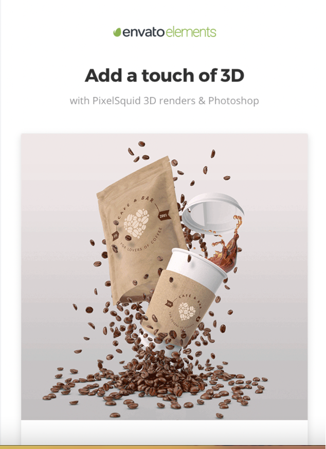
Trend 11: Isometric and 3D design elements
Isometric or 3D graphics can add depth and dimension to your email designs, making them more visually captivating. They can make your emails stand out in the inbox, attracting more clicks.
3D animations or illustrations can provide a rich, immersive visual experience. And when combined with interactivity, they can drastically enhance user engagement.
Parallax scrolling effects, where background and foreground elements move at different speeds, can create a layered, dynamic design. This can add a touch of sophistication and interactivity to your emails.
Trend 12: Hand-drawn and organic elements
Incorporating hand-drawn elements can make your email designs feel more personal and authentic. This approach subtly communicates that there are real people behind your brand, which can help build trust and foster stronger relationships with your audience.
Whether it’s a sketched icon, a handwritten font, or a doodled border, these elements can add a unique, artistic touch to your marketing emails that sets them apart from the competition’s.
Likewise, organic, imperfect shapes can significantly enhance your email aesthetics. In stark contrast to the rigid, geometric shapes commonly used in digital designs, organic shapes are free-flowing and less structured, which can evoke feelings of creativity, spontaneity, and warmth.
These hand-drawn and organic elements can be particularly effective when used consistently across your emails, contributing to a unique visual identity that your subscribers can instantly recognize. You can even pair them with storytelling techniques to create a more immersive, engaging email experience.
Trend 13: Neumorphism and glassmorphism
Neumorphism and glassmorphism can make your emails feel sleek and cutting-edge, resonating with audiences who appreciate contemporary aesthetics. However, when using these designs, ensure your content remains legible and accessible.
Neumorphism, or “new skeuomorphism”, is a design trend that combines elements from flat design and old-school skeuomorphism. It creates an effect that resembles digital embossing or debossing, where the design elements look like they’re extruded from the background, creating a 3D effect that appears soft and lifelike.
The main characteristic of neumorphism is the use of subtle shadows and highlights to create “soft” objects that look like they’re part of the background, almost as if they’ve been carved out of the same material. This is typically achieved using a color palette leaning more towards minimalism and carefully applied light and dark shadows.
Glassmorphism is another design trend that’s characterized by the use of transparency, background blur, and vivid colors to create a “frosted glass” effect. This effect creates a sense of depth, making UI elements appear as if they’re floating over the background while still allowing it to peek through.
Glassmorphism often uses a semi-transparent “glass” layer, with a subtle light border, a multi-layered approach with objects appearing behind each other, and vibrant colors to create contrast.
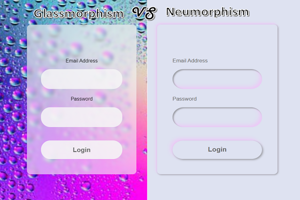
Both neumorphism and glassmorphism aim to add depth and a sense of realism to UI designs, but each creates a different aesthetic and mood. And while these styles can be visually appealing, it’s crucial to consider accessibility and legibility in your designs, ensuring that your content is always easy to understand and interact with.
What’s next?
So you’ve read the article, found a trend that you like, and are wondering what the next step is. We’ve got you covered here as well!
The tasks that are ahead of you right now include:
- studying the trend and its email design examples even further
- adapting it to your brand
- designing an email/email template based on the adapted trend
- doing some testing
- and finally, sending off your email(s)
If you’re an email marketer who is diligent about following all recommended email marketing best practices, you’ll also want to add monitoring performance results, refining, as well as iterating the process to your to-do list. This way, you can make any necessary adjustments to your email design and thus enhance the effectiveness of your email campaign!