The registered users of your app might not even know about its coolest features. This is one of the reasons why they stop using your product or don’t transition from the free plan. When the competition among online tools is so high, it may be not enough to solve customer pains. You also need to provide additional value and make your users aware of it! Proper onboarding helps solve such issues, as well increase user engagement, decrease churn, and grow profits.
Onboarding can be implemented in a few ways: an in-app tutorial, direct messages via email, or other channels preferred by your users. In this article, we are focusing on the onboarding email sequence.
This post is a guide for both product marketing and development teams, aimed at setting appropriate email campaigns. However, there is a lot to explain about the user onboarding process. This is why we have decided to divide it into two sections: background and practice.
If you need to review several templates, or get some ideas and rules for email content, you can skip the first part and move right to the practical recommendations. If you wish to get a better understanding of the onboarding process, comprehend your users’ motives to define what, when, and why you should (or should not) send, then welcome to the full version of the article.
What is onboarding and how does it work?
The idea of onboarding (and term) comes from human resources, where onboarding is defined as psychological and professional integration of new employees into the company culture and operations as part of its human capital management.
User onboarding is a similar process aimed at creating an exceptional user experience for your new members. As a result, they should be aware of:
- Your app functionality: all capabilities and features, as well as how to find and activate them.
- Your app use cases: how they can use it and which problems they can solve.
- Their benefits: how their life gets better with your app and what bonuses they get by using it.
Onboarding emails is a common term for a sequence of messages aimed at introducing your app and its benefits to the users. From a business perspective, the main task is to convert new users to paying customers. But don’t forget that educating your users is an important mission, as well. Even free users can become your brand ambassadors if they are happy with your product.
When someone creates a new account on your app they expect it to solve their problems without creating new ones. When you install a new video game, you are offered a tutorial first to inspect main features and settings. Users should feel relieved and entertained without stressing over complicated UI or hidden settings.
This is how onboarding actually works.
If you want to offer a seamless user onboarding process, you should consider specific user onboarding software that is easy-to-use and drives product adoption. UserGuiding is one of the first user onboarding tools that comes to mind if you are looking for an affordable solution. User onboarding tools allow users to create Interactive Product Tours, User Guides, Onboarding Checklists, Feature Highlights, NPS Surveys, In-App Messages and Resource Centers.
When do you need to use onboarding emails?
Marketers study their customers, trying to understand their needs and intended purchases, but we won’t dive deep into marketing funnels and different methodologies that define the customer journey here. Let’s just quickly review several common terms and practices that can help build better email campaigns.
Onboarding works around the “Aha!” moment. This term is extremely popular now in product marketing. It means the wow effect your users experience with your product. For example, “Wooow! I can finally check email addresses in Bcc for my test emails!” or “I can finally attach files to my project cards and send them in email notifications right away!” These are the reasons why they decide to try using your app and then…switch to a paid plan.
One of the onboarding goals is to get your users to these “Aha!” moments.
That’s all great to keep in mind when you are planning the launch of your product with a marketing team, but what if your app has been released some time ago and you already have happy customers? When do you need to take care of setting up an onboarding email strategy?
The onboarding email sequence can help to solve the following problems:
- Users log in and never come back.
- Users leave your app after the free trial has ended.
- Your customers don’t use your special features.
- You get too many support requests for explanations on app usage.
What do you expect from onboarding emails?
Before you start planning your onboarding campaign, define your goals and determine how you are going to measure outcomes. Otherwise, how do you know which method works and which doesn’t?
| Onboarding goal example | Measurement |
| Improve app abandonment after one use by 5%. | Compare the number of returning users. |
| Increase conversion from free trials to a paid account by 5%. | Compare the number of paid subscription purchases. |
| Increase the use of a specific feature by 10%. | Compare the number of users of this specific feature. |
| Improve the user experience for new users by increasing awareness of how to work with the app. | Compare the number of support requests on ‘getting started’ topics |
Align emails with your goals and balance them with user expectations.
Onboarding emails: what and when should I send?
When you hear “onboarding emails,” you most likely think of the welcome email. Indeed, this is the first, and a really important, message in the whole sequence. However, note that it is just the beginning. Sending welcome emails doesn’t mean that you have successfully implemented a user onboarding process!
Let’s review a common email sequence so that you can understand the approach to building your own onboarding experience. Details depend on your goals, type of business and industry. There is a list of general rules and recommendations for all messages in your sequence:
- Consistency. Choose the email sender (‘from’) and template style, and use them for every message. Your messages should be clear and recognizable. Use the same rule when writing an email subject.
- Personalization. Having a personalized user experience is what you would expect from a great product, wouldn’t you? From adding the user’s name to applying dynamic content based on their behavior, these practices add value to the onboarding process and add trust to your brand.
- Privacy rules. Make sure that your messages comply with all appropriate privacy regulations (CAN-SPAM, GDPR, etc.). Always put an ‘unsubscribe’ option and add your company address.
Welcome email
A welcome email is the only required part of the whole sequence. In some cases, it can be the only onboarding email you send if you have a small, super simple, and free service.
In general, welcome emails can target four main goals:
- Greet your new users or subscribers to build relationships.
- Clearly state what your new user receives with your app, remind them about your product’s value and describe their benefits (forever free plan, a limited trial, etc.).
- Explain basic steps with your app or service to improve user experience.
- Set their expectations for further communications (i.e. whether you are going to send information and notifications, how they can reach you, etc.).
This means that when you send a welcome email you should have the future messages already planned. We have explained welcome messages in detail in a separate article with many samples and best practices.
Let’s review a couple of examples.

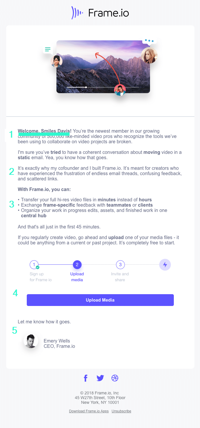
What we like about this message:
- It’s personal and creates a sense of belonging to the community.
- It shares a personal story about the brand.
- It explains the values that the user gets with the features.
- It has a clear call to action.
- It requests feedback in a courteous way.

What is special about this welcome email:
- It describes the values that users get.
- It is not only personalized with the user name but with the method of authorization. Based on this information, Zapier offers trying its relevant functionality.
- It has a nice explanation of the app’s “slang,” which adds a sense of belonging.
- It has clear calls to action and encourages you to take the next steps.
And here is a quite different approach to an email campaign:
AWeber uses a template that looks similar to a regular personal email and yet they still put their logo for a brand identity. However, the text is built with quite a similar model:
- It describes your benefits in the very beginning. (The paragraph about the customer solutions team doesn’t sound obvious to us. That’s why we put the “?” there.)
- It sets your expectations by informing you about the next communication steps. We lack this in previous examples.
- It explains how to get started in a really interesting way. You are prompted to choose your type of experience and get further instructions based on your reply.
- It provides you with a detailed explanation of how and when you can get answers to your questions.
The content of this message is nice and user-oriented, but it is a bit complicated to comprehend due to the lack of formatting. We would prefer to have several visual blocks and more structured templates.
Sending personal messages is definitely a nice approach but we recommend leaving it for your personal brand, or blog, or a small business. When sending messages on behalf of a bigger company (e.g. a brand or product), it is better to stick to structured templates. Users don’t need to associate your product with your personality (your CEO or a manager) until this is a part of your branding strategy. They expect to have clear instructions and most likely want to scan your message quickly and proceed with settings, rather than reading it carefully.
Introductory email
Once you have greeted your users and encouraged them to get acquainted with the basic functionality, it’s time to present your product in its best light. Focus on user benefits and explain how certain features can add value.
The main goal of this message is to make your users aware of your outstanding/pro/less known features and to bring them to that “Aha!” moment (repeatedly). You can achieve it by explaining several use cases or demonstrating a flow. It is also a great idea to base the content of this message on the current user behavior and app usage.
Let’s review a couple of examples.

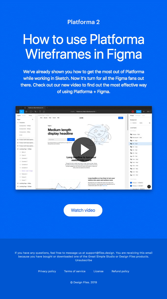
We like this one a lot because it clearly demonstrates the idea of this type of onboarding message. It gives you a list of strict steps on improving user experience and mastering the app usage. This message is based on the user’s behavior. Therefore, to receive it, you must complete your first order.

While this message lacks personalization, it is still a good example of introducing your product. It is clear that it is one in a series of emails and demonstrates how to use a certain feature.
Note that none of these emails contain a direct promotion. In other words, users are not prompted to upgrade or buy something.
You can send one and only introductory email or make a series of them. It depends on your product and the quality and quantity of educational materials you have. Just keep the balance! Don’t let your users get annoyed with a never ending flow of messages and pay special attention to the email subject. Describe the experience that your user will get after reading it. (Benefit + feature’s name) can be a good formula for this.
Reminder (or re-engaging) email
This is an additional step that you can implement according to your users’ behavior. They created an account, made several actions, then stopped using your app. You can’t force users to love your app or utilize it permanently, but at least you can remind them about it and try to understand your users better.
At this point, you can send:
- A FAQ to answer questions that might be left unclear or just offer to help.
- A feedback request or quick survey to understand user workflow and expectations.
- Free offer to re-engage.
The followings samples are for inspiration:


Encouraging email
We call this type of onboarding email “encouraging” as we suggest that they encourage purchases or moving to a paid subscription. You have introduced your product, explained its main benefits and proposed additional value.
If you use a free trial pricing model, the free period should be ending soon. This is the right moment to propose an upgrade. For ‘freemium’ or ‘free with paid features’ models, it is a good time to demonstrate the difference between free and paid options.
This email should wrap up your onboarding email sequence. In the best scenario, at this stage, your users are reading all your emails, are aware of all your features, and provide you with valuable feedback.

How often should you send onboarding emails?
This is an important question. Your campaign should not be annoying. But where is this “too frequent” line? Let’s say you provide a 14-day free trial. In this case, you should send one message every 3-4 days, and analyze the results. Explore the open and click rates, as well as unsubscribed.
Onboarding emails work for all kinds of products – but if you’re running a SaaS business, getting them right is especially critical. In this quick tutorial, we walk through five practical rules for creating onboarding email flows that keep users engaged and turn new signups into loyal customers:
Life after onboarding
This is the right place to repeat that you need to align your actions with your goals. To know exactly what works and what doesn’t, you should A/B test ideas, hypotheses and analyze the results.
Keep experimenting with contexts, wording, and designs. Focus on those steps that actually add value.
Key takeaways
An onboarding email sequence is a great way to improve user experience and convert free trials to paid subscriptions, and as a result, generate more profit for your app.
There are many approaches to building this type of email campaign. In this article, we described the main principles to help you craft your own sequence that brings desired results:
- Define your own goals and how they will be measured before you start preparing emails.
- Focus on bringing your users to the “Aha!” moment.
- Start with a welcome email. It should be simple, clear, well-formatted, and easily associated with your brand. Describe user benefits, explain how to get started with your app, set expectations for further communication, and add clear calls to action.
- Introduce your app and the whole range of its capabilities in the next messages. Demonstrate use cases and educate your users while still focusing on their benefits.
- Analyze user behavior. Propose help with mastering your app, ask simple questions to understand them better, or even offer some extra value for free.
- Encourage users to upgrade or switch to the full version of your app.
- Test everything. Test your messages before you send them to your clients; A/B test your subject line and the whole campaign. Pay attention to the actions that deliver results.
And one more important thing. Focus on your user. Try to predict their expectations. Ask yourself whether you would be satisfied with the email sequence if you were a new user of your app.


