We believe that poor customer experience is one of the crucial reasons for customers who do not return. You spent time choosing the definite service, placed an order or signed up for their emails, and what’s next? In a perfect world, you receive a clear email confirming that everything worked as expected, explaining how and when you will receive your order, etc. What if this does not happen? Do you feel disappointed? We’re fed up with these “Your order is being processed, we’ll let you know about the next step” types of messages.
This is because confirmation emails are another type of underestimated transactional messages. Frequently, confirmation is unfairly treated as a basic email, while surveys show that “64% of consumers believe purchase confirmations are the most valuable messages in their email inbox.” In addition, confirmation emails enjoy 70% open rate. With such numbers, it is inexcusable to send nominal “order confirmed” messages.
In this post, we explain why and how to send cool confirmation emails, what essential information to include, what to check for, and how to comply with all privacy rules like GDPR and CAN-SPAM.
How do confirmation emails work?
It is quite obvious that confirmation emails are sent to confirm user/customer actions. They are automatic email messages sent after a user has completed a definite action.
Types of confirmation emails
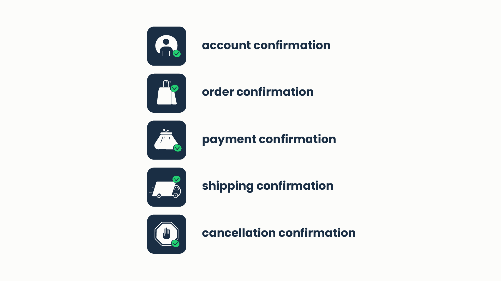
From a technical perspective, they are triggered transactional emails, which can be implemented with a simple if/then script in your app or as a part of your email marketing automation workflow.
From your users’ perspective, a confirmation email proves that a particular process has been successfully completed. This is a message clearly explaining further steps (or confirming that no additional actions are requested).
From your perspective, a confirmation email is an opportunity to deliver value to your customers by showing them everything is taken care of. In most cases, confirmation emails land in the main section of the inbox (which is especially valuable for Gmail client) and obtain high open rates. This makes such messages a great option to engage your clients and encourage them to interact with your product, and give an extra bump to your conversion rates.
Tools and services for transactional emails and how to set them right
For transaction emails to work properly and not affect your business reputation it is essential to choose the suitable sending service and to set it up in a proper way. Here, we offer three top sending email services for you to consider.
An Email Delivery Platform for developer and product teams with high inboxing rates and fast email delivery.
Email API/SMTP provides a stable email infrastructure for email sending and performance monitoring. It has two sending options: SMTP for quick and easy integration with any application to start sending in seconds and Email API for greater flexibility.
It lets you control your email performance with unique monitoring tools such as helicopter-view dashboards and drill-down reports with detailed stats on mailbox providers:
- G.Workspace
- Gmail
- Microsoft 365
- Outlook
- Yahoo
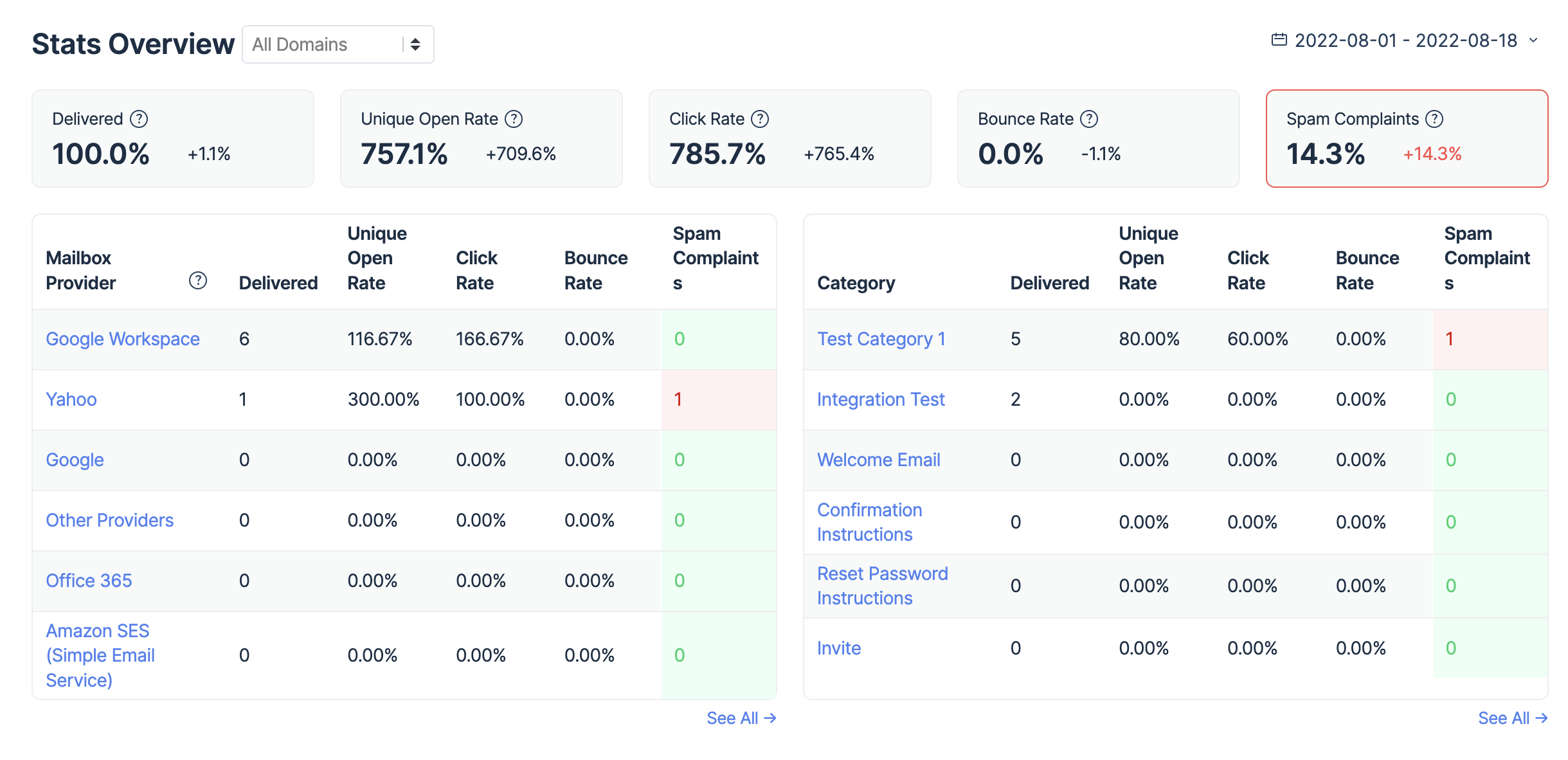
Furthermore, you can see email categories, extended email history with data up to 30 days, detailed stats, and deliverability alerts that allow you to catch and fix unexpected sending issues if they occur.

Additionally, Email Sending features transactional email templates where you can insert custom variables, upload images, preview template layout, and modify various portions through code or text editors. Alternatively, you can start from scratch and build your own transactional templates that can be triggered by passing the variables with API.
SendGrid is an email app that is a mastermind in the domain of transactional email sending. SendGrid outshines many other competitors in terms of comprehensive analytics, deliverability parameters, and overall user experience. It is highly flexible and suitable for bulk sending. Upon setting your SendGrid account, decide how you want to send emails to your customers. Three options are on the table: sending via SMTP, API, or plugins. Follow SendGrid the step-by-step instructions for proper configurations.
Mailgun is quite a popular sending service among developers. Mailgun’s suite of powerful APIs allows you to start sending emails from your application in no time. All you need to do is add a domain, verify it by adding DNS records, and in less than 24 hours you are ready to send transactional emails. For setting Mailgun the right way, check out their Quickstart guide.
One of the Postmark’s main messages is “start sending in minutes’, and that is actually true. Their API libraries for pretty much every programming language, allow Postmark to fit seamlessly into any stack. Moreover, Postmark can be proud of one of the smoothest migration policies one could imagine. To set the transactional email sending right, stick to the following steps: create Postmark account, add sender signatures and verified domains, set up authentication with SPF, DKIM, and DMARC protocols, and make fixes in your code. For more details refer to the “Getting started with Postmark” handbook.
What should you include in confirmation emails? (with examples)
The short answer is: include clear and relevant information that your recipients actually expect to receive. In addition, you can include some marketing details in a way that won’t be misleading or bothersome.
“Confirmation emails” is a general title for several different types of messages. There are several common points that have to be present in all emails.
- Branding. There is a strategy to make company emails look like personal simple messages. Yet, your company logo and clear design help associate your message with your brand and deliver the main idea even before reading the text.
- Privacy compliance. Email address is personal information and you have to comply with GDPR, CAN-SPAM, and CCPA rules. Make sure that users gave you permission to send them account-related messages and notifications by email.
- Business contacts. First, this means you are open to customers’ inquiries, feedback, and any sort of communication if needed. Second, this information is particularly important when it comes to transactional emails involving any financial operations.
- Date and time. You might be tempted to think this one is optional, but don’t be misled. Date and time is always handy for tracking your activity with customers as well as for provisional misunderstandings, especially regarding purchases, bookings and shipments.
- Confirmation email subject line. This one is a must, of course, but sometimes businesses underestimate the importance of a clear and concise message that the confirmation email subject line carries. Always think carefully on what it should look like to secure successful interaction with your customers.
Should I add “unsubscribe” to confirmation emails?
No, you should not. Confirmation emails are transactional emails so CAN-SPAM is not applied to them.
Now, let’s go into detail and review each type of email separately, how to create those that really work and examine some confirmation email examples.
Account confirmation
Creating an account means that this user has just joined your community and is a new subscriber. This is applicable to all kinds of services and products, where digital communication is possible:
- an account on a web service/application
- a new customer of an online shop
- registration in an online bonus program for an offline shop
- subscription to a newsletter
The registration confirmation is the first touchpoint with your new user or customer. Like in our everyday lives, you never get a second chance at making a first impression. That’s why account confirmation emails are so important.
The purpose:
- add security
- make your new members feel welcome in your community and confident with the next steps
- increase loyalty to your brand and encourage your new members to actually use your service
What users expect to receive:
- confirmation of their registration and instruction on how to activate their account
- guide on further actions, useful tips, and links
- contact information in case they have questions
What you should actually include:
The decision about what to include in each type of message has to be based on both your purpose and user’s expectations. Great registration confirmation emails have the following:
- personalized welcoming words
- clear CTA button (call-to-action)
- a brief explanation of why your recipient should press this button and what happens next
- your contact details and/or useful links, which can add value, like FAQ’s or a “getting started” tutorial
A good example to follow:
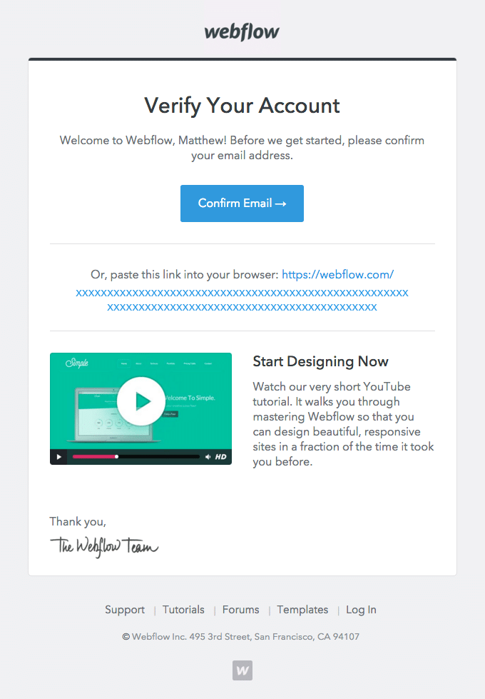
This email template contains all four points listed in the “what to include” section: personalization, clear CTA with explanation, a link to contact support team, and a video tutorial encouraging user to start using their product. Adding a direct copyable link to confirm the account is a very good practice too.
Order confirmation
An order confirmation is any kind of purchase confirmation email for physical goods from an online shop or an eCommerce platform, online services, bookings, merch shops, etc. This is the largest group of messages and a proper place for your creativity.
The purpose:
- confirm the order is accepted and the goods/services are available
- provide information on further steps like payment and delivery
- encourage your customer to make new purchases and share this experience with friends
What users expect to receive:
- confidence of getting exactly what they ordered – the ability to check the list of goods/services, prices, and other order details
- clear understanding of when and how they can receive their order – payment and shipping information
- ability to quickly find the information about this order if they need it someday
What you should actually include:
Of course, details will vary depending on the type of goods or services you offer. Web app subscription will look differently than flight tickets. However, the rules of good customer service work the same way. After receiving your confirmation message, your customer should have the answers to all possible questions without the need to check your website or make an additional call. A great order confirmation email should have the following:
- order identification details like order number, date, client name, or a link to the client’s account page
- information about the order like the list of items and actual price
- order status including payment and shipping terms
- the best way to contact you for any order-related questions
- client appreciation (it depends on your general policy and can include everything, from a simple thank you words to discounts for next purchases or for sharing with friends)
- optional: invitation to review your product or service
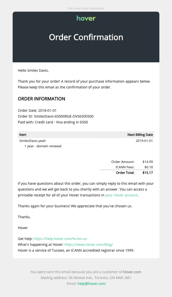
A good example to follow:
Payment confirmation (receipt)
Although businesses practice the inclusion of payment confirmation into the order confirmation, you would agree: once the online payment is done, it is better to have the receipt like in old good offline shopping times. There is never too much confirmation when it comes to money.
The purpose:
- confirm the payment is accepted
- provide information on the payment method
- indicate the time and date when the payment was made
- offer contact details if there are any questions about the payment, the sum, or the method
What users expect to receive:
- confidence in paying the exact sum of money as agreed
- assurance the payment was accepted and processed
- ability to connect with the seller in case the payment needs to be changed or cancelled
What you should actually include:
Receipt or payment confirmations should be as clear and concise as possible:
- amount paid
- date and (preferably) time of transaction
- payment method
- your contact details for further inquiries
- very preferable: a PDF download option for the receipt
A good example to follow:
This confirmation email from Simplecast gives a very comprehensive payment receipt for the customer, allowing them to use a PDF download to keep track of their spendings and to keep this confirmation in case of any disputes.
Shipping confirmation
Basically, shipping confirmation emails help customers track their purchases and allow them to know the estimated time of arrival. Shipping confirmation emails are highly appreciated among customers because they add up to making plans and adjusting expectations. Efficient supply chain execution helps ensure these confirmations are accurate and on time, improving the customer experience from order to delivery.
The purpose:
- confirm the goods were shipped
- provide information on the estimated time of delivery
- help adjust plans and expectations
What users expect to receive:
- indication that the goods were shipped
- tracking number, so they don’t have to follow up constantly
- assurance that those were the exact goods they ordered
- ability to check if the delivery address is right
- the date and time when to expect the delivery
What you should actually include:
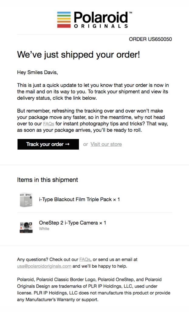
Be as customer-centric as possible while exercising an opportunity for cross-selling or upselling as well and here is a nice article to check some upselling techniques). Well, why not?
- Photos of the purchased goods
- Product name
- Product quantity
- Tracking number
- Billing summary
- Shipping address
- Shipping date and time
- Estimated arrival date and time
- (optional): at the bottom you can always have a recommendation to check out other goods and products or sign up for your loyalty program
A good example to follow:
Cancellation confirmation
If your customer decided to stop using your product for the moment, it is still important to say goodbye. First, it will help establish a friendly association with your brand. Second, it can be a good opportunity to get user insight and understand the reasons for such a decision. The customer success manager often leads this process, ensuring a positive final interaction. Another important point is compliance with privacy rules: with such a message you officially confirm that you delete all user data and won’t use it any more.
The purpose:
- confirm that the subscription is no longer active
- collect user feedback to understand what you can improve
- invite them to come back
- comply with privacy rules
What users expect to receive:
- confirmation that their subscription is inactive (and they won’t be charged or will stop receiving your messages)
- proof that you won’t keep and use their data anymore
What you should actually include:
- confirmation of account cancellation and user data deletion
- details on subscription renovation and (optional) bonus for returning customers/subscribers
- (optional) feedback request
A good example to follow:
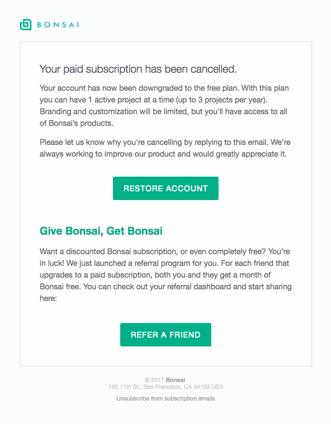
This example has a clear design and is useful for both sender and recipient. It offers to take a step back and to restore the account, has a feedback request, and encourages the referral of a friend.
How long does it take for a confirmation email to arrive?
This is quite a popular question asked on different forums and support chats. It’s time to talk about email deliverability. This one is really important – your great confirmation email template doesn’t matter if no one receives it.
When you have purchased a new pair of jeans online or subscribed to a music service, how soon do you expect to receive a confirmation? Usually, we expect it to arrive right away. In most common cases, it has to work like this. If it takes extra time to process user requests on your end, notify them about the expected waiting time.
In other cases, simple spam rules are the main reason for the delay of confirmation emails. Here are several tips to meet users’ expectations:
- Email headers. Email headers include sender’s address (“from”), recipients (“to” and “cc”), and subject.
- Don’t send confirmation emails from a “no-reply” address. Yes, we know, it’s a common practice. But we still don’t recommend it. “No-reply” addresses increase chances of going to the spam folder and making your message faceless. It is much better to put the name of your service, specific person, or at least something clear like customer care.
- Don’t put too many addresses to Cc and Bcc (Bcc is not a header, though). This may trigger spam filters as well.
- Don’t overuse spammy words in the subject like no cost or risk-free, don’t use CAPS LOCK, or repeated signs like !!!!!!!!! and $$$$$$
- Email content. Don’t overuse media content like images, GIFs, and video. Test your emails. Choose and implement neat design templates. Make sure that your messages look good and everything works as designed.
- Infrastructure. Take care of your sender’s reputation and use domain authentication.
- What else? Notify your users about the probability of landing in a spam folder. It’s still not good but at least they know where to look. Also, you can recommend adding your address to their contact list.
How to test confirmation emails
Regular testing and review of confirmation emails is crucial to business success. It is quite dangerous to think that once the transactional email flow is set, you shouldn’t go back to it. A single change in the code might lead to broken emails. Don’t wait for your clients to get back to you saying their confirmation emails are unreadable or there is something wrong with them. Test and review regularly.
Here are a few good tips to follow when testing confirmation emails:
- Test and review all transactional emails at least every three month
- Set an annual plan for testing automated transactional emails and stick to it
- For the automated emails that perform well (high open and click-through rates) do at least quarterly reviews
- Optimize email design and message content at least once in half a year
What should you pay attention to when testing your confirmation emails?
We have prepared a useful checklist for you.
- Email headers and bcc. Make sure everything looks and works properly.
- Email body. Check out if it is correct and displayed correctly.
- Links and images. See if everything works as intended.
- Attachments. Test if they are included and shown correctly.
- HTML and CSS. Find out if there are any potentially problematic issues in the markup and code
- Spam analysis. So your domain wouldn’t be banned in case of surpassing the spam score.
The last thing before you start working on your confirmation emails
Remember that consistency is one of the basic elements of communicating with customers. Determine the tone and voice of your messages (e.g. friendly, strict, earnest, or joking), define primary channels and notify your recipients if you are going to change something. For example, if you always send booking confirmation emails but then decide to switch to some messenger app, let your users know what kind of notifications to expect.
In this article we have explained how and why a simple touch of branding and a user-centered approach will turn your confirmation email into a user engagement tool in several actionable steps:
- Define the goal and anticipate user expectations.
- Craft a nicely designed template (and properly test it).
- Take care of deliverability.
We wish you many happy customers and are always glad to help you send better emails!


Comments
2 replies