Confirmation emails are among the most demanded types of triggered messages. They are sent to confirm that the user’s action has been successfully completed and often bring additional value. For example, order confirmation usually contains a receipt, while booking confirmation can be used when registering at a hotel, etc.
We have explained in detail how to create an impeccable confirmation email in our recent Guide to the Great Confirmation Emails. It contains recommendations on what should be included in the emails, as well as advice on consistency and deliverability. We included a couple of email examples in that article, but today’s post is designed to bring you inspiration. We have gathered a bunch of email samples that can be used in different cases.
Confirmation emails examples we love
We have carefully selected 23 samples from the huge Really Good Emails collection of email templates. Why did we pick these? Our aim is to demonstrate well written, engaging, and “right” emails that are prepared according to the most important rules. Let’s remind ourselves what should be included in a good confirmation email:
- Branded template for the recipient to associate it with your product or service and quickly understand what the message is about.
- Personalization details. For confirmation emails, personalization is not just good manners, but a necessity. The recipient should clearly identify your message and be able to find important information on their order or request.
- Clear and concise content. There is a space for creativity and even marketing tricks, but the confirmation email should be brief and free from technical or unnecessary words that can confuse the recipient. A summarizer can work well in drafting such an email.
Note that transactional messages (and confirmation emails in particular) don’t strongly require the recipient’s consent or an unsubscribe link. However, it is a good and safe practice to include info on why they have received your email and provide an easy way to manage their subscription preferences. Some samples below contain the sender’s address and unsubscribe links (and some do not).
Booking confirmation
Let’s start with one of the most desired email types in 2020 — booking confirmations.
The first sample is for a flight confirmation. Here’s what we like about it:
- It’s visually appealing, but still clean and branded.
- This email provides all necessary information about the upcoming flight.
- It also contains helpful details on making the flight comfortable and extra links for adding services.

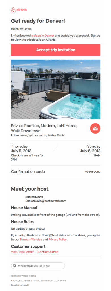
The next email is an apartment booking confirmation from Airbnb. We do love their templates! With beautiful pictures and recognizable design, they provide essential information and clear CTAs.
Restaurant reservation confirmation
Now online reservations are gaining more popularity. Here are a couple of samples of restaurant reservation confirmations.
The first template is crafted by Resy. It provides all the information, including:
- The name of the restaurant, address, time, and number of guests.
- A link for adding this event to a calendar.
- Parking details and extra info.
- The restaurant’s contact details and reservation terms along with an explanation of how you can change your reservation.
Resy also adds a brief description of the current promo and links to the mobile app.

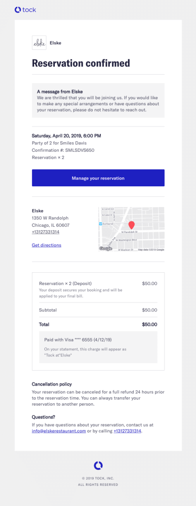
Here is another type of reservation confirmation from Elske. It also works as a payment confirmation because a deposit was required to secure the booking. This template is more concise but also contains all the necessary information to understand and quickly change the reservation.
Order confirmation
Order confirmation is the most common type confirmation email. For every action your customers take to purchase your product or service, you should send a clear confirmation that explains the current state of their order and the next actions (if any). We have gathered a few emails confirming different types of purchases.
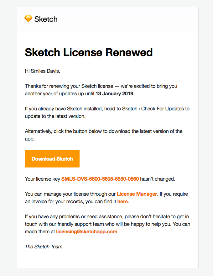
The first one is Sketch’s license renewal confirmation. Sketch is a design toolkit, but it’s email template design is extremely simple. No extra images and visual elements — just their logo image and comprehensive information on how to manage the new license.
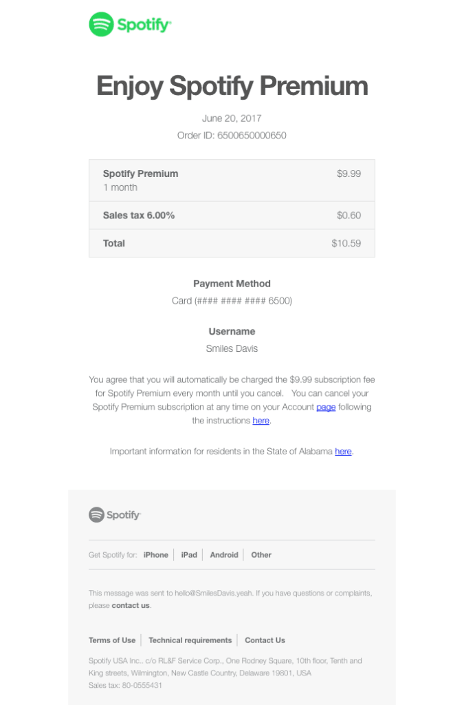
Another simple, but still comprehensive order confirmation is created by Spotify. It is a Spotify Premium subscription receipt that contains order number, date, purchase amount and tax separately, payment method, and username. Importantly, it also includes a note on the further automatic monthly processing of payments and an explanation of how to manage your subscription.
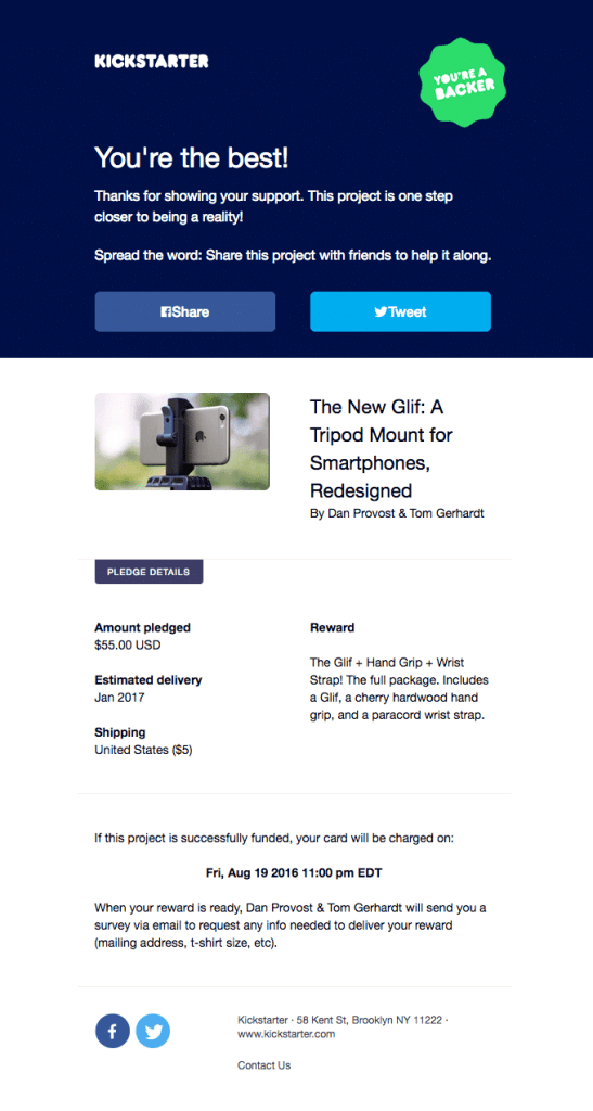
The next template on our list is a creative and interesting one. It is a pledge confirmation by Kickstarter, a crowdfunding platform. Along with all the pledge details, it explains what to expect next. In particular, we like the message header expressing gratitude to the recipient and encouraging them to share the project on social media.
Shipping confirmation
Shipping confirmations are very close to the order confirmations as, in many cases, for physical goods (let’s say, a new pair of sneakers or a puzzle set of furniture from Ikea), order confirmations contain information about delivery.
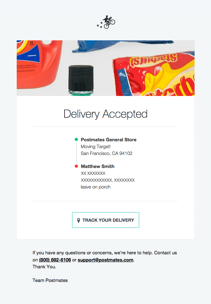
The first template in this section is a bit different — this is a notification from the shipping company that the order has been passed to them for delivery. It contains a route and a tracking button.
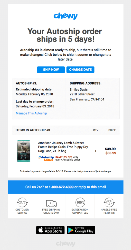
Scheduling automated shipment for regular purchases of one and the same goods is a good idea! In our sample, it is dog food. Chewy has a short but sweet email template that contains order details, cost, delivery address, and quick options for shipment management.
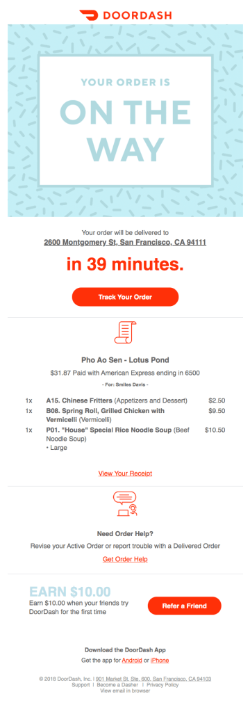
The last delivery confirmation in this post is for a food order. It’s more common to track these types of orders in a mobile app, but if you provide an option for ordering via a website, it’s a good practice to send an email.
The template was designed by Doordash, a food delivery service. You will find the delivery address, order details and cost, link to a receipt (which is important) tracking information, and the exact delivery time. The last one is interesting, but not super reliable (due to the situation on the roads).
Payment confirmation
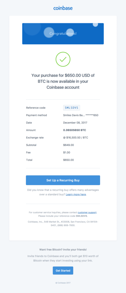
Usually, payment confirmation means a message that confirms that your payment for some service has been successfully processed. But we have found a couple of interesting cases that can be related to as a transfer confirmation. The first one is for a cryptocurrency purchase.
It doesn’t differ much from any other purchase, except for the exchange rate. Overall, it is detailed, but short.
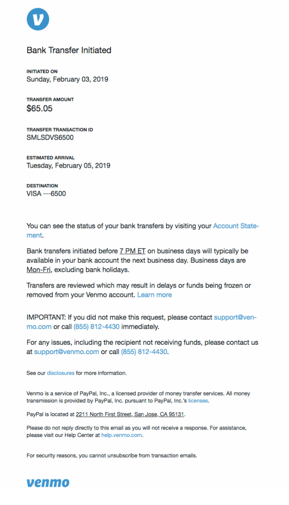
The next template is a clear bank transfer confirmation. Be careful with such messages because they contain sensitive information that shouldn’t be disclosed to third parties. Venmo’s template is crafted with security in mind as it doesn’t show the full card number or holder’s name, but contains all the necessary links and instructions.
Appointment confirmation
For a good customer experience, it’s crucial that you confirm not only orders that have been already made, but the upcoming events or appointments.
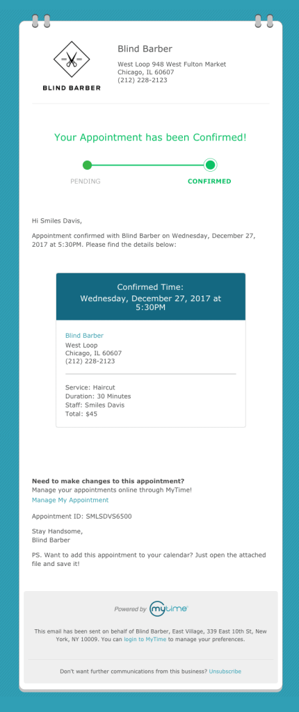
Here you go with a well crafted template that confirms an appointment with a barber.
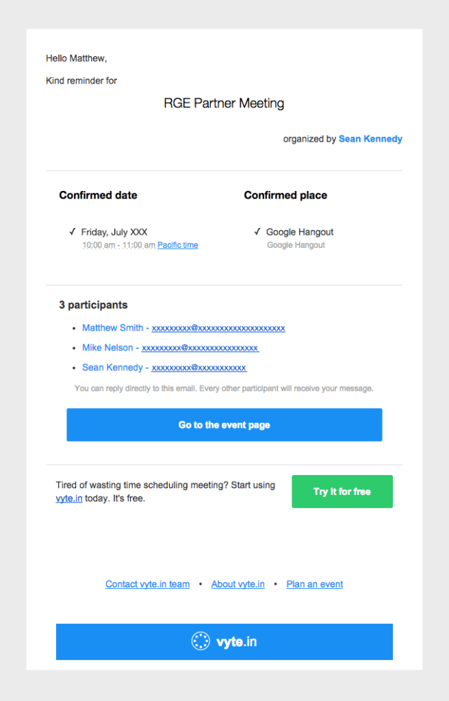
The following message is a reminder about an upcoming meeting, from a B2B appointment setting platform; however, it can be used as a good appointment confirmation example. It contains all the necessary information about the organizer, attendees, date, and place.
Request confirmation
When you make an online request, you should get a confirmation that it was received. If it’s not accepted yet, describe what should happen next and what actions should be taken by the sender. Exactly same as 1stdibs does with their receipt of a request for joining their trade program. It explicitly explains how long the wait will be for the final confirmation as well as what should happen next.
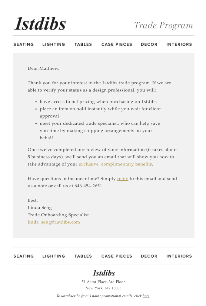
Receipt of the request from 1stdibs
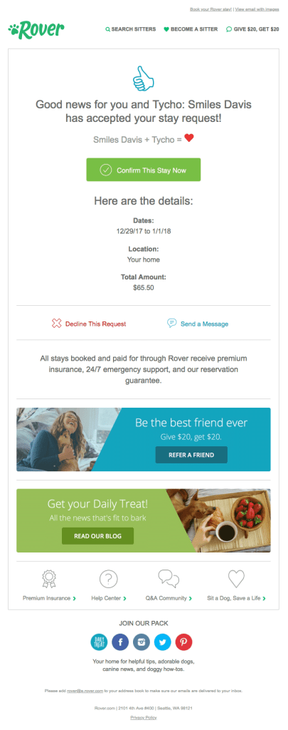
The next example is a nice request confirmation from Rover, a platform for pet sitters and dog walkers. Nice wording + clear design and call to action + necessary details on terms and cost = a great template.
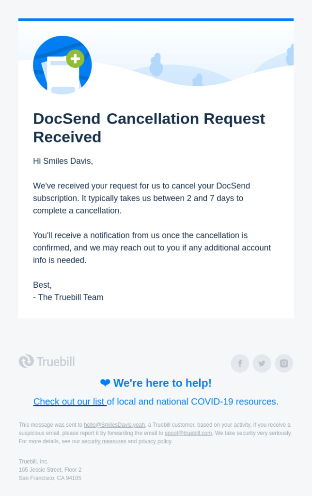
It is disappointing when someone stops using your service. However, it’s important to say goodbye in a nice way. If can’t process the cancellation request immediately and need time to remove all the client’s data, explain this in a message, as DocSend does.
Subscription confirmation
There are so many subscription confirmation examples that you can find just in your own inbox! But the newsletter subscription confirmation sent out by Shuka Design Bureau back in 2016 still grabs attention. Creativity and best practices perfectly match in their message: a sender’s hero and a double opt-in.
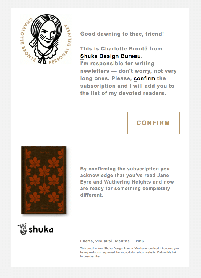
Newsletter subscription confirmation from Shuka Design Bureau
Other confirmation email samples
Here are a few more confirmation templates that don’t fit into any of the above categories. Each of them has a simple design, concise content, and well explained purpose.
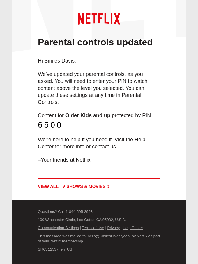
Account update confirmation from Netflix
When you have any kind of complicated process, the best you can do is to explain all the steps and their importance to your customer, like Nextdoor did in their verification confirmation message.
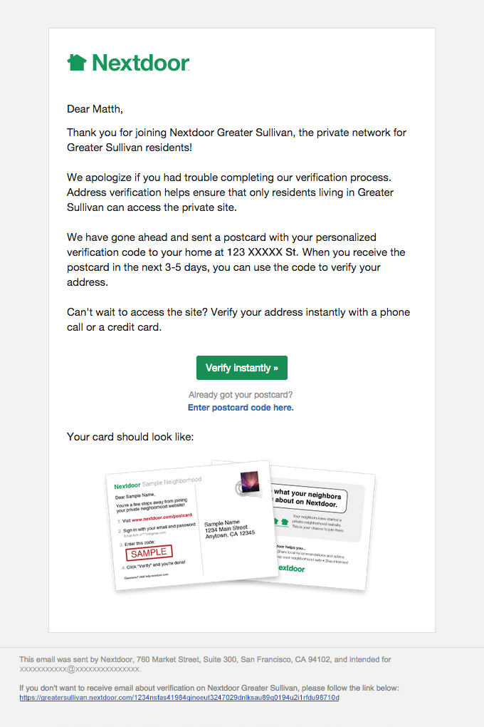
Verification confirmation from Nextdoor
Finally, here is a nice example of account activity confirmation from Avvo. It simplifies access to important information and encourages you to continue using their platform.
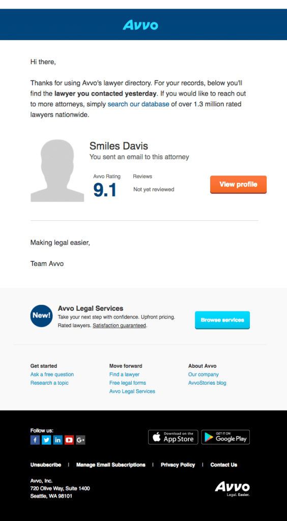
Final words
A confirmation email should be sent out every time your user or customer requests a change or has an interaction with your product or service. It is an important part of client communication because confirmation is one of a few emails that they truly wait to receive.
In this post, we have demonstrated 20+ examples of confirmation emails, including order, shipment, appointment, payment, reservation, and other occasions. We have also explained what is good about each of them so you can easily craft your own template.
Hopefully this post will help you create better emails. We wish you seamless communication with your happy customers!



Comments
3 replies