
Since the last two decades, a lot has changed on the Internet, but emails have maintained their position as the most profitable and dependable digital marketing channel. It is relevant to all industries and customer demographics.
If you do not send well-designed emails, it may damage your future engagement, thus undermining your ROI severely. Whether it is the email header designs, the copy, the visuals, or the overall email template, everything must be outlined in such a way that it addresses the customer’s challenges and presents a solution.
Today, I am going to list down seven email design mistakes that you need to avoid by all chances. Have a closer look at the email design blunders that kill your ROI below:
#1 Putting Hard To Find CTA
The biggest mistake one can make while designing emails is to make CTA buttons hard to find or, even worse, forget to place them! Remember, there is a pre-defined purpose behind every email, and it always revolves around making the user take action. Make sure that your CTA button is placed in the upper fold of your email template, and it is easily differentiable from the rest of the background. There can be exceptions as per the design’s requirements like in the below case, but you should ensure that it’s easy to find and click your CTA button:
#2 Having Broken Links In Your Email Template
A thumb rule of using hyperlinks in email marketing is that all your roads (links) should lead to Rome (desired action.) The average click-through rate is 2.5%, and thus, even a single broken link can significantly bring down the lead generation. Make sure that your CTA buttons have the current hyperlinks. I recommend making this a part of your QA process.
#3 Missing On Mobile Optimization
It is no secret that almost everyone checks their mailboxes on their smartphones, and there’s a lot of difference when it comes to rendering on mobile devices and computers. This starts right from the number of characters displayed in the subject line and preheader text and covers how your email appears to your subscribers. If you aren’t using responsive HTML email templates, you will end up lowering your open rates and ultimately lose engagement. Make sure you are using mobile-optimized email templates to maintain flawless renderability irrespective of the device type.
Pro tip: don’t forget to check the size of your email template, it might unexpectedly increase your deliverability scores.
#4 Using Spammy Words In Your Subject Line/Email Body
Since the beginning of email marketing, scamster has been targeting people, and you would have probably received an email saying you’ve won a lottery some time in your life. Naturally, ISPs are wary of such messages, and you should avoid using any spammy word in your subject line or in your email body. If you encounter writer’s block, you can always use an email subject line generator to craft authentic lines to help you boost your email open rate. But be aware that they will look out for content that sounds too good to be true, like winning a lottery through a lucky draw, and thus, you should avoid using too persuasive a tone.
#5 Having Disproportionate Text Vs. Image Ratio
In the early days of email marketing, text-only messages ruled the market, but online fraudsters exploited users with malware embedded in images. These messages contained a single image, and since then, mailbox providers put a red flag to too many images or image-only messages. A text vs. image ratio of 80:20 is recommended to avoid any penalization.
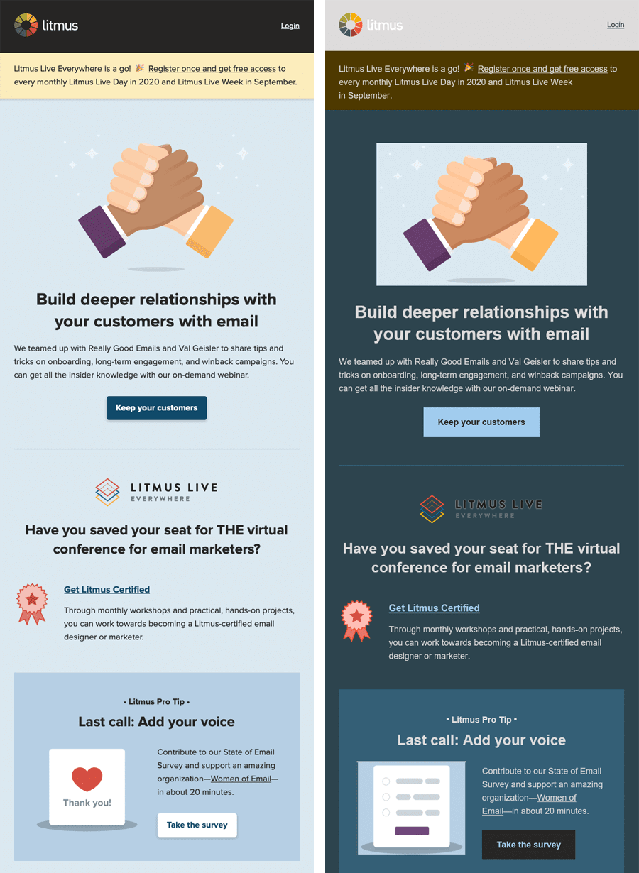
#6 Not Displaying Brand Elements Properly
Another serious mistake that can lower your ROI is not to display your brand’s digital assets properly. This can happen due to multiple reasons, like choosing the wrong color palette or attempting new design patterns. When your subscribers go through such messages, they can find it suspicious. However, your brand suffering setbacks due to inconsistencies remains the bigger risk. It is best to keep your brand elements such as color palette, custom logo, fonts, and taglines consistent with your website to avoid diluting your brand. Here’s an example of dark mode optimization gone wrong and its impact on brand elements:
#7 Not Providing Option To Unsubscribe
Lastly, I would point to a mistake that can dent your email marketing and your overall digital marketing efforts: Not allowing your subscribers to unsubscribe. No doubt, list building is a tough and time consuming process, but with time, even the legitimately acquired contacts will start turning dormant. They will lower your engagement rate and occasionally mark you as ‘spam’ since the messages will appear irrelevant to them.
Summing Up
Apart from these email design mistakes, you should also keep an eye on the issues like mistakes in setting up the automation workflows, poor segmentation, and personalization efforts. The recipe to successful email design is simple: compelling copy, use of right and minimum design elements, minus these mistakes. I hope you find this article on email design mistakes insightful.