While newsletters aren’t anything new, they’ve managed to stay one of the most convenient and popular ways to get updated on the latest information.
But do you know what exactly goes into creating a newsletter? And, more importantly, how to design a newsletter that looks top-notch? Let’s break it down and take a look at some newsletter examples!
Why is good email design essential for driving engagement?
Regardless if you’re sending out newsletters, promotional emails, transactional emails, or other types of emails, as part of an email marketing strategy, the design of the messages sent can make or break your email performance.
Why is this the case? Well, you see, email design goes hand in hand with the effectiveness of email marketing campaigns and the amount of engagement they receive.
So, if an email is well-designed, it will be visually appealing, responsive, and all other things that facilitate a great user experience. And if an email recipient has a good user experience, chances are they will engage with the email and take the desired action.
How will you know if you nailed your email design? Besides how the email looks visually to you and your team, the following performance metrics should be a good indicator:
- Deliverability rate: The number of emails delivered divided by the total number of emails sent multiplied by 100
- Open rate: The number of unique email opens divided by the number of emails delivered multiplied by 100
- Click-through rate: The number of unique clicks on links within an email divided by the number of emails delivered multiplied by 100.
- Conversion rate: The number of conversions generated from an email campaign divided by the number of unique clicks on the email’s call-to-action (CTA) multiplied by 100.
When it comes to creating your email newsletter, you don’t just write and send it impulsively. First, you learn what makes a newsletter well-designed, among other things, and then you invest time and effort into planning and bringing it to life.
Here are some well-designed newsletter characteristics to keep in mind:
It’s readable
Newsletters should be a quick and easy way to get information, so if a newsletter becomes difficult to read, it will lose its appeal and effectiveness and won’t engage the audience.
To avoid this, in every newsletter, include plenty of white space, clear and concise content, a well-structured layout, appropriate font and font size, headers, subheaders, and proper formatting.
Tells a story
Your newsletter content should, first and foremost, make sense. And once you have that covered, you should make sure it has a storytelling aspect to it.
You can achieve this by adding a narrative structure, captivating introduction, conversational language, emotional appeal, real-life examples, visuals, continuity, and cohesion. Paragraph generator is a useful tool as it helps you generate narrative style paragraphs or you can turn your existing content in similar structure. After that, you can use the content right away!
Focuses on the audience
Like all content created for your brand or business, a newsletter should be valuable and beneficial to your audience. This way, it will establish trust, build relationships, and become a trusted source of information and insights.
Relevant, informative, personalized, and actionable content is what your newsletter should feature if you want it to be truly audience-focused.
Also, to catch the reader’s attention, you can adjust your writing style and use first and second-person pronouns in your copy.
Includes CTAs
What action do you want your audience to take? Maybe read new product announcements or purchase a product on your eCommerce store? Regardless of what the action is, to push the audience toward it, create your CTA button so it’s eye-catching and easy to understand.
With the characteristics of a well-designed newsletter out of the way, now it’s time we cover its basic elements. These elements are:
1. Attention-grabbing subject line
The email subject line is the first thing that your recipients will see, so it’s crucial to make it interesting enough to encourage them to open your email. A good subject line should be concise, informative, and create a sense of urgency or excitement, just like this one from Crate and Barrel:

2. Engaging content
Sparking curiosity, evoking emotions and participation, as well as building a loyal audience are just some of the things engaging content can do.
To turn your content from a boring block of text to an engaging piece of writing, you should incorporate interactive elements within your visually-appealing design, ask thought-provoking questions, nail your storytelling and a conversational tone, as well as add some personalized recommendations.
If you need ideas for engaging content forms, case studies, customer success stories, quizzes, how-tos, BTS content, updates, and so on, are always a smart choice. You may use services like EssayPro or others to help you write high-quality, engaging content to attract attention and interest readers.
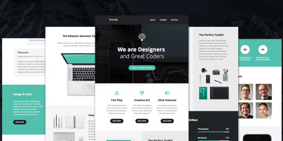
3. Great layout
What’s the point of crafting great content if reading and navigating it is a struggle? For this reason, it’s crucial you apply design principles to lay out all the elements of the newsletter in a way that allows a balance between whitespace, headings, and organized sections of content. Not only will this be visually appealing, but it will also be easily scannable.
Another thing to keep in mind is your font choice and color palette choice, as well as the visuals you go for, as this affects how effectively your message is being communicated and the reading experience in general. In case you see something attractive from your competitors, you can now clone their colors. If you can work with Figma and want to integrate your designs into your website or newsletter, you just need to transform your Figma designs into HTML online.
4. Clear call-to-action
A clear CTA encourages readers to take a specific action. This could be visiting your website, making a purchase, signing up for a service, or following your social media pages.
When coming up with your CTA, pay attention to how clear and concise the language you are using is and how prominently placed the button is. Other things to think about include the button’s size and color.
This is how we do CTAs at Mailtrap:
5. Personalization
Personalization is achieved through the use of the recipient’s name, location, and other relevant information and aims to build a relationship with your audience and increase engagement.
And if you’re thinking about whether skipping on personalization is possible, the answer is “no”. Why? It’s simple!
People nowadays are constantly bombarded with emails on top of emails from all kinds of businesses, and any non-personalized attempt at communication, be it a company newsletter or something else, might come across as mass emailing or, even worse, spam. Your newsletter should serve as an electronic business card, making each recipient feel individually addressed and valued.
Email elements are like puzzle pieces, meaning they should be put together carefully. Still, there are many ways to structure a newsletter, and how you should structure yours will depend on your goals.
As a general example, here is the structure of a traditional newsletter:
- Newsletter header: This typically includes your newsletter’s title and logo. Along with this, the header may also include a title or number for the specific newsletter issue.
- Introduction: Here is where you tell your readers what to expect in the newsletter content. Do keep in mind that you’ll have new and old email list contacts reading, so the newsletter introduction will play an important role in making sure nobody is confused.
- Core content and its sections: We’ve covered core content a bit earlier in the article, so we won’t go back into the same topic again. The only thing we will note is to break up the piece of content that is your newsletter into a few sections once it’s written to help with readability.
- CTAs: Depending on your goals, you may have multiple CTAs sprinkled throughout your core content. In other words, sticking to one CTA towards the end of your newsletter is, of course, not a must.
- Footer: Last but not least is the spot where you put things like contact information and links to your website and social media. Here is also where you should include an unsubscribe link in order to be compliant with data protection laws and regulations.
The first step in designing a newsletter is, you guessed it, planning the content and overall structure of the newsletter. Here you will make decisions on some “creative” details, such as the tone and style of writing, as well as some “basic” details, like the sending frequency of the newsletter.
Take as much time as you can to complete this step, as a well-planned newsletter can help establish brand authority, increase engagement, boost conversions, and reap the other benefits that come with newsletter sending.
For some help, watch our video on the 10 newsletter content ideas for achieving different business goals:
Deciding on your target audience
A target audience is a specific group of people that you want to target with your newsletter. This could be past customers, potential customers, or just a specific demographic.
Once you know who this audience is, you can create content that is highly relevant and engaging specifically for them, and thus, increase the likelihood of conversions.
Email-sending software should allow you to create, distribute, and track the performance of newsletters. And when it comes to options, there are plenty available, each with different features and pricing structures. Just keep in mind to choose something that meets your specific needs and budget.
If you need some recommendations, here are the top 5 email newsletter software solutions on the market:
- Mailchimp
- Constant Contact
- Brevo
- ConvertKit
- ActiveCampaign
For each of your newsletters, you’ll want to have a specific action (a conversion action) that your readers should complete during or after reading your newsletter. This could be purchasing, signing up, or simply visiting your website. Creating a landing page that effectively converts visitors into sales can have a significant impact.
By clearly defining a desired conversion action, you can tailor your newsletter layout and content to encourage readers to take that action.
Choosing a layout
For your layout, you can choose to use an email newsletter template and then customize it or come up with one from scratch using code or a drag-and-drop editor.
When deciding on the layout, go for something visually appealing that will also present your content in the best way possible while directing readers toward your CTA.
Still, do keep in mind that the only way you’ll know if a specific layout will work for you is by putting it through some tests, such as A/B tests, preview tests, etc.
Creating good content and personalizing it
Content creation is a process different for each company, and each writer within it, so we can’t give many pointers on it. Still, what you should keep in mind is to follow common newsletter content creation best practices, add elements of your brand, and of course, add personalization. If you have multiple writers in your team, consider making use of content approval software so you can continuously review, comment and approve content.
Scheduling
When you schedule your newsletter to go out can also impact the engagement it receives. So, consider the time zones your audience covers, and based on that as well as the recommended times and days for newsletter sending, pick something that will work best.
We should note that your sending schedule is also an aspect you should test if you want to achieve optimal email newsletter performance, as your target audience might prefer receiving emails on days and times you were not expecting.
Testing
Even though your newsletter might seem like it turned out perfect, this is rarely the case, especially on the first try. To spot and remove any errors, you’ll need to test your newsletter with proper email testing tools that can inspect and debug everything from the HTML email code, content, email headers, SMTP transaction info, mobile device responsiveness, email client (Outlook, Gmail, etc.) rendering, and more.
Other types of testing you can do are A/B testing, where you create different versions of the same email and compare their performance, testing different audience segments, testing different sending times, and so on.
Tracking results and making improvements
Tracking your results and analyzing them is the only surefire way to improve things for the better. So, after each email you send, keep an eye on its performance metrics to see what content, design, etc. resonates with your audience the most and make adjustments accordingly.
Getting an email designed and ready to send can take a village. But, with a set of good tools, especially ones with automation features, one could even do it on their own.
Here are some tools to consider:
Placeit
Placeit is a cloud-based mockup, video, and design template generator for creating professional items quickly and efficiently. It offers a wide variety of assets that are easy to use.
- Pros: The Placeit subscription includes access to a huge library of customizable templates, including video templates and logo templates. And its pricing plans are simple with no hidden fees.
- Cons: Requires an internet connection to use. Pricing plans may not be affordable for some users.
- Pricing: From $14.95/month.
Canva
Canva is an online content creation platform that includes a variety of design tools. Among the assets Canva offers, you can find icons, shapes, stickers, charts, grids, and gradients for customizing images.
- Pros: It’s easy to use, offers a wide range of design templates, and is affordable for small businesses. It’s also a great tool if you don’t know how to use professional editing alternatives like Photoshop.
- Cons: It lacks some professional-grade design features.
- Pricing: Free or $12.99/month.
Adobe Express
Adobe Express is a free tool enabling users to create unique and custom newsletters online and with ease in just minutes. What’s more, using the tool requires no prior design experience.
- Pros: No design skills and no credit card required. Users of the tool have access to thousands of standout templates and libraries of free stock images, shapes, backgrounds, and fonts.
- Cons: Creation on mobile is not available in the free plan.
- Pricing: Free or from $9.99/month.
Google Docs
Google Docs is a web-based word-processing software offered by Google. It allows users to create, edit, and collaborate on documents in real-time.
- Pros: Google Docs is great for users who don’t need as many features as users of Microsoft Word. Also, sharing documents, real-time collaboration, and automatic saving of a document’s changes are huge Google Docs benefits.
- Cons: It doesn’t offer advanced features for those who require more complex document and formatting options. It can be used for creating only low-level newsletters in terms of design and should not be used in case access to tools such as Canva is available.
- Pricing: Free or $18/month per user on a business plan.
Envato
Envato is a convenient marketplace where you can find all sorts of creative digital assets. From graphic templates and product mockups to fonts and lifelike photos, you’ll find everything you need to design a click-worthy newsletter.
- Pros: Their library is home to over 16 million creative digital assets, and you get unlimited downloads when subscribing to any plan.
- Cons: Although it offers monthly freebies, the platform doesn’t currently have a free trial.
- Pricing: From $16.50/month.
Of course, AI tools are also an option, and you can check out a list of the best free ones in our dedicated video:
Use high-quality images and graphics
While a quality, engaging copy is super important, images, graphic designs, and even GIFs keep things visually interesting and can provide essential context for your readers.
For that, you can utilize graphic asset libraries, which offer everything from location pin icons ideal for travel agencies to showcase exciting destinations to star graphics to highlight best-selling products in your newsletter.
So, in every newsletter you send, include high-quality stock images or original ones if you have them.
Also, at all costs, avoid using pixelated, irrelevant or blurry images, as these can distract the reader, leave a bad impression, and pull attention away from the information you’re communicating.
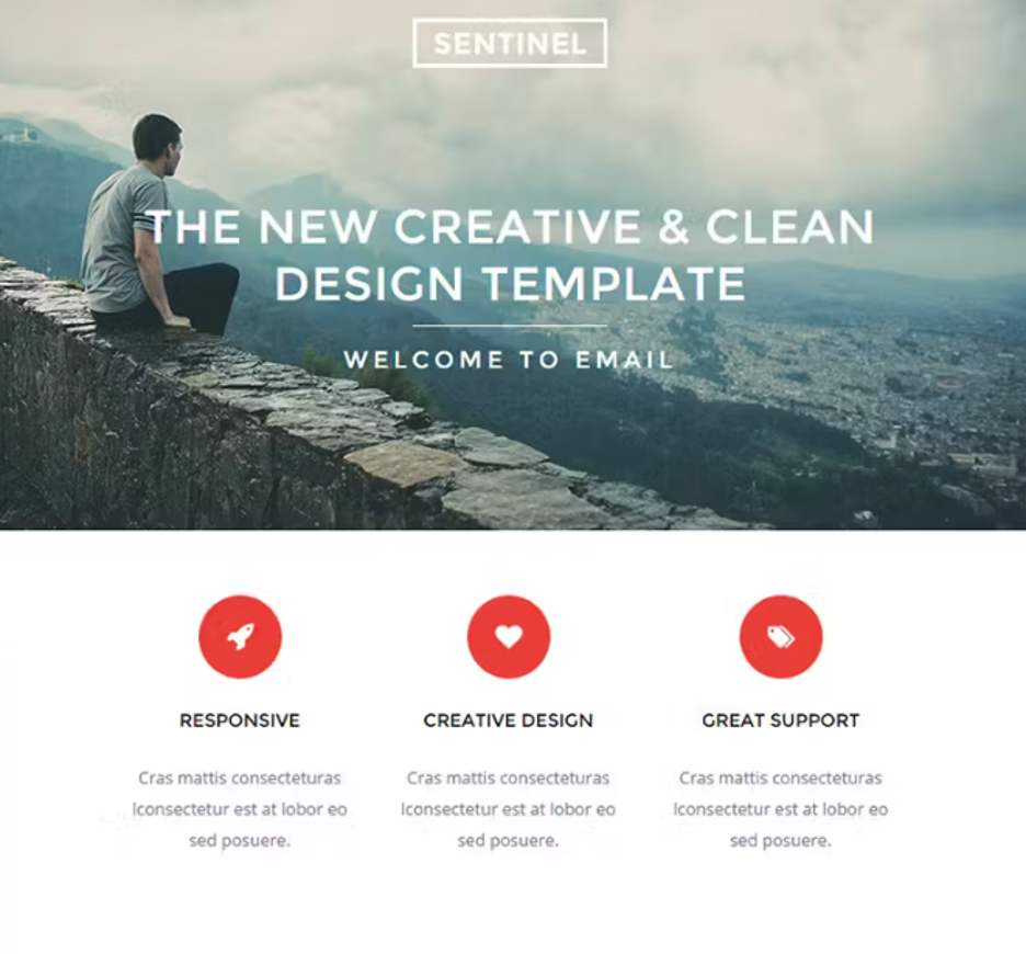
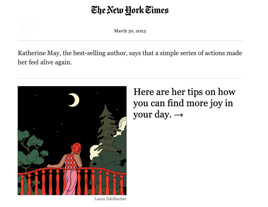
Using high-quality stock images or original ones can make designing your newsletter much easier and leave you with a beautiful email like this one from The New York Times.
Don’t overdo it
Going over the top with your newsletter design can be tempting, but a minimalist approach can often be more effective and less distracting. Just think how much more readable a simple newsletter is compared to one with a flashy design.
Through simplicity, you allow readers to focus, thus improving engagement and the understanding of the key messaging.
Make your content accessible
Having a newsletter with content accessible to people with disabilities can help you reach a wider audience and send more traffic to your product pages and landing pages.
Here are just a few things you should keep in mind regarding content accessibility:
- Typically, sans-serif, web-safe fonts are best when it comes to font legibility. So, use them instead of complex typography and try to stick to a font size greater than 12pt.
- Using a color scheme with low contrast can make it difficult (or even impossible) for folks with vision disabilities to read or view content. To avoid this, use a color contrast detector and ensure you’re using a color scheme that provides sufficient contrast between text and background colors.
- When it comes to images and logos, make sure to include alt-text that accurately describes them when incorporated into the content.
Keep an eye on trends
While email best practices tend to stay the same, email marketing trends are ever-changing. And if you want to have your newsletter stand out from the rest, keeping an eye on the top trends as well as incorporating them into your email design is a must.
Summary
If done right, newsletters can have a massive positive impact on the relationship with your audience. However, you have to be aware of the effort that goes into creating the best email newsletter, starting from defining goals to perfecting the user experience.
Fortunately, with this step-by-step guide, you’ll know how to design a newsletter in no time!