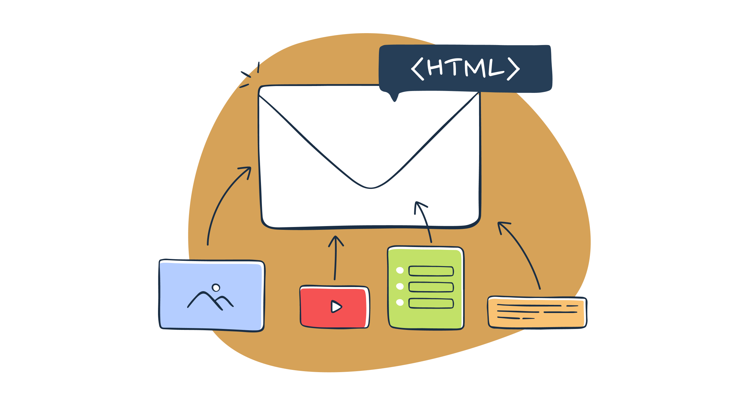
Email accessibility and marketing
Around 15% of the world’s population, or estimated 1 billion people, live with disabilities. More than 2.2 billion people suffer from visual impairment. Hence, the focus on accessibility in email campaigns is not only a social issue of inclusiveness, but also a question of up-to-date marketing strategies, the visibility of the brand, and overall business reputation.
Practicing email accessibility: a win-win situation
Why should one prioritise accessibility in emails?
Because both businesses, and their clients can benefit immensely from it.
- Expanding your outreach
Emails prepared, coded, and designed with regards to accessibility let you reach out to more subscribers and to engage larger groups of people who otherwise would have been left out.
- Enhancing user experience
Accessibility design practices help you consider how to keep your message simple, comprehensive, and to the point while offering the same kind of experience to different groups of people. Inclusivity in emails also helps overcome all kinds of problems that might potentially put off your subscribers. Eventually, accessibility in emails leads to greater conversions and revenue.
- Building up brand loyalty and recognition
Mutual respect: that’s what builds a good and solid reputation of the brand. The customers who know their needs are taken into consideration tend to become the most loyal customers and supporters of the brand, contributing to increased brand awareness.
- Being socially responsible and respectable
Social responsibility of businesses is the indicator of their ability to serve the community in particular, and humanity in general. This social capital of respectability of the brand can’t be replaced by anything else.
- Leveraging legal risks
The World Wide Web Consortium (W3C), an international standards organization, created the Web Content Accessibility Guidelines (WCAG) document to maintain accessibility standards in the digital world of communication. The failure to comply with these standards may lead to potential lawsuits or penalties and inevitably damage your reputation.
That being said, let’s find out how you can make your emails accessible.
Starting with WCAG
To code accessible emails, you have to understand what makes them accessible. The WCAG (Web Content Accessibility Guidelines) are an excellent place to start. However, you have to remember that the guidelines are guidelines for web content, not email content, so not all of the guidelines are relevant to email. As such, you have to identify which ones aren’t relevant, which ones are relevant, and the techniques you need to use to meet their respective success criteria. It’s worth noting that many businesses are mandated by law to ensure their emails are accessible, under the Americans with Disabilities Act (ADA). It is crucial to educate yourself more about achieving ADA email compliance.
Insights from research
In addition to WCAG, there’s insights from research on email accessibility implementations. ‘Email for All’ conducted one such piece of research recently. Email for All is a partnership between ActionRocket and Beyond the Envelope™, and their aim is to promote the implementation of accessibility in emails and ensure those implementations make a real difference to recipients – email accessibility made real. I wrote an article on some of those research results, which were interesting, intriguing, and insightful!
General remarks on testing
Tests are conducted multiple times throughout the HTML email coding lifecycle. Aside from the need to test its syntax, its code needs to be end-to-end tested to ensure that when the sender sends it from their platform and the recipient receives it on their email clients, webmail clients or apps, it renders the email as expected.
Why wouldn’t it render the email as expected? Well, email sending platforms may remove or replace some of the code, and email clients, webmail clients and apps may not support some of the code. There’s no such thing as an email equivalent to web standards!
There are nearly one hundred different ways an email could be rendered, depending on which email client, webmail client or app a recipient is using, how they’ve set it up (e.g. dark mode), and even the type of email account they have!
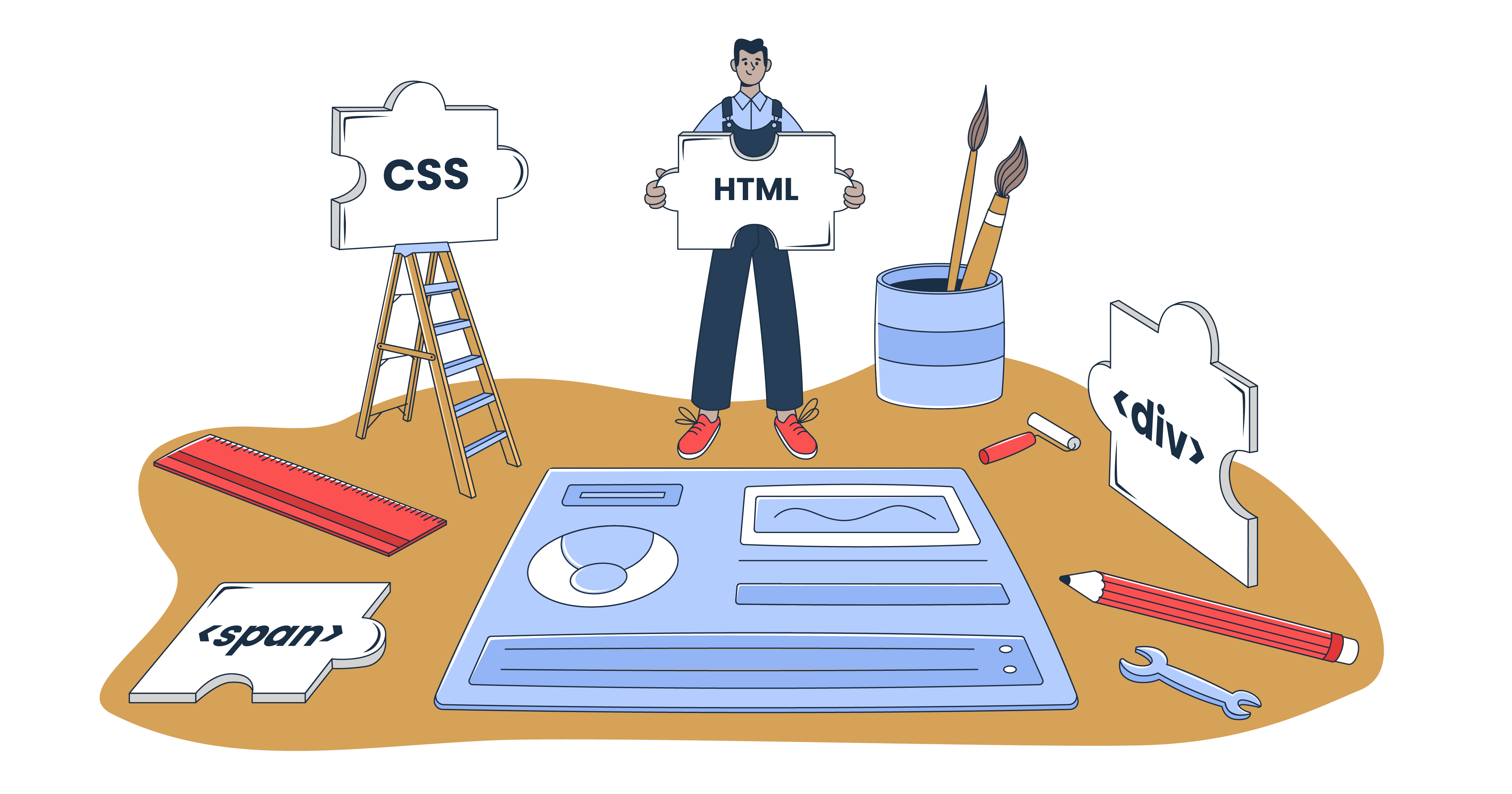
Coding considerations
If you’re not familiar with HTML email, you’re not likely to be familiar with its idiosyncrasies. If you’re not, I’d recommend reading Mailtrap’s Guide on How to Build HTML Email.
With email, it’s not unusual to implement techniques supported on some email clients, webmail clients and apps, and fallbacks supported on the rest. It’s no different when implementing accessibility into email.
Exceptional, accessible email coding techniques
Most of the techniques used to implement accessibility into email are the same as those used to implement accessibility into the web. However, there are some exceptions.
HTML tables
In email, HTML tables are used, for the most part, to structure layouts. However, recipients using assistive technologies, such as screen readers, may find those technologies force them to listen to the content of each and every table cell, in each and every table row within those layouts – even the table cells that are empty! As you might imagine, this results in a highly frustrating experience for the recipient!
Implementing the role attribute, with the value presentation, inside each opening <table> tag will prevent screen readers from behaving in this way.
<table role="presentation">
Tip: Implementing role=”presentation” immediately after table makes it easy to ‘find and replace’ and ensure it’s in place at the testing and quality controlling stage!
Colours
Colour coding
In email, colours need coding using six-character hexadecimal rather than three-character hexadecimal abbreviations. This ensures they render as expected on all email clients, webmail clients and apps.
#ee0000 not #e00
The exception is the implementation of transparent colours, where RGBa colour codes can be used, but even then, you need to use six-character hexadecimal colour codes as fallbacks, as not all email clients, webmail clients and apps support RGBa.
Colour contrast and colour ratio
Colour contrast, or the lack of it, can be the difference between an email being visually accessible or inaccessible at a glance. Testing it is straightforward using the WebAIM Contrast Checker, which checks whether the foreground and background colour combinations used in an email ‘pass’ or ‘fail’ WCAG 2.1 AA or WCAG 2.1 AAA.
WCAG 2.0 level AA requires a contrast ratio of at least 4.5:1 for normal text and 3:1 for large text. WCAG 2.1 requires a contrast ratio of at least 3:1 for graphics and user interface components (such as form input borders).
Some other useful tools to calculate contrast ratio:
Non-exceptional, accessible email coding techniques
Language
Implementing the language code, inside the language attribute, inside the opening HTML tag enables assistive technologies, such as screen readers, to read the email in the appropriate language.
<html lang="en-GB">
Semantic elements
Describing each piece of content using semantic elements will help recipients using assistive technologies, such as screen readers, understand the hierarchical structure of the email:
- <h1> to <h6> for a headline and headings
- <p> for paragraphs
- <ul> and <li> for unordered lists
- <ol> and <li> for ordered lists
Heading levels
It’s important not to ‘skip’ heading levels within a section of content. If a section includes a <h1> and a <h3>, it must also include a <h2>, for example.
In email, you need to apply inline styling for each of the headings.
<h1 style="font-family:Arial, sans-serif; font-size:30px; line-height:1.25em; font-weight:normal;">
Font sizes
There’s no guideline on what constitutes an accessible font size in WCAG. I recommend using 18px for paragraphs on mobile and 16px for paragraphs on desktop, with proportionally larger sizes for headings and the headline as you rise up the levels.
In email, you need to apply inline styling for each of the paragraphs, either inside the opening <td> tag of the table cell that contains the paragraphs or the opening <p> tag of the paragraphs themselves. The paragraphs will inherit the styling applied to the table cells.
<td style="font-family:Arial, sans-serif; font-size:16px; line-height:1.5em;">
or
<p style="font-family:Arial, sans-serif; font-size:16px; line-height:1.5em;">
Line-heights
Line height (line spacing) on paragraphs should be at least 1.5 times the font size, as defined in the WCAG 2.1 AA Success Criterion 1.4.12 Text Spacing guideline.
It’s important to specify a font-size, as the value of the em, the unit used for line-height, will be defined by it.
<kbd>font-size:16px; line-height:1.5em;</kbd>
Bold or strong?
When using HTML elements to style text in bold, it’s important to know the difference between <bold> and <strong>, and use the one that’s the most appropriate.
Creating visually bold text
The <b> element will render the text bolder than the default weight.
<b>Bold text</b>
However, it’s better to style text bold with inline styling:
<span style="font-weight:bold;">Bold text</span>
Creating visually bolder and semantically important text
The <strong> element will render the text bolder than the default weight and will give it more importance for recipients using assistive technologies, such as screen readers.
<strong>Bold (and more important) text</strong>
Images in emails for people with disabilities
ALT text, or alternative text, is a must for the images in emails aimed at people with disabilities since the subscribers may not be able to see the images themselves.
All images and vector graphics should include an alt attribute, and each alt attribute should contain alternative text. The alternative text will differ depending on whether it dictates, describes or depicts the image’s content, as you see in the following examples:
Logo dictates
Alternative text for a logo will dictate the brand name:
<img alt="Mailtrap by railsware.">
Product describes
Alternative text for a product will describe the product:
<img alt="The Mailtrap user interface.">
Scene depicts
Alternative text for a scene will depict the scene:
<img alt="A team of men and women sat at their desktop computers, using Mailtrap.">
Tip: Placing a full stop (period) after the alternative text causes a screen reader to pause momentarily before reading the next piece of text.
Sometimes an image cannot be dictated, described or depicted, and in such cases, it will be necessary to implement a null attribute.
alt=""
Accessible Rich Internet Applications
ARIA stands for Accessible Rich Internet Applications. It is a set of attributes that can be added to HTML to render the roles, states, and properties of user interface elements in a more comprehensive manner. ARIA attributes also make it easier for accessibility / assistive technologies such as screen readers to read and understand the code.
Here you can find the comprehensive list of ARIA attributes.
Most of the attributes start with “aria-” prefix followed by the action you want them to take.
Here are a few typical examples with “aria-” prefixed attributes for the popular actions allowing for accessibility:
Whenever screen readers come across the social media icons with links, they either read as an <a href = “https://www.facebook.com”, or they just indicate if the link is visited or not. For people with visual impairments, this is undescriptive and impossible to operate with.
Accessibility solution:
Inside the <svg> </svg> tag add
aria-label=”Follow the company on Facebook”
Image captions
For screen readers to read the image captions instead rather than the file name of the image, especially when the caption might be changed in a while, there exists an “aria-labelledby” attribute that you can add within the <img> </img> tag.
Here is how it works: leave the “alt” attribute empty, and then underneath use an “aria-labelledby” with the value of the caption id.
alt=””
aria-labelledby=”caption”
In general, screen readers read images through the “alt” attribute, or (if there’s no “alt” attribute) through the image file name. In case you have an image functioning as a button, it is highly inaccessible: people with disabilities using the screen reader wouldn’t know the image functions as a button.
To make the image-button accessible to interact with, use the “role” and “tabindex” attributes within the <img> </img> tag.
alt=””
aria-labelledby=”caption”
id=”button”
role=”button”
tabindex=”0”
Animation in emails: accessibility advice
When using any kind of animation in emails, one should consider two basic categories of people with visual differences:
- visually impaired people
- people who may have photosensitivity
There are many considerations on how to make animation content accessible. However, the general advice is to avoid using GIFs and animations because they fail the WCAG 2.2.2 Pause, Stop, Hide (Level A) Guideline:
“Moving, blinking, scrolling: For any moving, blinking or scrolling information that (1) starts automatically, (2) lasts more than five seconds, and (3) is presented in parallel with other content, there is a mechanism for the user to pause, stop, or hide it unless the movement, blinking, or scrolling is part of an activity where it is essential…”
If you still think that animations are essential to your email message, for people who are photosensitive, stick to the following rules.
- Provide a play button
- Provide a stop button
- Play the animation for less than 5 seconds
For visually impaired people:
- Provide the ALT text descriptions. And make them as to the point as you can. Try to think about what the animated content is trying to convey, rather than describe its particulars. Keep in mind that “alt” descriptions should be less than 125 characters.

Source: System Concepts
| Inadequate ALT text description | Adequate ALT text description |
| Several yellow minions in blue outfits are sitting on the chairs, laughing, and clapping | A crowd of excited minions cheering and clapping |
Tools to test email accessibility
There are several tools available for testing accessibility in email.
WebAIM WAVE® Web Accessibility Evaluation Tool
Though designed for websites, using the URL from an emails’ view in browser’ or ‘view online’ link will give you an instant view of accessibility errors, such as the lack of heading hierarchy, the lack of alt attributes and poor colour contrast.
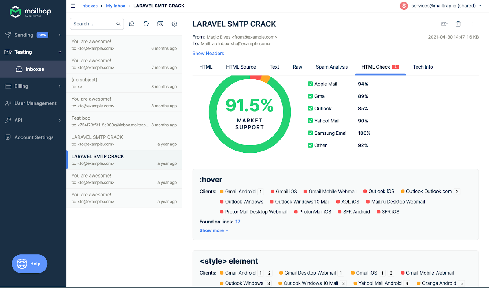
Litmus
Litmus enables you to preview how your email will display on over ninety different email clients, webmail clients, app and device combinations. It also includes some features for testing accessibility.
Email on Acid
Email on Acid enables you to preview how your email will display on over ninety different email clients, webmail clients, app and device combinations. It also includes some features for testing accessibility.
Email Sandbox
With Email Sandbox, you can check the validity of the HTML code for accessibility purposes considering all static and dynamic elements like hovering, buttons etc. Email Sandbox captures all testing emails, and you can iterate on your HTML emails as many times as you want without spamming your real customers by mistake.
Mobile, Tablet and Desktop Devices
There’s no substitute for testing on real mobile, tablet, and desktop devices to get a sense of someone’s visual, auditory, and tactile user experience. This is as true for email as much as it is for web, particularly when you set up those devices to use different email account types (e.g. Gmail App with a non-Google account) and different modes (e.g. Dark Mode). This also allows you to test their screen readers, such as VoiceOver on Apple devices, TalkBack on Android devices and NVDA on Windows.
Conclusion and Checklist
In this article, we have looked at a few visible and invisible aspects of HTML email, its code and design, and how to implement accessibility using them. We have also covered the general guidelines on how to test and quality control email accessibility. Let me now leave you with a checklist to help you to do the same:
- Quick Check: Use the WebAIM WAVE® Web Accessibility Evaluation Tool to identify accessibility issues quickly
- Language: Check the presence of a language code inside a language attribute – <html lang=”en-GB”>
- HTML Tables: Check the presence of role=”presentation” within all HTML tables, by ‘finding’ <table role=”presentation”
- Colour: Check colour contrast using the WebAIM Contrast Checker
- Semantic elements: Check the appropriate use
- Heading levels: Check the appropriate use, and that headings aren’t ‘skipped’
- Font-size (Mobile): Check font-sizes are 18px
- Font-size (Desktop/Laptop): Check font-sizes are 16px
- Line-height: Check it’s 1.5em on paragraphs of text
- Bold or Strong: Check the appropriate use
- Alt attributes: Check alternative text is dictative, descriptive, depictive or null
- ARIA attributes: Make it easier for accessibility / assistive technologies such as screen readers to read and understand the code.
- Responsive: Check the responsivity of emails on email clients, webmail clients and apps on mobile devices, using Litmus or Email on Acid, and using ‘real’ mobile, tablet and desktop devices.
- Usable: Check the usability of emails using ‘real’ mobile, tablet and desktop devices.
- Accessible: Check the accessibility of emails using screen readers, such as VoiceOver, TalkBack and NVDA on ‘real’ mobile, tablet, and desktop devices.