


Ever opened an email campaign and eagerly continued to scroll down the page? That’s a sign you’ve come across great email design. It captures attention quickly and sets the tone for what comes next.
In this ultimate guide, you’ll see real-world email design examples — from headers and footers to full campaigns. We’ll break down what each one gets right and how you can borrow the same techniques. So, whether you’re sending a welcome sequence, a launch email, or a weekly newsletter, you’ll find inspiration (and a few practical tips) to level up your next send.
Email design examples
A good email design doesn’t need fancy tech or interactive features. Just a thoughtful email layout that supports your message. This is a perfect lead into our first email design example: The Minimalist design.
Let’s take a look at some minimalistic designs and three other types of email designs to inspire your marketing strategy.
Minimalist
Minimalist email designs are perfect for helping your audience focus on your core message, offer, or new product.
StudioSuits, for instance, keeps its emails super simple. It typically shares product spotlight images with short descriptive language on a white background. It might also share pricing, color options, and fabric choices.
Here’s an example of an email marketing campaign that showcases its latest green suits collection:

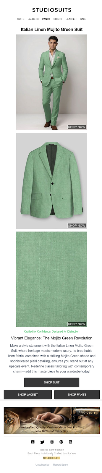
You’ll notice it has great photos, short descriptions, and clear buttons to shop. No extra stuff. This clean, focused style makes it easy for people to take action.
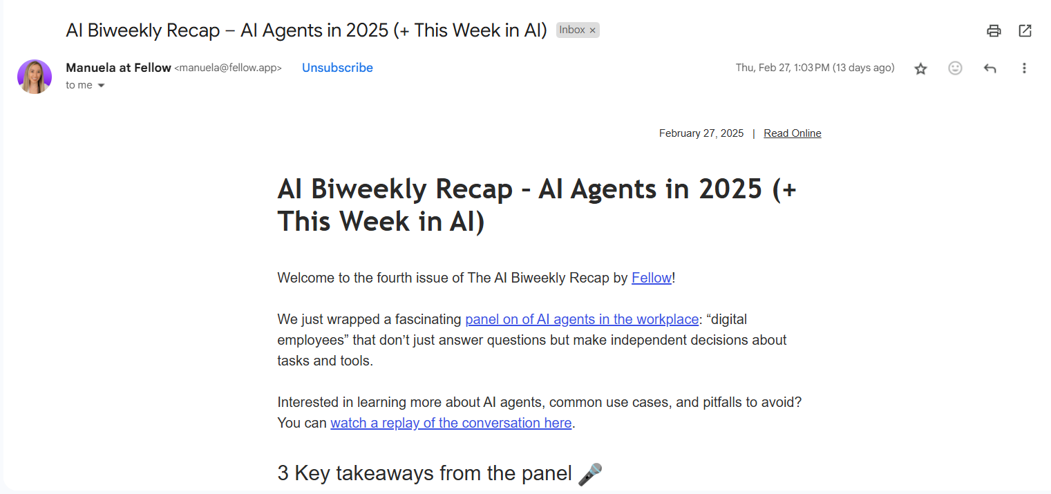
Fellow sends out super minimal emails, too. Just white space, bold text, and a few headings. No flashy design or high-quality images. This helps readers focus on what matters most without feeling overwhelmed.
Here’s an example of Fellow’s AI Biweekly Recap to show you what we mean:

Impact on KPIs:
- Click-through rates often improve because there’s less distraction. Readers are guided toward one clear call-to-action.
- Conversion rates on plain text emails can rise for the same reason: Fewer choices = less friction.
- Open rates may not be directly impacted by design. But a minimalist subject line that matches the clean feel can boost consistency and trust.
Colorful and branded
Colorful email designs are great for making a bold first impression, standing out in crowded inboxes, and creating memorable welcome or promotional emails that reflect your brand’s personality.
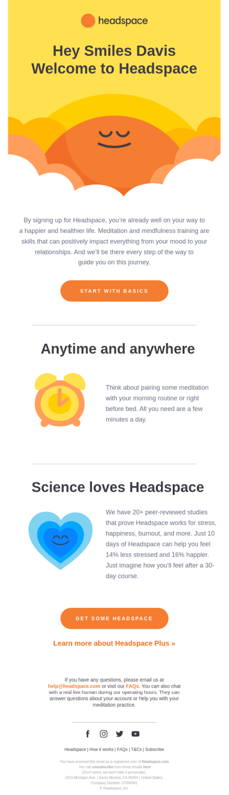
Headspace’s welcome email ticks all of these boxes:

Impact on KPIs:
- Open rates may benefit when the subject line hints at a vibrant, fun message (especially in welcome or announcement campaigns).
- Click-through rates to landing pages can improve when bold visuals highlight buttons or product features.
- Conversion rates might vary. Colorful designs can either energize or distract, depending on execution. Best when paired with a focused message.
Customer centric
Customer-centric email designs help your audience feel seen and understood. They’re great for building emotional connections and trust with your audience. These also work well when you’re presenting custom, segmented offers.
For example, emfluence the marketing platform’s nurture email below is highly pointed to its recipients’ use case:

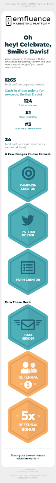
Impact on KPIs:
- Open rates can increase significantly if subject lines feel personal or directly relevant.
- Click-through rates tend to rise when content aligns with user behavior or preferences.
- Conversion rates improve over time, especially with loyalty campaigns, because the design nurtures trust and emotional connections.
Creative
Creative email designs use storytelling and visual warmth to spark curiosity. This style pulls people in, encourages them to explore, and works great for stories, brand throwbacks, or fan-submitted content.
Design trends like scrapbook-style layouts, for instance, are currently trending across social media and making their way to email and other marketing assets.
Online scrapbooking email designs may include layered images, torn-paper edges, Polaroid-style frames, and hand-drawn notes that give emails a warm, handmade vibe.
Here’s an example inside of Canva:

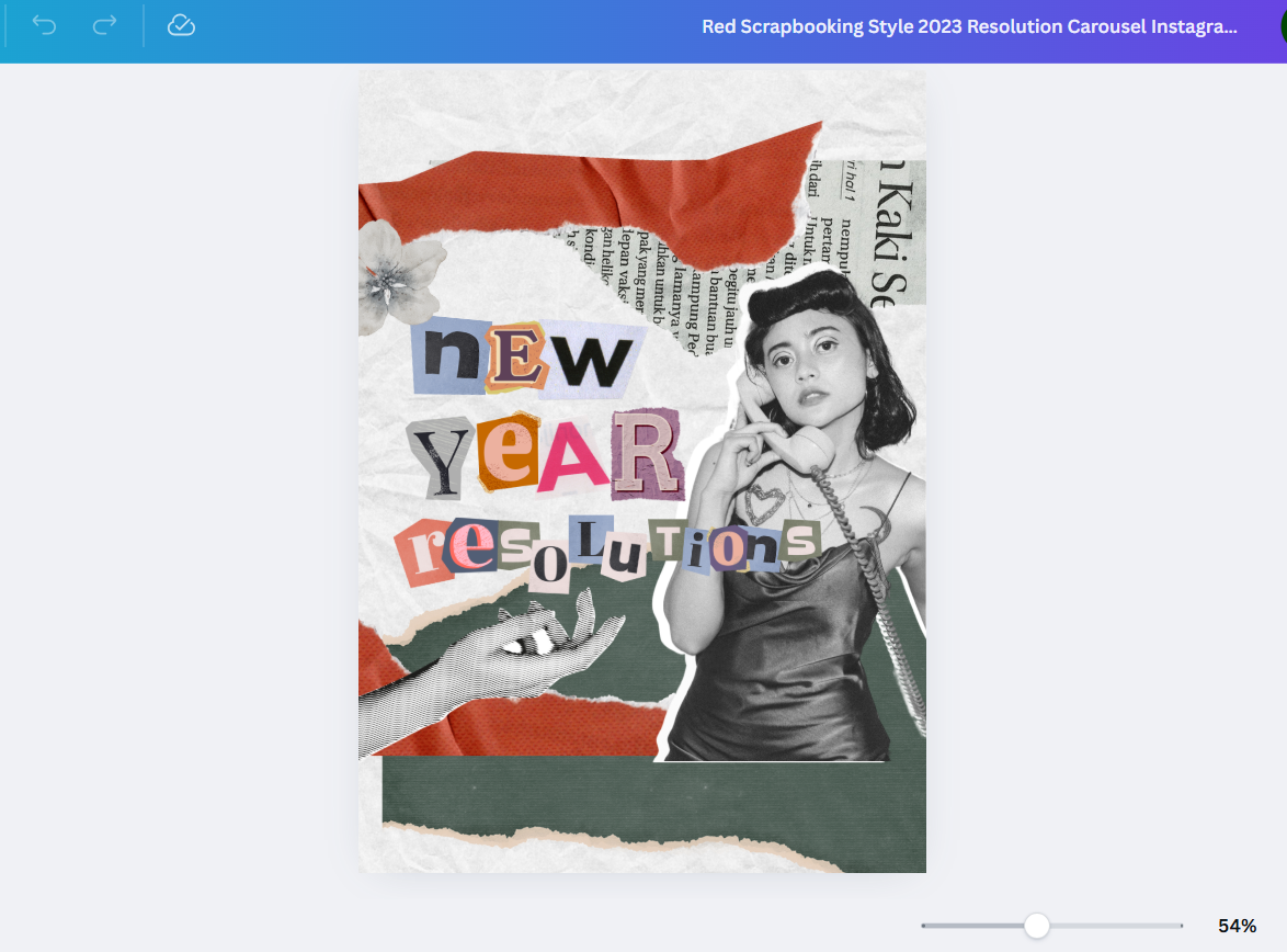
Impact on KPIs:
- Conversion rates depend on how well the creativity connects with your brand message—when done right, it can humanize your offer and boost intent.
- Open rates can get a lift if the subject line teases a story or offers something novel.
- Click-through rates may go up if the creative layout draws people in and encourages exploration.
Email header design examples
Your preheader sets the visual tone for your email campaign. Think of it like the cover of a book — it doesn’t need to say everything, but it should invite people to keep reading and focus on a specific message.
Here are a couple of examples to inspire you:

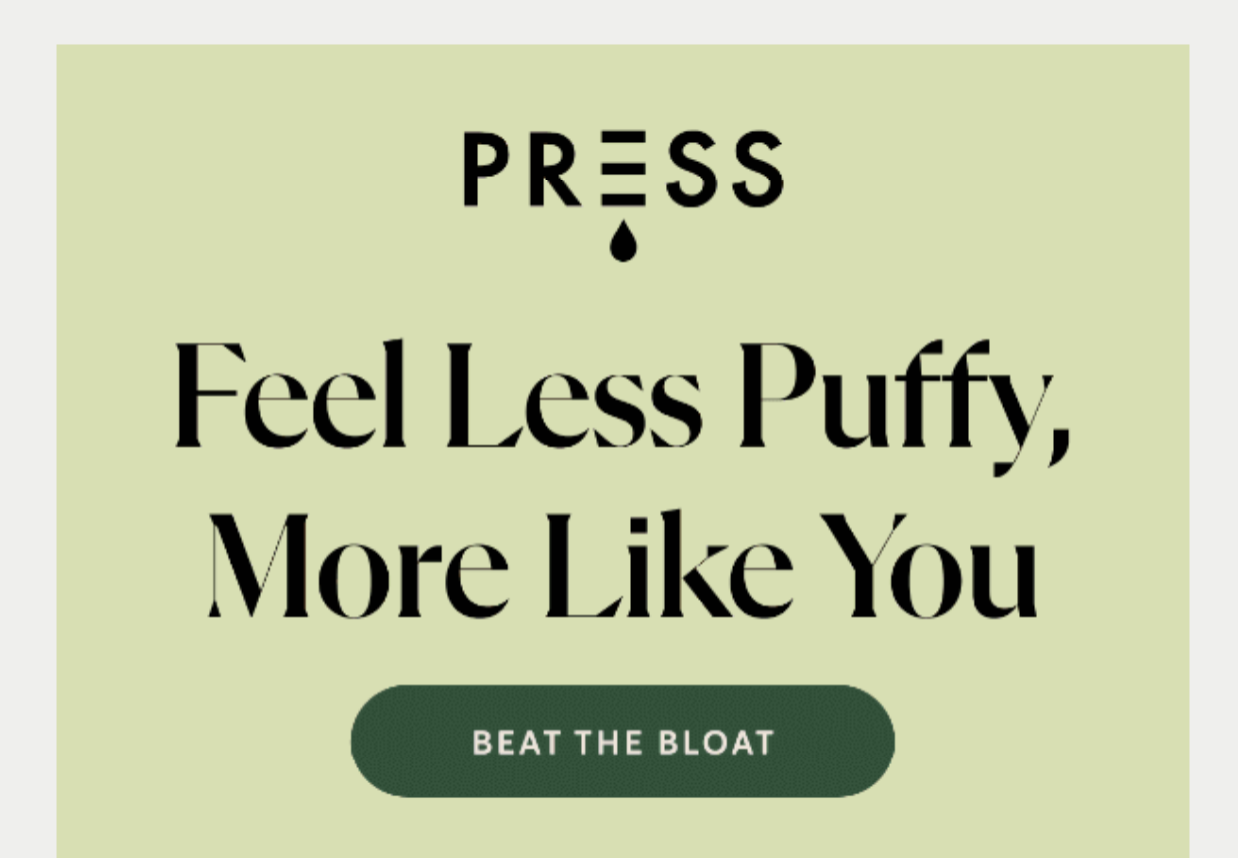

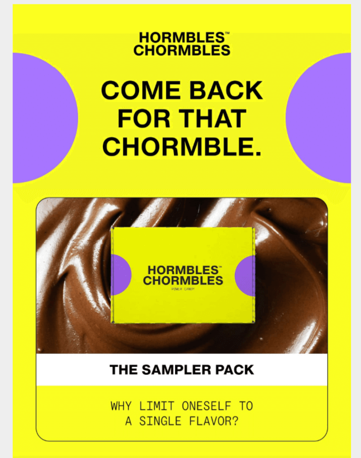
These examples follow header design best practices well. PRESS uses a clean background colour, bold typography, and a clear CTA button that immediately tells readers what action to take.
Hormbles Chormbles grabs attention with vibrant colours, playful copy, and a prominent product shot, making it memorable and on-brand. Both examples set the visual tone right away and encourage readers to scroll further.
Design notes:
- Use a background color that aligns with your brand
- Add a specific message that inspires readers to scroll
- Include your logo and design elements
Remember to really do your best to captivate your audience from the get-go. Having your reader’s attention is pivotal to crafting effective emails.
The footer is your closer. It adds polish and provides key info your audience may need, like your toll free number or other contact details, social links, and legal disclaimers. (And of course, the unsubscribe!)
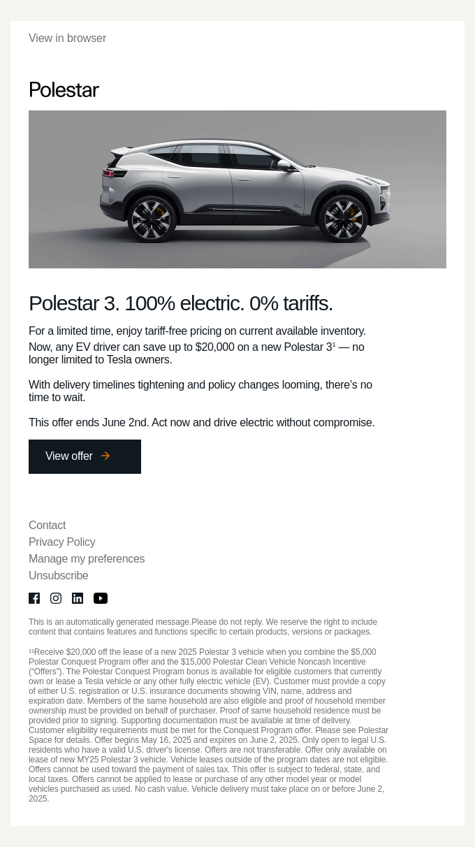
Here are a couple of examples to inspire you (Supergroup and Polestar, respectively):

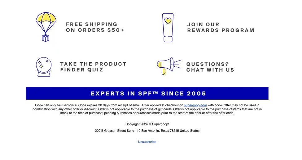

These footer examples show two effective approaches. Supergoop’s footer highlights quick links like free shipping, rewards, and quizzes, making it both functional and engaging while still including legal details and an unsubscribe option.
The Polestar email takes a more formal route, prioritising legal disclaimers, contact info, and social links; a must for compliance-heavy industries. Both approaches keep the footer clear, structured, and easy to navigate, which is exactly what best practices call for.
What to include:
- Contact information or a reply address
- Social media icons
- Legal or subscription information
- Brand colors for consistency
- An unsubscribe button
Keep it tidy and easy to navigate. The footer should wrap up your message with clarity and confidence.
Email signature design examples
Signatures aren’t just for individual correspondence. In branded campaigns, they help add a personal touch, especially when you’re sending from a real person or team.
Here is an example to inspire you:


This example shows how a simple, handwritten-style signature paired with the sender’s role adds authenticity and warmth. This approach works especially well because customers often value trust, tradition, and the sense of a brand made by real people. A personal signature reinforces that feeling, making the email less transactional and more like a genuine connection.
Elements to consider:
- Add your name and title (or team name if it’s a group send)
- Keep fonts, typography, and colors consistent with the rest of the email
- Consider a photo or small brand graphic if appropriate
- Use your signature with the logo
- Maintain your brand identity
Email campaign design examples
Campaign emails have one goal: Get your reader to act. Design helps guide them toward that.
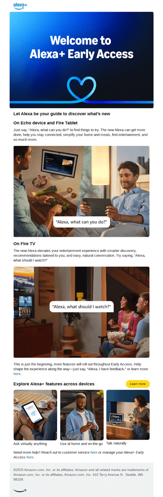
Look how brilliantly Amazon (Alexa context) lays out its offer. It chose a bold and colorful email design, outlining the key features and benefits in a structured, carefully laid out way.

Musicbed also created this effective email that captivates email clients with moody images and an immediate invitation to listen to sounds:

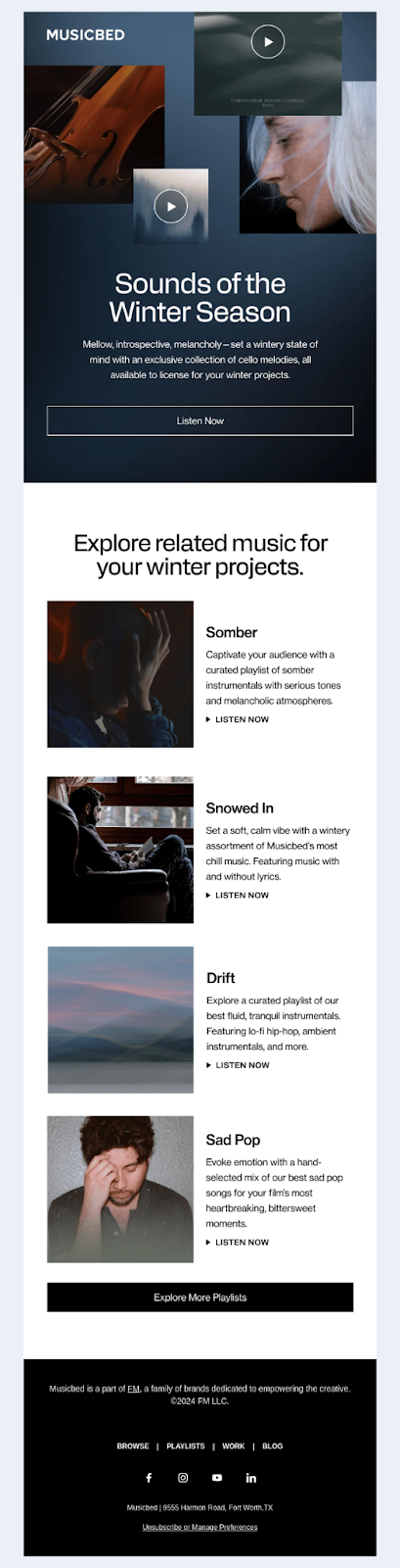
Creatives on the hunt for relevant music will definitely feel tempted to “explore more playlists.”
When building a campaign:
- Stick to a single focus
- Use bold or interesting visuals or emojis to showcase your product or offer
- Make your CTA buttons prominent and actionable (A/B test these!)
- Ensure everything looks good on mobile devices (use responsive email design)
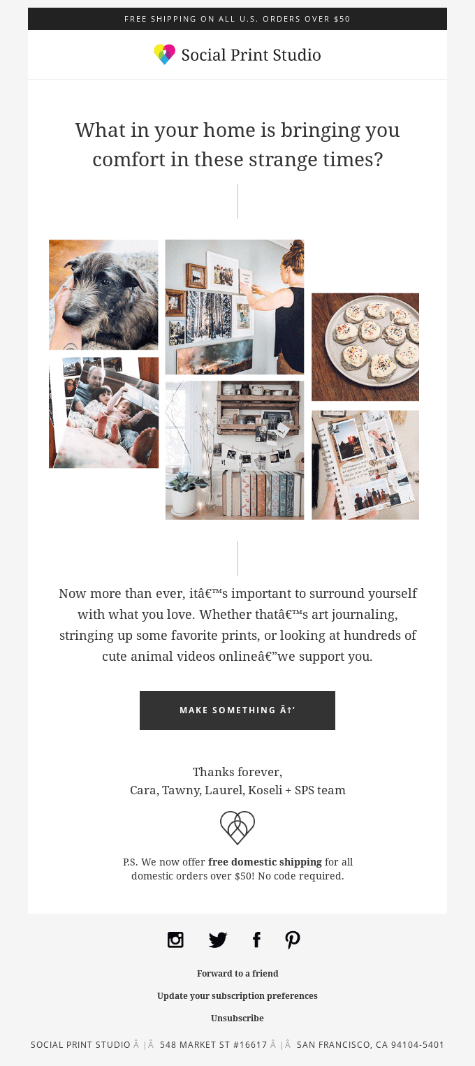
Newsletters are all about readability and consistency. You want your target audience to look forward to them and not feel overwhelmed.
Stick to a theme like StudioSuits’ Spotlight Sessions above. Or use a simple “Here’s what’s new” approach with clear dividers so readers can get a quick recap and scroll to specific sections.
Here’s how Miro does the latter:


Newsletter tips:
- Use consistent formatting (section headers, dividers)
- Keep paragraphs short
- Add visual cues like icons or bold text to guide the reader
- Use branded email templates to keep your look consistent
If your content is strong and your layout supports it, readers will keep coming back.
Bad email design examples
Design mistakes happen sometimes. But try to stay ahead of these to keep your business looking professional.
For instance, clutter is a common issue. Too many fonts, colors, or competing CTAs can confuse your reader. So can using images without alt text or designing only for desktop.
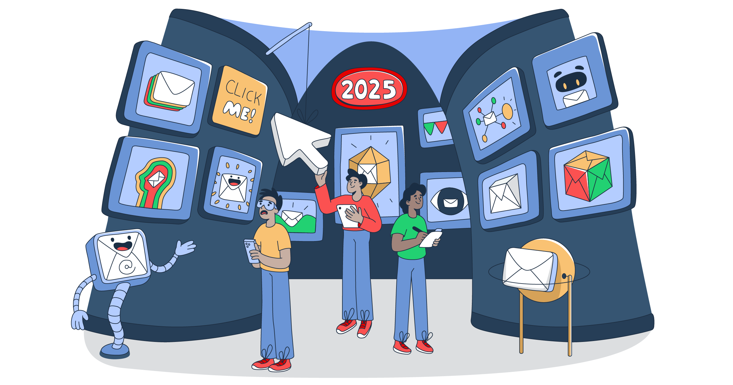
Trying to go overboard with creativity can backfire, too. In the following email, there’s way too much going on for the eye to focus:

Another problem is typos or automation gone bad with marketing tools.
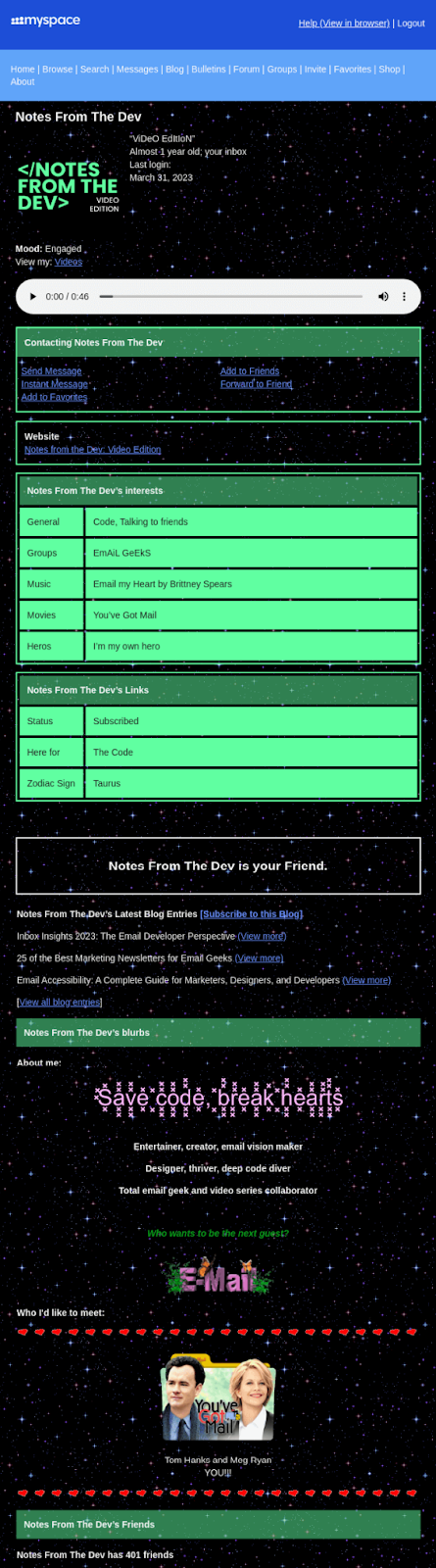
Here’s a scrapbook style automated email that missed the mark and included random symbols that disrupt text:

Quick fixes:
- Stick to one to two fonts per email
- Use a clear hierarchy for headlines and body text
- Always add alt text for images
- Test on multiple devices and email clients
Clean, functional design always wins.
Final thoughts
You don’t need to reinvent the wheel to improve your email design. Study examples from brands doing it well, like the ones we covered in this guide, and apply what makes sense for your own campaigns.
Design is part art, part function. When it’s done right, it helps your message land with clarity and impact. Use these examples to audit your current emails or inspire your next campaign. Test what works, simplify where you can, and always design with your reader in mind.