


Designing a responsive email template shouldn’t be a daunting task. With all the available tools, free templates, and tutorials, you’ll be all set to create messages that resonate anywhere.
In this guide, I’ll share everything I’ve learned about creating responsive email templates that look great and perform well on any device. I’ll show you:
- How to build a responsive html email template, even if you’re not a coding expert.
- Some of the best sources to find free responsive HTML email templates.
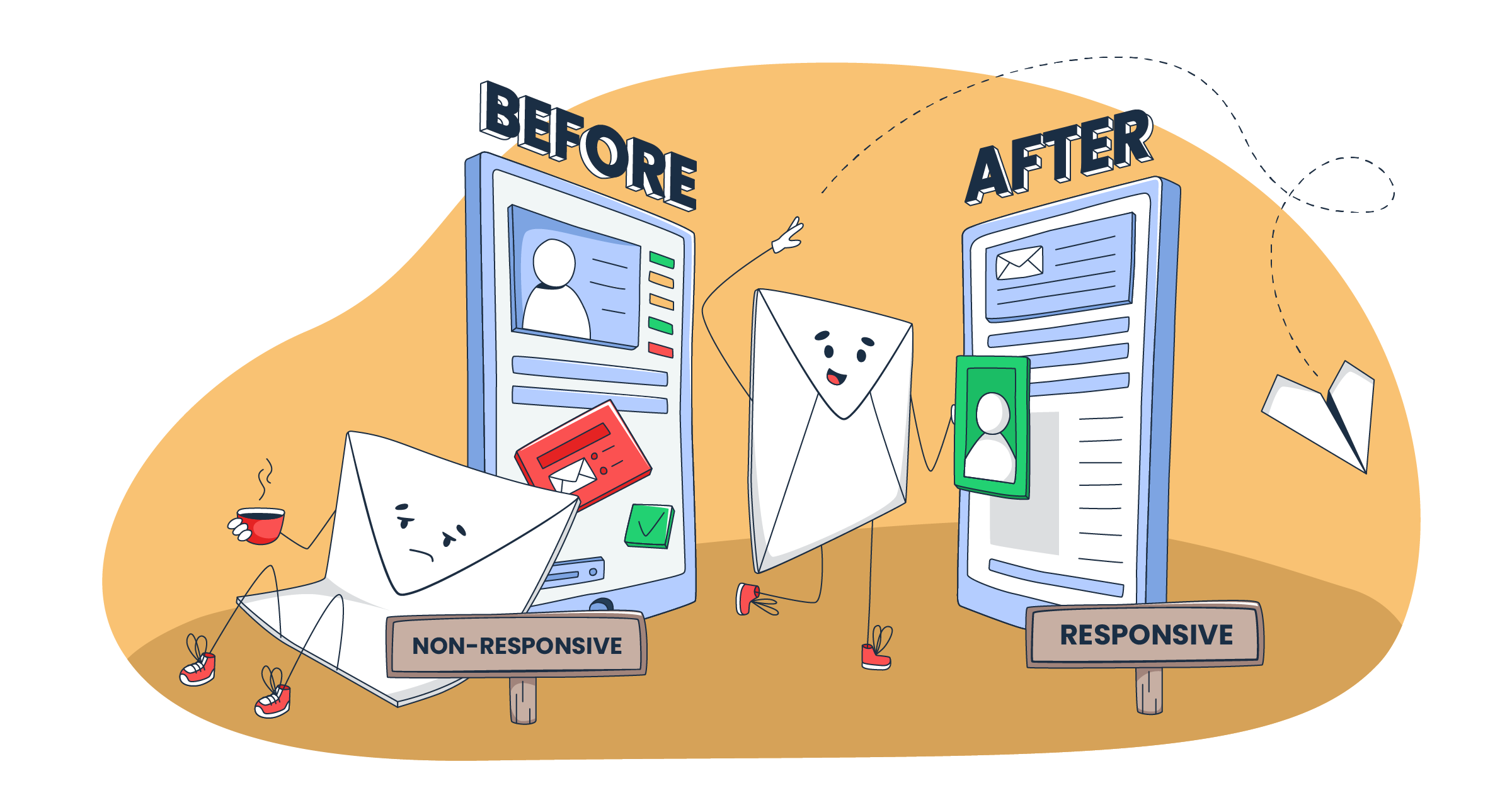
What is responsive email design?
Responsive email design is an approach to crafting HTML emails that automatically adjust their layout and content to fit different screen sizes. It’s about designing a single HTML email that adapts fluidly to different email clients and desktop and mobile devices.
This approach significantly improves readability and usability, leading to higher open rates and better overall email marketing performance.
Different layout approaches for responsive email design
There are several different layout approaches, each with its own pros and cons. Here’s a breakdown:
Fixed (static) layout
Don’t use this method; it’s here only for educational purposes (to understand what not to do 😀)
So, don’t set a fixed width (e.g., 600 pixels) for your email. It will stay that way, regardless of the screen size. This leads to a terrible mobile email experience, forcing users to pinch and zoom to read the content.
.container {

  width: 600px; /* Fixed width */

  margin: 0 auto; /* Center the container */

  ...

}
Fluid (liquid) layout
This is a step up from the fixed layout method. Instead of using pixels, you use percentages for widths. This means the email content expands or contracts to fill the available space.
The method could work for very simple, text-heavy email newsletters where precise layout control isn’t critical. The downside is that on very large screens, text lines can become too long for comfortable reading, and on smaller screens, things can get cramped.
.container {

  width: 90%;        /* Fluid width - takes up 90% of available space */

  max-width: 600px;   /* Limits maximum width */

  margin: 0 auto;     /* Centers the container */

}
Quick note on the code: The container will resize itself based on the width of its parent element (usually the email client’s viewing area). It will occupy 90% of the available width, up to a maximum of 600px.
Hybrid (semi-fluid) layout
The method combines fixed and fluid elements. For example, you might have a fixed-width container with fluid columns inside. It’s useful when you need to keep certain elements (like a logo in the email header) at a specific size while allowing other parts of the email layout to be more flexible.
.container {

  width: 95%;        /* Fluid width - adapts to viewport */

  max-width: 960px;   /* But doesn't get too wide */

  margin: 0 auto;     /* Centers the container */

}

.sidebar {

  width: 200px; /* Fixed-width sidebar */

  float: left;  /* Place sidebar on the left */

}

.main-content {

  width: calc(100% - 200px); /* Remaining width, fluid */

  float: left;  /* Place content next to sidebar */

}

img {

    max-width: 100%;

    height: auto;

}

/* Media Query for smaller screens */

@media (max-width: 768px) {

  .sidebar, .main-content {

    width: 100%; /* Stack columns on small screens */

    float: none;  /* Remove floats */

  }

}
The overall layout is somewhat fluid, but you have strict control over the width of specific elements (like the sidebar). The layout adapts but in a more controlled and structured way than a purely liquid layout.
Adaptive layout
The approach uses CSS media queries to apply completely different style sheets based on device characteristics (like screen size or orientation). You’re essentially designing separate layouts for specific breakpoints.
The upside is that you get more control over the layout on different device types (e.g., one layout for all phones, another for all tablets, and a third for all desktops). It’s more work but with a lot of control.
.container {

  width: 95%;

  max-width: 1200px; /* Maximum width for the largest layout */

  margin: 0 auto;

}

.column {

  /* Default styles (for the largest screen size) */

  width: 33.33%; /* Three columns */

  float: left;

  padding: 10px;

  box-sizing: border-box; /* Include padding in the width */

}

img{

    max-width: 100%;

    height: auto;

}

/* Medium screen layout (e.g., tablets) */

@media (max-width: 1024px) {

  .column {

    width: 50%; /* Two columns */

  }

}

/* Small screen layout (e.g., phones) */

@media (max-width: 768px) {

  .column {

    width: 100%; /* One column */

    float: none;  /* Remove floats */

  }

}Note: Media queries are widely supported, but there are still specific email client quirks. For instance, Gmail could ignore whole blocks if one curly bracket is missing, so be mindful of those.
Responsive layout
This is the recommended method. It uses CSS media queries within a single stylesheet to adjust the layout and styling. It combines fluid elements (percentages) with breakpoints to reflow content.
For example, a two-column layout on a desktop might become a single-column layout on a mobile device. This provides the best user experience across the widest range of devices.
.container {

  width: 90%;         /* Fluid container */

  max-width: 1200px;  /* But with a maximum width */

  margin: 0 auto;

}

.row {

  display: flex;      /* Use Flexbox for flexible row layout */

  flex-wrap: wrap;    /* Allow items to wrap to the next line */

}

.col {

  flex: 1;          /* Each column takes equal space by default */

  padding: 10px;

  box-sizing: border-box; /* Include padding in width calculation */

}

img {

  max-width: 100%;  /* Fluid images */

  height: auto;

}

/* Adjustments for different widths. */

@media (max-width: 1024px) {

  .col {

    flex: 0 0 50%;  /* Two columns on medium screens */

  }

}

@media (max-width: 768px) {

  .col {

    flex: 0 0 100%; /* One column on small screens */

  }

}
In a way, responsive design is a continuous adaptation, and elements resize fluidly and proportionally as the screen size changes.
How to choose the best layout for your design
Here are the design tips based on the type of email you’re sending:
- For text-heavy emails: Fluid or responsive layouts are your best bet. Prioritize readability. Use max-width in your CSS styles to prevent overly long lines on large screens.
- For newsletters: A responsive layout is highly recommended. It allows for flexible column layouts and easy content rearrangement on different devices.
- For promotional emails with interactive content: A Responsive layout is essential. It ensures that interactive elements (buttons, carousels, forms) display and function correctly on all devices.
How to build a responsive email template (no-code option)
Using email bulders is okay, regardless of your skill level. They’re fast, generally reliable, and give you control over design consistency.
Check out my favorites:
Tabular
Tabular HTML email builder lets you easily create responsive emails for any platform using a drag-and-drop interface without coding.


Tabular provides control over mobile and language-specific designs and supports personalization.
Here is why Tabular is a great choice:
- Tabular’s algorithm is designed to ensure email templates look good in over 50 email clients, including older versions of Outlook.
- It allows you to create different versions of your emails, specifically for mobile viewers or viewers from other countries, with different visuals, text, and more.
- Tabular offers advanced personalization with variables and conditional content that will allow you to showcase different products or further personalize your emails.
Mailtrap Email Builder
Mailtrap Email Delivery Platform is engineered for high deliverability with growth-focused features, and industry best analytics. Of course, it includes a drag-and-drop editor and an HTML email template builder for creating responsive emails.


You can also benefit from features like AI assistance to refine your copies, a free image library, and personalization options. The platform supports both desktop and mobile editing with device previews.
Here is why Mailtrap is a great choice:
- It has a drag-and-drop builder and an HTML editor, giving you more flexibility
- It provides a library of free images and a simple photo editor to enhance your designs.
- It offers email personalization and campaign scheduling.
- It features an AI email copy assistant to refine your subject lines and email body.
How to develop a responsive email template
I’ll walk you through some common layout techniques and provide basic HTML code examples. Remember that email clients are notoriously finicky, so we’ll rely heavily on tables for layout (yes, tables!) and inline CSS.
One-column layout
This is the simplest and often the most effective layout, especially for mobile users. It guarantees that your content is easy to read and scroll through on small screens.
- Full-width, vertically stacked content: All content elements (images, text, buttons) are arranged vertically, one after another, and typically span the full width of the email’s main container. A max-width (e.g., 600px) on the container prevents excessive width on large screens.
- Table-based structure: The layout is built using HTML tables (<table>, <tr>, <td>) to ensure maximum compatibility across various email clients, particularly older versions of Outlook that have limited CSS support.
- Mobile-first responsiveness: While inherently responsive due to its single-column nature, the design should consider smaller screens (e.g., max-width: 100% on images and potentially a media query to adjust padding/text sizes).


Two-columns layout
A two-column layout in email design arranges content into two side-by-side sections within the email body, similar to columns in a newspaper or magazine.
- Nested table structure: A two-column layout in email is typically achieved using nested HTML tables. The outer table provides the overall structure (and often a max-width), while an inner table with two table data cells (<td>) side-by-side within a single row (<tr>) creates the two columns. Further nesting within each <td> is common for content organization.
<table role="presentation" width="100%" ...>

  <tr>

    <td align="center">

      <table role="presentation" class="container" ...>

        <tr>

          <td class="column-1">

            </td>

          <td class="column-2">

            </td>

        </tr>

      </table>

    </td>

  </tr>

</table>- Defined column widths (fixed, percentage, or hybrid): Large images and even long text can cause layouts to break; defined widths prevent that and maintain the intended structure across different email clients and screen sizes. Each column (<td>) must have a defined width. There are three main approaches:
- Fixed widths (pixels): Provides precise control but is not responsive.
- Percentage widths: Creates fluid columns that adapt to the container’s width, but maintains equal proportions.
- Hybrid (fixed and fluid): One column (often a sidebar) has a fixed width, while the other (main content) uses calc() or other techniques to fill the remaining space. This is the most common approach for balancing control and responsiveness.
A two-column layout must be made responsive using CSS media queries. Without this, the layout will not adapt to smaller screens (mobile devices), resulting in a poor user experience.
Responsive web design (RWD) elements for email templates
Here are the core elements that make responsive email work:
Inline CSS
Most email clients strip out <style> tags and external stylesheets. It means you must use inline CSS to style your email.
Instead of this:
<style>

  p {

    color: blue;

  }

</style>

<p>This is a paragraph.</p>
You need to do this:
<p style="color: blue;">This is a paragraph.</p>You can use CSS inliners (online tools) to automate this process when working with complex responsive templates.
Media queries
As you can guess by now, media queries are the heart of responsive design. They allow you to apply different styles based on device characteristics. Here’s a basic example:
@media screen and (max-width: 480px) {

  /* Styles for screens 480px and smaller */

  body {

    font-size: 14px;

  }

  .header {

      font-size: 24px;

  }

  .cta-button {

    width: 100%; /* Make the button full-width */

  }

}
This media query targets screens with a max-width of 480 pixels. Inside, we’re adjusting the font size of the body text and making CTA buttons full-width. You should use media queries to do the following:
- Change the font-size
- Show/hide elements
- Switch layouts (e.g., stack a two-column layout into a single-column layout)
- Resize images
Table-based layouts
Sadly, tables are still the most reliable way to create consistent layouts in email. While they’re considered outdated for web design standards, email clients (especially older versions of Outlook) haven’t caught up.
Here’s a basic table structure for a two-column layout that stacks on mobile:
<!doctype html>

<html lang="en">

    <body>

        <table width="100%" border="0" cellspacing="0" cellpadding="0">

  <tr>

    <td align="center">

      <table width="600" border="0" cellspacing="0" cellpadding="0" style="max-width: 600px;">

        <tr>

          <td width="300" style="padding: 10px;" class="column">

            </td>

          <td width="300" style="padding: 10px;" class="column">

            </td>

        </tr>

      </table>

    </td>

  </tr>

</table>

    </body>

</html>
Use cellpadding and cellspacing attributes on your <table> tags to control spacing.
<table width="600" border="0" cellspacing="0" cellpadding="10">

  ...

</table>
Viewport meta tag
This tag goes in the <head> of your HTML email and controls how the email scales on mobile devices. It’s absolutely essential for responsive design.
<meta name="viewport" content="width=device-width, initial-scale=1.0">The width=device-width tells the browser to set the width of the viewport to the width of the device’s screen. The initial-scale=1.0 sets the initial zoom level to 100%.
Images optimization in responsive email design
Images can cause problems if not optimized correctly. To add images to your emails, you’ll need to host them online (using a service like a CDN or image hosting platform) and reference their URL in your HTML code.
Image formats
Use JPEG for photographs, PNG for graphics with transparency, and GIF for animated images (use sparingly, as large GIFs can impact email deliverability).
Image sizing and compression
Large image files slow down loading times and can cause your email to end up in the spam folder. Always compress your images before adding them to your email.
Use inline styles such as max-width: 100%; height: auto; to make your image fluid.
<img src="my-image.jpg" alt="My Image" style="max-width: 100%; height: auto; display: block;">The display: block; is important to prevent unwanted gaps below images in some email clients.
Alt text
Always use descriptive alt text for your images.
<img src="logo.png" alt="Company Logo">Screen readers use alt text, and it also displays when images are blocked (which happens more often than you might think).
Responsive email design in Outlook
Outlook, particularly older desktop versions (2007-2019), is the bane of many email designers’ existence. It uses the Microsoft Word rendering engine, which has very limited support for modern CSS.
Downsides of Outlook’s rendering process
Outlook often ignores max-width, adds extra padding, and has trouble with background image rendering.
Workarounds and fixes
- Conditional comments: Use these to target specific versions of Outlook:
- Ghost tables: These are Outlook-specific tables hidden from other email clients. They force Outlook to behave. I recommend using these – they’re somewhat trickier to code but more reliable.
There are many other specific Outlook hacks, like using mso-hide: all; to hide elements. The best resource I’ve found for dealing with Outlook is the “Fixing Email Bugs” series on Litmus’s blog.
Email client support table for responsive HTML elements
Here’s a simplified table summarizing support for key elements:
| Element | Gmail | Outlook (Desktop) | Apple Mail | Yahoo Mail |
| Media Queries | Yes | Limited | Yes | Yes |
| Max width [max-width] | Yes | No | Yes | Yes |
| Source Set [srcset] | No | No | Yes | No |
| Viewport Meta Tag | Yes | Yes | Yes | Yes |
| Web Fonts | Varies | No | Yes | Varies |
| GIFs | Yes | Yes | Yes | Yes |
| Embedded Video | No | No | Yes | No |
| Background images | Yes | Limited | Yes | Varies |
This is a simplified view. Support can vary depending on the specific version of the email client and the operating system. Always test!
Test responsive email templates
Never, ever send an email campaign without thoroughly testing it first.
Methods for testing
Here are the testing methods and you can actually use a combination of them:
- Manual testing: This is the most basic test, and it only works for some isolated use cases – like learning template testing. You basically send emails to yourself and check them on as many different devices and email clients as you can. And you have to pay close attention to:
- Layout: Does everything reflow correctly on smaller screens? Are columns stacking as expected?
- Images: Are images displaying correctly? Are they scaled appropriately? Is the alt text showing when images are blocked?
- Links: Do all links work? Do they go to the correct destinations?
- Interactive Elements: Do buttons, forms, and other interactive elements function properly?
- Text Rendering: Is the text legible? Are there any weird line breaks or font issues? Check for appropriate text-decoration.
- Check if email is cut short in Gmail.
- Email Testing Services are invaluable for professional email marketers. They allow you to preview your emails across a huge range of email clients and devices (far more than you could possibly own yourself). They provide screenshots, automated testing, and even spam filter checks. These services are not free, but they’re worth the investment if you send a lot of email campaigns. They help identify potential rendering issues before you hit send, saving you from embarrassing mistakes and ensuring your email newsletter looks perfect for everyone.
- Testing checklist: Create a testing checklist to make sure you don’t miss anything, here is an example:
- Check that your email header renders properly.
- Is the layout correct on all devices?
- Do images display correctly?
- Are alt tags present and descriptive?
- Do all links work?
- Do interactive elements function correctly?
- Is the text legible?
- Is the subject line compelling?
- Is the preheader text effective?
- Is there a clear call to action?
- Is there an easy-to-find unsubscribe link?
- Does the email pass spam filter checks?
- Is doctype defined correctly?
Responsive email design best practices
Here’s a quick overview of everything we previously discussed:
- Mobile-first approach: Start by designing for the smallest screen first. This forces you to prioritize content and ensures the mobile email experience is excellent. Then, you can progressively enhance the design for larger screens using CSS media queries. This approach is much easier than trying to cram a desktop-optimized design into a mobile phone.
- Prioritize content: Your email content should be clear, concise, and easy to scan. Get to the point quickly. Use short paragraphs, headings, subheadings, and bullet points to break up large blocks of text.
- Use a single-column layout (when possible): A single-column layout is the simplest and most reliable way to create a mobile-friendly email. It works well across all email clients and avoids many layout headaches associated with multi-column designs. If you need to use multiple columns, make absolutely sure they stack correctly on small screens.
- Optimize font sizes: Use font sizes that are large enough to be easily readable on mobile devices. Typically, the body text should be 14px at the low end ,and it’s okay to go larger (16px or even 18px).
- Use large, clickable buttons: Make your call-to-action button (CTA) large, prominent, and easy to tap on a touchscreen. Don’t use tiny text links for your primary call to action. Use a contrasting background-color for your CTA buttons to make them stand out.
- Avoid large blocks of text: As mentioned earlier, break up your text. No one wants to read a wall of text on their phone (or even on their desktop).
- Preheader text: Use preheader text (the short summary text that appears after the subject line in many email clients) to complement the subject line and lead recipients into the email body.
- Keep it Simple: Avoid overly complex designs that might break in some email clients. Simple, clean designs tend to perform better and are less likely to cause rendering issues.
- Remember design size: Desktop: 600px – 800px width. Tablets: 640px – 768px width. Mobile: 320px – 480px width
- Accessibility: It’s not just about how your email looks, but also about how accessible it is to everyone, including people with disabilities.
- Automation: Explore features that allow for dynamic content. Use an email service that supports it.
Common pitfalls
Here are some common mistakes you should avoid
- Not testing thoroughly: This is the biggest one. Test, test, test!
- Using too many images: Images are great, but don’t overdo it. Large image files can slow down loading times and trigger spam filters.
- Using JavaScript: Most email clients block JavaScript for security reasons. Don’t use it at all.
- Ignoring alt text: Always provide descriptive alt text for your images.
- Not optimizing for Outlook: Outlook is a pain, but you can’t ignore it. Use the workarounds I mentioned earlier.
- Using absolute positioning: Avoid absolute positioning in HTML email. It can break layouts in unpredictable ways.
- Forgetting the viewport meta tag: This tag is essential for responsive design.
- Overcomplicating the code: Keep your HTML code as clean and simple as possible. This will make it easier to troubleshoot and maintain.
- Not testing the functionality of interactive elements.
Wrapping Up
Follow the best practices and techniques outlined in this guide. They’ll help you create email campaigns that look great, engage your subscribers, and drive results on any device.
But remember that responsive template design is a continuous learning process. Email client rendering keeps evolving, so stay up-to-date with the latest design standards and testing tools.