



By the time your bounce rate looks wrong, the thing that caused it has been running for days.
Most monitoring advice is a list of metrics with target numbers next to them. That list isn’t wrong. It’s late. Every metric on it reports damage that already happened, which means it can confirm a problem and never prevent one.
This piece sorts deliverability signals into the ones that warn you and the ones that bill you. It covers which data source each signal comes from, how far behind real time each source runs, the thresholds worth alerting on, and what to do in the first thirty minutes after an alert fires.
I’m assuming you own the DNS, the ESP config, and the webhook handlers, and that you’re the only person at your company who understands any of it. That’s exactly why the monitoring has to run without you watching it.
Email deliverability monitoring vs. a deliverability audit
These get used interchangeably, and they are different jobs.
An audit is bounded, occasional, and human-driven. Someone sits down, works a checklist, and produces a report. Mailtrap’s email deliverability audit guide walks through that process end to end.
Monitoring is continuous and automated, and nobody sits down to do it. It produces alerts rather than a report. Monitoring is the security camera, and the audit is what you run once the camera catches something. An email header analyzer can also help during an investigation by revealing the technical details behind how a message was processed and routed.
Now, the distinction that actually trips teams up.
Deliverability means the receiving server accepted your message. Inbox placement means a human might see it. Your ESP dashboard can only report the first one, because the first one is the only thing it observes. A 99.4% delivery rate tells you nothing about whether any of that mail reached a primary tab. It tells you the mail was accepted and then disappeared into a decision you have no visibility into.
Teams conflate these constantly, then wonder why a dashboard full of green numbers sits next to a campaign that produced no replies.
Leading vs. lagging email deliverability signals
This is the organizing idea, so I’ll put it plainly: most teams monitor only lagging signals, then describe deliverability as mysterious and unpredictable. It isn’t. They’re reading the receipts and calling it a forecast.

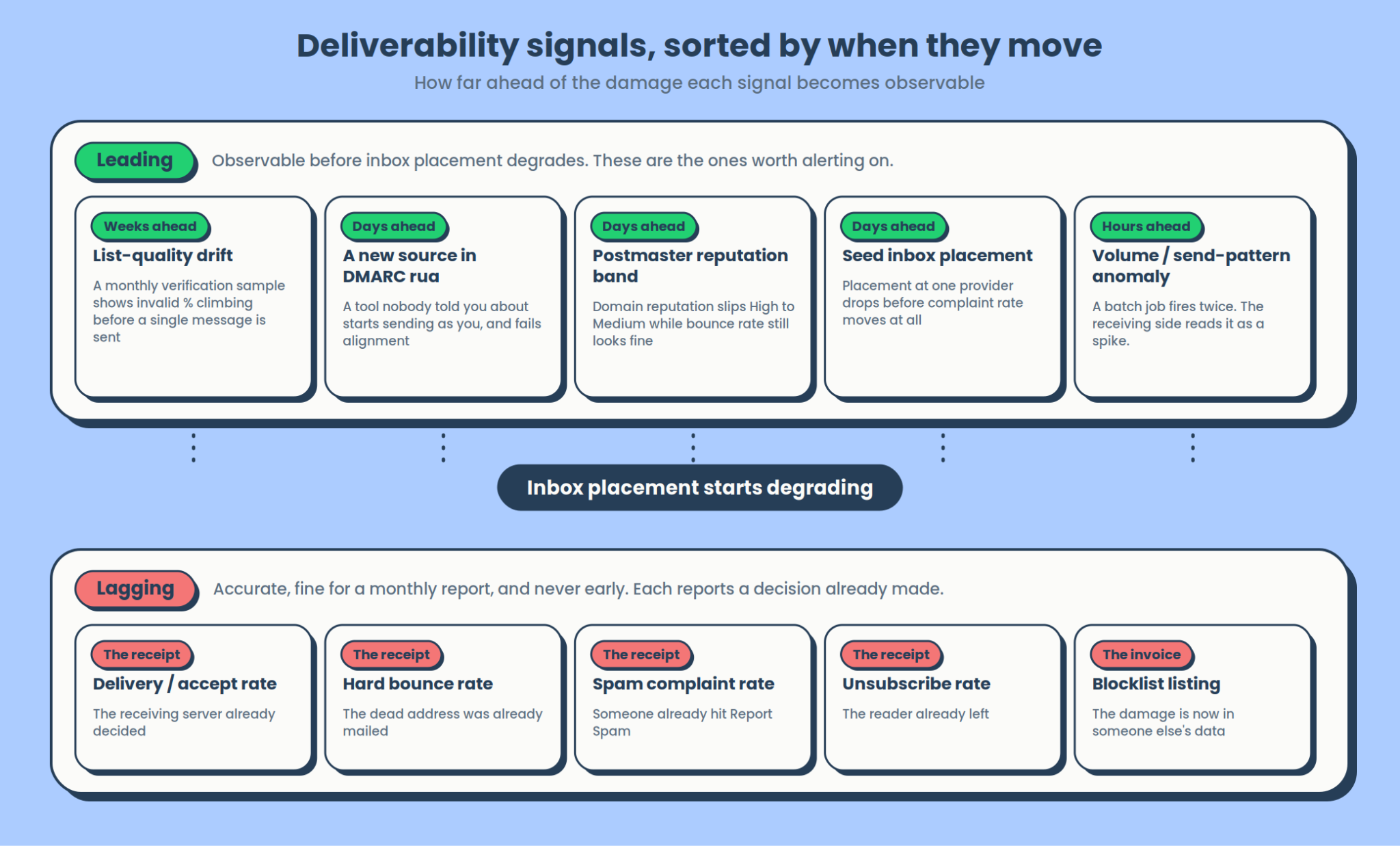
Lagging signals are the ones everybody already watches. Bounce rate, spam complaint rate, delivery rate, unsubscribes. They’re accurate, and they’re genuinely useful for a monthly report. They also arrive after the send. A hard bounce is a receipt for a decision that has already been made about an address you have already mailed.
Leading signals move earlier:
- DMARC authentication pass rate, broken out by sending source. A new marketing tool sending unaligned mail on your domain shows up here days before it shows up anywhere else.
- Inbox placement from seed tests. Placement drops before complaint rate rises, because people stop seeing your mail before they start reporting it.
- Domain reputation trend in Postmaster Tools, sliding down while your bounce rate still looks fine.
- List composition. Nobody treats this as a monitored signal. It’s the earliest one available, and it gets its own section below.
- Volume and send-pattern anomalies. A batch job that fires twice looks like a spike to the receiving side, and throttling follows.
| Lagging signals | Leading signals | |
|---|---|---|
| What they tell you | A decision was already made about mail you already sent | A decision is about to be made differently |
| When they tell you | After the send, sometimes hours after | Hours to weeks before placement degrades |
| Good for | Reporting, trend lines, proving a fix worked | Alerting, prevention, catching config drift |
| Bad for | Prevention. They structurally cannot do it | Precise attribution of a specific bad send |
| Examples | Bounce rate, complaint rate, delivery rate, unsubscribes, blocklist listing | DMARC pass rate by source, seed placement, reputation trend, list-quality slope, volume anomalies |
Four email deliverability monitoring data sources, four different clocks
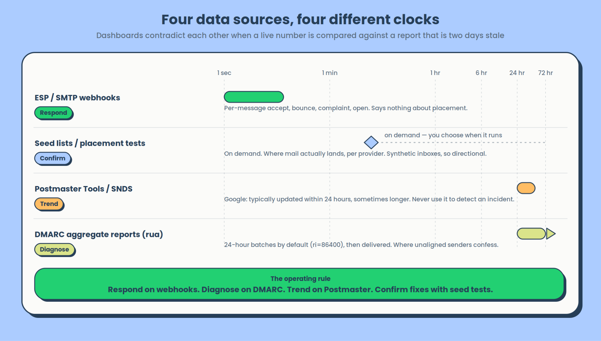
This is the reason monitoring dashboards contradict each other. People compare a number from a live webhook against a number from a report that’s two days stale and conclude their tooling is broken.

| Source | Latency | Good for | Can’t tell you |
|---|---|---|---|
| ESP / SMTP webhooks | Seconds | Per-message accept, bounce, complaint, open | Anything about placement |
| DMARC aggregate reports (rua) | 24-hour batches by default, then delivery time on top | Which sources send as you, and whether they align | Individual messages, content |
| Google Postmaster Tools / Microsoft SNDS | A day or more | Reputation trend, spam rate as the provider sees it | Real-time anything |
| Seed lists/inbox placement tests | On demand | Where mail actually lands, per provider | Real subscriber behavior |
The rule that follows, stated as a rule: respond on webhooks, diagnose on DMARC, trend on Postmaster, confirm fixes with seed tests. Each source has exactly one job.
Using Google Postmaster Tools to detect an incident is a category error. Google’s own documentation puts it plainly: “Typically, the data is updated within 24 hours but can take longer.” That makes it a trend instrument. Using webhooks to judge reputation is the same mistake in reverse: webhooks see one message at a time and have no opinion about your domain.
Reading a raw DMARC aggregate report
Almost nobody opens these directly, which is a shame, because the aggregate reports are where unaligned senders confess.
Under DMARC, the rua tag names the address that receives aggregate feedback, and the ri tag sets the requested interval, defaulting to 86400 seconds. The ruf tag is the separate, per-message failure channel, and far fewer receivers honor it.
Each report is XML. Every <record> looks roughly like this:
<record>

  <row>

    <source_ip>203.0.113.47</source_ip>

    <count>1842</count>

    <policy_evaluated>

      <disposition>none</disposition>

      <dkim>fail</dkim>

      <spf>fail</spf>

    </policy_evaluated>

  </row>

  <identifiers>

    <header_from>yourdomain.com</header_from>

  </identifiers>

  <auth_results>

    <spf><domain>mail.somevendor.io</domain><result>pass</result></spf>

  </auth_results>

</record>
Read it in this order. <source_ip> is who sent, <count> is how much, <policy_evaluated> is the aligned result and the one that matters, and <auth_results> is the raw result before alignment was considered.
The record above is exactly the shape of the problem you’re hunting. SPF passed on its own, against mail.somevendor.io. But the From header says yourdomain.com; the two don’t align, so DMARC records a fail. That’s a marketing tool somebody signed up for last Tuesday, sending 1,842 messages as you, invisible in every other dashboard you own.
If you set up one alert here, make it this: any source IP appearing in your aggregate reports for the first time.
One note on seed lists before moving on. Those inboxes have no engagement history behind them, so placement results are directional. Treat a ten-point drop as a signal and an “87% inbox placement” figure as close to meaningless in isolation.
Email deliverability metrics to monitor: thresholds, windows, and segments
Metric and threshold are the easy half. Measurement window and segment are the half that makes a threshold usable, and they usually go missing.
A 0.3% complaint rate measured over a rolling 30 days across all mail is a completely different number from 0.3% on yesterday’s marketing send to Gmail. Google reports spam rate per day, against your authenticated domain, for mail to personal Gmail accounts specifically. That is not how most dashboards compute it by default.
| Metric | Threshold | Window | Segment it by |
|---|---|---|---|
| Spam complaint rate | Below 0.10%; never reaches 0.30% (Google) | Daily | Receiving provider, sending domain, stream |
| Hard bounce rate | Below 5%. AWS SES reviews accounts at 5% and may pause at 10% (AWS) | Per send, plus rolling 7 days | Campaign, import batch, stream |
| Soft bounce rate | Trend-based. A rising slope is the signal | Rolling 7 days | Receiving provider |
| Delivery rate | Below 95% is worth investigating | Per send | Receiving provider |
| DMARC pass rate | Above 95%, per source | Per report cycle | Sending source, above all |
| Domain reputation | High. Any band drop is an event | Daily, as published | Provider |
| IP reputation | High, per sending IP | Daily, as published | Sending IP or pool |
| Inbox placement | Track the delta between tests | Per test | Provider |
| Engagement (opens, replies) | Segment-relative | Rolling 30 days | Segment age, stream |
A few of these deserve a line of explanation.
Complaint rate. Google asks senders to keep the rate reported in Postmaster Tools below 0.10% and to avoid ever reaching 0.30%. Yahoo publishes 0.3%, and publishes it for all senders rather than just bulk ones. Microsoft’s 2025 requirements for high-volume senders apply above 5,000 messages a day to consumer Outlook, Hotmail, and Live addresses and require SPF, DKIM, and DMARC to pass, but Microsoft publishes no numeric complaint threshold at all. Don’t assume one exists. And to see complaints in the first place, you need a feedback loop configured.
Bounce rate. AWS SES counts hard bounces only, excludes soft bounces entirely, and is explicit about the consequences: at 5% or greater, your account is automatically placed under review, and at 10% or greater, sending may be paused. Their complaint thresholds are 0.1% for review and 0.5% for a pause. If you send through SES, those four numbers are your actual alerting thresholds, not a best practice.
Reputation. Sender reputation belongs on the list, but treat it as one slow input rather than a headline. It moves after the behavior that caused it, and by the time a band drops you already have something else to look at.
Engagement. Treat opens and replies as a placement proxy rather than a marketing metric. A segment whose open rate halves while its bounce rate stays flat is usually being filtered into a spam folder.
Separate your streams or the averages will lie to you
This is the part that makes the whole table work.
Monitor transactional and marketing mail separately, on separate subdomains, with separate DMARC reporting addresses.
A password-reset stream at 0.05% complaints and a newsletter at 0.4% average out to roughly 0.2%, which looks acceptable and hides the thing about to get you blocked. The two streams also carry opposite risk profiles. Nobody complains about a password reset, so a transactional stream that starts generating complaints is a far louder signal than the same movement on a newsletter.
Split them at the infrastructure level and every threshold above becomes meaningful.
How to monitor list-quality drift before you send anything
Verification usually gets framed as a cleanup task you perform once something has gone wrong. Treat list composition as a signal you monitor on a schedule instead. It’s the earliest warning available, and it’s observable without sending a single message.

Lists rot on a predictable curve, mostly through job changes. The “30% a year” decay figure that gets repeated across this category has no primary study behind it that I can find, so I’d rather anchor on something you can check yourself. US median tenure with a current employer is 3.9 years, and 22% of workers have been with theirs a year or less. That is the engine underneath the decay.
Treat job change as a floor rather than the whole number, though. Title changes and email format migrations break an address without anyone moving companies, and neither shows up in tenure data.
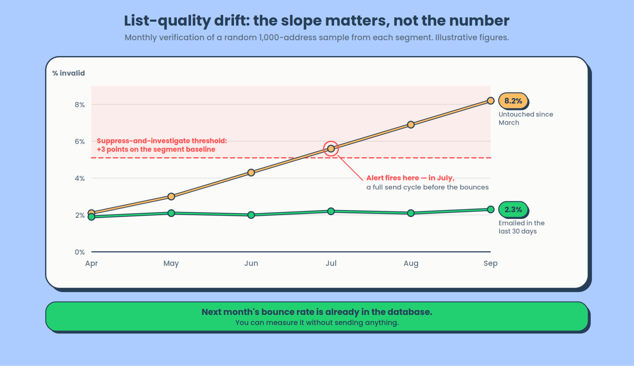
Decay also isn’t uniform. A segment you last touched in March carries a completely different risk profile from one you emailed on Friday. Next month’s bounce rate is already sitting in your database today, unevenly distributed, and you can measure it before you send.
The sampling job
- Pick a random sample from each significant segment. A thousand addresses is plenty, since you’re measuring a rate rather than cleaning a list.
- Run the sample through verification.
- Record three numbers: percentage invalid, percentage accept-all, percentage unknown.
- Chart all three per segment, monthly.
- Alert on the slope, not the level.
Step 5 is the whole point. A segment sitting at a steady 4% invalid is fine. A segment drifting from 2% to 6% over two months is telling you exactly when it’s going to bounce, and it’s telling you a full send cycle early.
For the verification step, I use Hunter’s Email Verifier for one specific reason. Its API returns accept_all as its own status value alongside valid, invalid, webmail, disposable, and unknown, rather than folding it into “valid.”
{

  "data": {

    "status": "accept_all",

    "score": 72,

    "email": "j.doe@targetcompany.com",

    "accept_all": true,

    "mx_records": true,

    "smtp_server": true,

    "smtp_check": true

  }

}
That distinction is what makes the tracking possible. If your verifier collapses accept-all into valid, you can’t chart the accept-all percentage separately, and it’s the sneakier of the two curves. Those addresses never fail loudly. The receiving server says yes to everything, so they quietly stop being real while your bounce rate stays flat. The API also turns the monthly sample into a cron job instead of a manual export.
Trigger rules
Three rules turn a chart into monitoring:
- Re-verify any segment untouched for 60 to 90 days. That’s roughly where a quarter’s worth of job changes accumulates.
- Always re-verify before reactivating a dormant list. One reactivation campaign against a two-year-old segment is the most common way a healthy sender lands in trouble.
- Treat a 3-point rise in invalid percentage as a suppress-and-investigate event. Suppress the segment, find out what happened to it, then decide. Don’t file it for next month’s report.
One diagnostic to keep in your head: a rising invalid rate on a segment you haven’t touched is decay, and list cleaning handles it. A rising invalid rate on a segment you’re actively collecting is a broken signup form, and only correlation with your capture points will find it. That’s where a form builder like Woorise can help. It can validate email addresses as they’re submitted and block suspicious or invalid entries before they reach your email list.
Suppressing is half the response. Most of those addresses failed because one person left, and the company behind them is still a valid target, so pull the failed domains into their own list before you delete anything and find company email addresses on each one to recover a current name and title. A monitoring loop that only removes rows shrinks your list every month by design.
One more split worth making, the same one this article opened with. Charting the slope month over month is the monitoring job. The audit job runs once, before a campaign, and it catches what drift never will: where the list came from, role-based addresses that accept mail and never reply, and disposable domains left behind by a lead magnet. A six-check pre-send audit covers that sequence.
How to design deliverability alerts people don’t mute
Thresholds appear everywhere. What to do with a threshold appears nowhere.
Every real monitoring setup dies one of two deaths. Alerts tuned so tight they fire weekly, get muted in month two, and are silently dead by month four. Or alerts tuned so loose that the first notification is also the crisis. The fix is tiers, not sensitivity.
Critical. Pages a human.
- Bounce rate above 5% on a live send
- DMARC pass rate below 90% on any single source
- An XBL listing, or an SBL listing that isn’t a CSS listing
That last one needs a word of explanation, because the lists overlap. Spamhaus publishes the CSS inside the SBL zone, so a naive “are we on the SBL” query returns true for both. They mean different things. An SBL proper or XBL listing implies deliberate abuse or a compromised machine and genuinely warrants waking someone up. A CSS listing usually means sloppy list hygiene, which is serious but not a 2 am problem. Split them, or your critical tier will fire on the wrong thing.
These are all “stop sending now” conditions, and there are only a handful. Keep it that way. A critical tier with fifteen rules in it is a warning tier wearing a costume.
Warning. Goes to Slack.
- Bounce rate above 2%
- Complaint rate above 0.2%
- Domain or IP reputation dropping a band
- Seed placement falling more than 10 points at any single provider
- A CSS listing
- A new source IP in your DMARC aggregate reports
Digest. Weekly email.
- Trend lines on everything above
- List-quality slope per segment
- Volume by stream, so a doubling is visible before it becomes a throttling problem
- Full DMARC source inventory, including anything that started sending as you this week
Two design rules sit underneath all of that.
Alert on rate of change, not just absolute value. A bounce rate that doubles from 0.4% to 0.8% is a real event, and no absolute threshold will ever catch it. Every metric in the table above should have a delta rule sitting next to its level rule.
Put a volume floor on every rule. Two bounces out of eleven emails is 18% and means nothing. Without a floor, your lowest-volume streams will generate most of your alerts, which is exactly how a team learns to ignore the channel.
Here’s the spec format I use. It’s deliberately boring and copyable:
- name: hard_bounce_rate_critical

  metric: bounces.hard / messages.delivered

  window: single_send

  min_volume: 500          # below this, do not evaluate

  threshold: 0.05

  tier: critical

  route: pagerduty

  runbook: /runbooks/deliverability-incident.md

- name: dmarc_new_source

  metric: dmarc.source_ip

  window: per_report

  condition: not_seen_in_prior_30d

  tier: warning

  route: slack#deliverability

runbook: /runbooks/unknown-sender.md
Every rule points to a runbook. An alert that doesn’t tell the person receiving it what to do next is a notification, not an alert.
Email deliverability incident response: the first thirty minutes
Thresholds are easy to find. An ordered response to one is harder. Here’s the runbook I use, and the order matters.
1. Stop the bleeding. Pause the affected campaign or queue before you diagnose anything. Every minute of continued sending into a reputation problem deepens it. Diagnosis is cheap. Sending is not.
2. Isolate by provider. Group the failures by recipient domain. This is the decision point for everything that follows.
- One provider failing: a reputation or blocklist issue with that provider. Go to step 6.
- All providers failing at once: authentication or infrastructure. Check DNS first, because the fastest way to break every stream simultaneously is a DNS change.
3. Diff the authentication. Compare DMARC pass rate against last week, then diff the DNS records themselves. Three causes account for most of what you’ll find, roughly in this order:
- A new marketing tool sending unaligned mail
- An expired or rotated DKIM key
- An SPF record pushed past the DNS lookup limit
That last one gets described wrong constantly. RFC 7208 limits SPF evaluation to 10 terms that cause DNS queries, not 10 resolved lookups. The include, a, mx, ptr, and exists mechanisms and the redirect modifier all count. Exceed it and evaluation returns permerror, which most receivers treat as a failure. Adding one vendor’s include: can push you over silently, and nothing in your ESP dashboard will mention it. Watch for multiple SPF records on the same domain too, which is its own permanent error.
4. Check what changed in the list. A new import, a reactivated segment, or a signup form that stopped validating. Correlate the bounce spike against import timestamps. If the spike lines up with an import, you have your answer and the rest of this list is wasted time.
5. Check volume. Sudden jumps trigger throttling that reads exactly like a deliverability problem, and a batch job that ran twice takes thirty seconds to rule out. Provider deferrals show up as a 4.7.x enhanced status code, which under RFC 3463 means a persistent transient policy rejection. You’re being deferred, not rejected. Back off and retry rather than re-queuing at full rate.
6. Check the blocklists. Query Spamhaus and the major RBLs, and establish whether the listing is IP-level or domain-level, because the remediation is completely different.
The Spamhaus lists are not interchangeable. The SBL and XBL are IP-based and imply deliberate abuse or a compromised machine. The CSS is also IP-based and is the one a legitimate but sloppy sender is most likely to hit, since poor list hygiene is an explicit listing trigger. The DBL lists domains only. A PBL listing isn’t an accusation of anything; it’s a statement that the IP shouldn’t be sending direct-to-MX at all. Mailtrap’s blacklist guide covers delisting.
Escalation rule: a bounce rate sustained above 5% means stop sending entirely and audit, in this order: list, then authentication, then reputation. Detection and triage end here. For the repair work, use the deliverability audit guide and Mailtrap’s walkthrough of diagnosing deliverability issues.
Email deliverability monitoring tools: a stack you can build this week
This is an assembly guide rather than a tools roundup. Every component below has one job, and I’ve said what that job is.

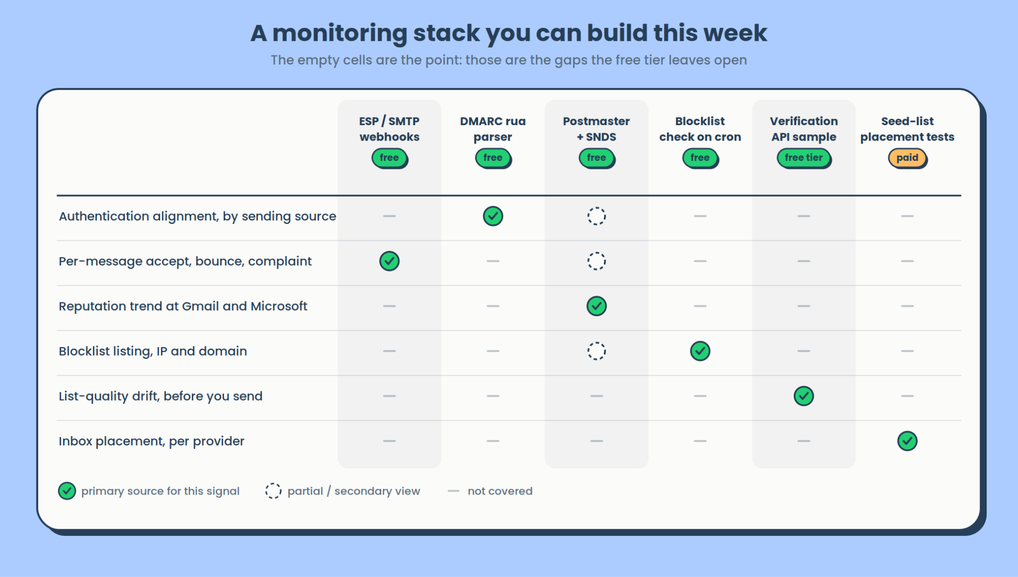
The free tier covers most of it:
- Google Postmaster Tools and Microsoft SNDS for reputation trend. Free, and the only view you get into how the two largest providers actually see you.
- A DMARC aggregate report parser. This is the highest-value component in the stack and the one most teams skip. You are already generating these reports. Someone just has to read them.
- Your ESP’s webhooks for per-message events. This is your only real-time input.
- Blocklist checks on a cron. A daily query against the major RBLs for your sending IPs and domains.
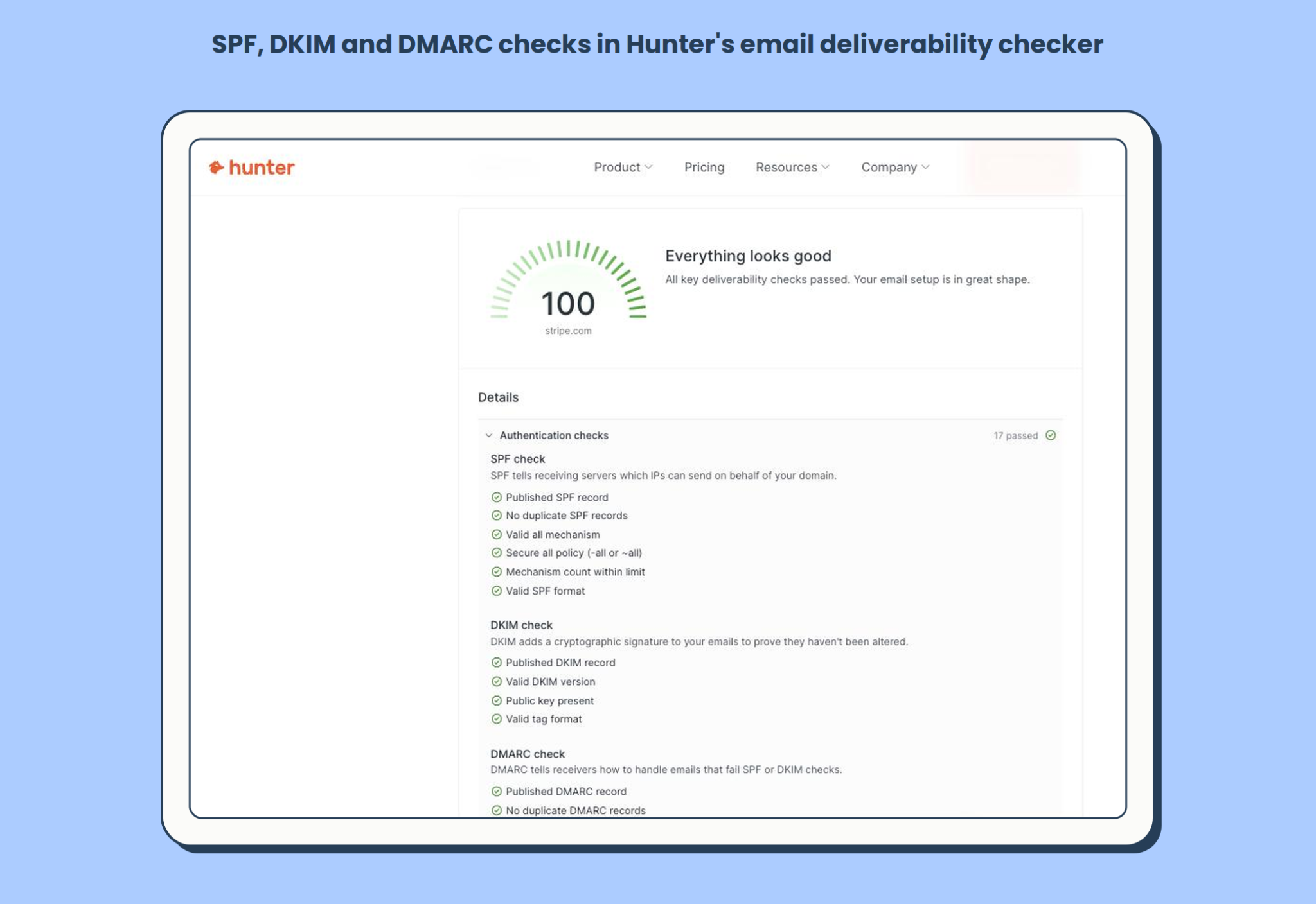
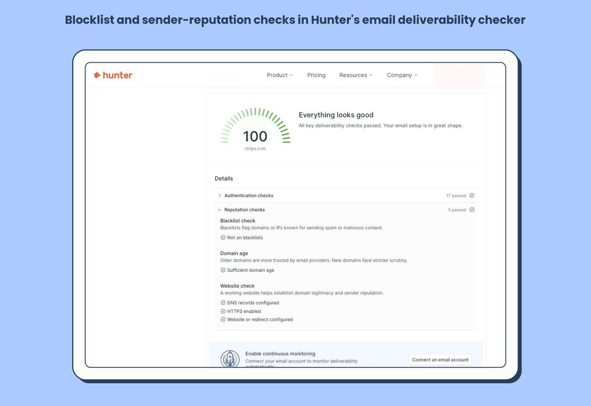
- A scheduled DNS and authentication check. Config drift is silent, so something should re-read your records on a cron rather than only when you go looking. Hunter’s free email deliverability checker covers the set in one pass: SPF, DKIM, DMARC, MX and blocklist status, including whether the SPF mechanism count is still inside the limit. It needs no signup, which makes it usable as step 3 of the runbook above.

- Verification sampling for list-quality drift, as described above.
What paid tiers actually buy you. Two things, and the roundups tend to blur them. Seed-list placement testing at scale, across enough providers to be meaningful. And historical retention beyond what the free tools keep, which matters the first time you need to answer “was this already happening in June?” and find you can’t. Mailtrap’s deliverability tooling comparison goes deeper on the paid options.
The gaps to leave visible. Nothing in the free tier gives you inbox placement. Nothing gives you list-quality drift unless you add verification. And no tool anywhere gives you per-message placement, because that data doesn’t exist outside the receiving provider.
The takeaway
Bounce rate is a receipt.
Build your alerting on the signals that move first. Know which clock each of your data sources runs on, and stop comparing a webhook against a report that’s two days old. Watch your list decay before it turns into a send.
If you do one thing this week, instrument DMARC pass rate by source. The aggregate reports are already being generated whether or not anyone reads them; the parser is a weekend project at most, and a new source IP appearing in those reports is the earliest warning you will ever get that something has changed.